Wow, those optimizations are crazy, great job!
ZionDHill
Creator of
Recent community posts
Ended up playing way longer than I expected.
This game is loaded with personality in every aspect of the presentation. Heck, even the credits were a treat for the eyes. There's really not much negative to add since it's a hyper-polished fan game of one of the most fun Game & Watch games. The sound and animations are adorable and super polished. I can there was a ton of time put into this. This one is definitely staying in my games folder.
You should be really proud of this one and I look forward to seeing what you make next!
This game is sick! I think my biggest complaint has to be the lack of option for full screen, for this twin-stick style of controls, it's very difficult to play, but the dozen or so rounds I did play were awesome! It's less of a big deal,but the menus are not aligned well with the cursor detection or something, because I have to kind of thumb around to find where to click for the menu buttons.
But when it comes to the gameplay, there's a ton of polish in here! A nice hidden gem of a mini-game! I think the sound design and combo effects blend great together, and every enemy and obstacle is very clear to understand while also feeling fun and blending well together.
I'll definitely come back to this one every once in a while for a quick romp, great job bruv!
This game felt a lot like Pizza Tower meets Brotato. I would have loved to see more of this game, but I had a mix of not knowing how to use the shop or if it even worked and also dying to enemies while spinning. Looking past those 2 major flaws, all of the UI and animations look great, the sound design pretty solid as well. I think this game has a great concept, but I feel the game was just a slightly too unfinished to enjoy it fully.
Congrats on the submission!
We're very glad you enjoyed Pequod! It's funny that we've seen so much praise for the colors, since they were kind of a mistake. I modulated all of the sprite colors while testing to make sure everything was always very visible, but then we didn't have time to change it all back, lol
Thanks for playing!
I really loved just how tight the scope felt with this entry. It feels like you knew what you wanted to make and just did it! The level of visual polish is really nice as well, the puzzles were simple, yet fun. Nothing overstayed it's welcome, so I think you did a bang-up job! Also this is a great use of the theme that isn't just temperature related, way to think outside of the box while still having a simple game with that Nokia 3310 charm!
Thank you, that means a lot to hear!
I greatly appreciate your interest in the art of my game, when it comes to the hit animation, I'm not sure if you're referring to the little explosion particle thing the enemies do upon death, or the sword swipe, so I'll just give a quick answer for both!
When it comes to the explode effect, my favorite explosion effects close in on themselves before expanding outwards, so I made sure to have that effect, gives it a little bit of a pull before it pops out, I also made sure to give the animation enough time to feel like it got to dissipate, hence why the final frame is only 4 pixels, one in each corner.
Here's the sprite sheet for that explosion, feel free to use it/expand upon it if you'd like!: 
When it comes to the sword swipe, it was a much trickier thing to pull off, I ended up using Godot's sprite rotation system while making sure to avoid anti-aliasing, this helped sell the effect as it looks much more dynamic than if it were only used in the cardinal directions. I used this animation reference I found on Pinterest as my reference for said animation, I really love the hard-edged look of these swipes because they remind me of Samurai Jack.
And here is the sprite sheet for the sword swipe, once again, feel free to use/expand upon it if you'd like!: 
I hope these answers were sufficient for you, and if you'd like to ask for anything more in-detail, feel free to message me on Discord!: ziondhill
Thanks, it's a great feeling seeing such praise for something I made myself!
Also all of the sounds were from Nokia compatible sound fonts, but I couldn't figure out how to do the single channel audio with the one day I had for this jam. If they do disqualify me though, it's completely fair, I just really adore 1-bit art and wanted to participate!
Thank you for the feedback, it means a lot!
Also yeah, I really wanted to participate in this jam, but I didn't know about it until the last 24 hours and am still quite new to game dev and couldnt figure out how to make the single channel sound within that time, so if I get disqualified, it's completely fair, but I wanted to participate regardless.
Yeah, there was an exporting/file error that was my fault, but it was not figured out until the game jam's deadline was up.
We will be posting an updated version that fixes the bloated files and rendering issues in 15 days when we are permitted to edit uploaded files again.
We're really sorry for the inconvenience, and we greatly appreciate your interest in the game!
We're very glad to hear you enjoyed it! I'm really sorry about the mouse sensitivity, as I set a goal for myself this jam to implement good accessibility options, so I put a lot of work into the keybind mappings! About 10 minutes after the deadline my friend asked if there was mouse sensitivity and I realized I missed one of the most important accessibility options!
But you live and learn, I definitely learned it the hard way, we're glad to see it didn't dampen your experience too much though!
Thanks for playing!
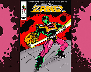
Awesome to hear man, we're all really glad to see you enjoyed our game! AvengeDog went all out on the game's "Jack Kirby" style, and we're glad to see people appreciate it as much as we do! When it comes to the level design, I would have definitely liked to have been able to implement more, among features like health drops and some form of buffs/scaling, but we're really happy with what we were able to accomplish in the time we had!
Thanks for playing!
We're very sorry to hear that you experienced this issue! But it's good (if not a tad funny) to hear you were able to find some kind of fun through our technical error! When it comes to the error, if I may ask, what were the specs of the hardware you were running the game on? I'm not sure if we can do anything about it now that the jam deadline is up, but I would still like to squash the issue for future reference!
Reminded me of my first time playing through Bloxorz, was a lot of fun, I enjoyed the visuals and the puzzle design felt very well designed. My only issue with the game was that the audio was incredibly choppy, but I'm unsure if this was an error on my part or what. I also wish that the animation for picking up the stick was faster or that the player could at least do actions while the animation is playing, because with some puzzles it felt like half of the duration was waiting on this animation.
Beyond those minor issues, very charming little game, good job!
Amazing job! I really enjoy this, I think it strikes a solid balance between arcade style gameplay and chill vibes. The visuals are on point, very expressive and readable while also sticking to the 4-color palette! The music is melancholic and non-intrusive, so it really suits the game well in my opinion. If I had a critique for this game, I believe that there could potentially be room for sound effects for rolling the snowballs, and maybe more fitting ones for the tik-tok noise when you switch bodies/are about to melt. This is more of a nitpik more than anything though.
Amazing submission, 5-stars!


