Hey the page look very white so add some graphics in the bg and try more fonts, you can look at my project page in my profile for a quick idea. very excited to play your game.
it's looking good but one more thing when I am opening the page in mobile devices, the background contains only one picture which is in top and the mid and bottom area are totally white so try to do it more better otherwise everything is good
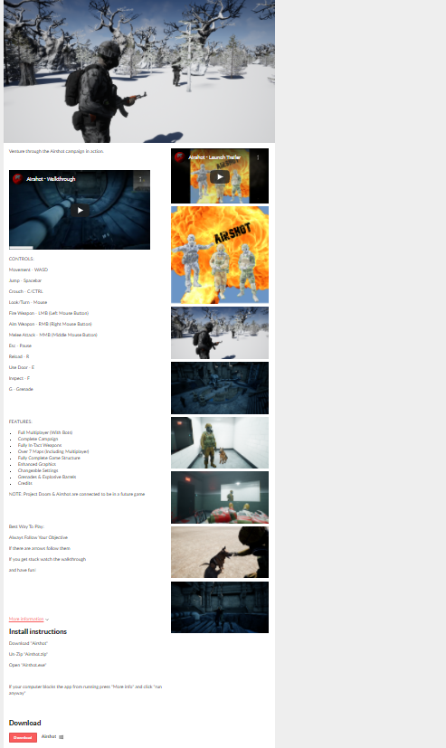
I think the number of pictures you have is really good. I would say that the repeated pictures (the ones in the "main body" that also appear in the screenshot column) don't add anything, since they're repeats. I would remove them from the screenshot column.
Also, having red text (your "more information" section has this, along with all of the tags inside it) on top of a green background is kind of hard to read / can cause eye strain. Desaturating the green or the red (or changing the red to a black or dark grey like the rest of the text on the page) would be a good way to work around this!