Indie game storeFree gamesFun gamesHorror games
Game developmentAssetsComics
SalesBundles
Jobs
TagsGame Engines

runner - a cyberpunk escape roguelike

A topic by Drew Harry created Mar 05, 2024 Views: 1,364 Replies: 12
Viewing posts 1 to 13
The computer ejects a disc labeled amulet.dat. You shove it into your black messenger bag and turn around to escape with your prize. The lights above you turn red and an alarm sounds. The quiet path you arrived by is now filled with dancing laser sensors and methodical patrol bots. In the distance you see an elevator to the next level, behind three layers of security force fields. You smash PLAY on your sonic implant and start running for the exit.

runner is a non-combat, movement-oriented roguelike. Your character is trying to navigate the space to achieve some simple objectives, unlock the exit, and get out before too much security arrives. While you can't fight directly, you will have a collection of movement options like wall running, running jumps, rolls, and maybe a smoke bomb or emp. You win by chaining together clever movement combos to outwit and out-run your methodical opponents.

I'm building in Typescript, using rot.js. This is my first game jam. Some years ago I wrote code more often, but I'm refreshing my skills after a long gap. 

You can find source here: https://github.com/drewww/runner

Devlogs to follow!

Day 1 / Enemies & Movement

Made good progress today! First enemies.

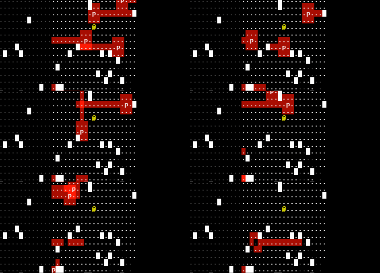
I have one enemy type so far. "Patrollers." They look straight forward + can see adjacent spaces. They move predictably, either turning "right" every time they hit an obstacle or by turning "180" when they hit a wall. Nothing fancy. I'll add more types later. 

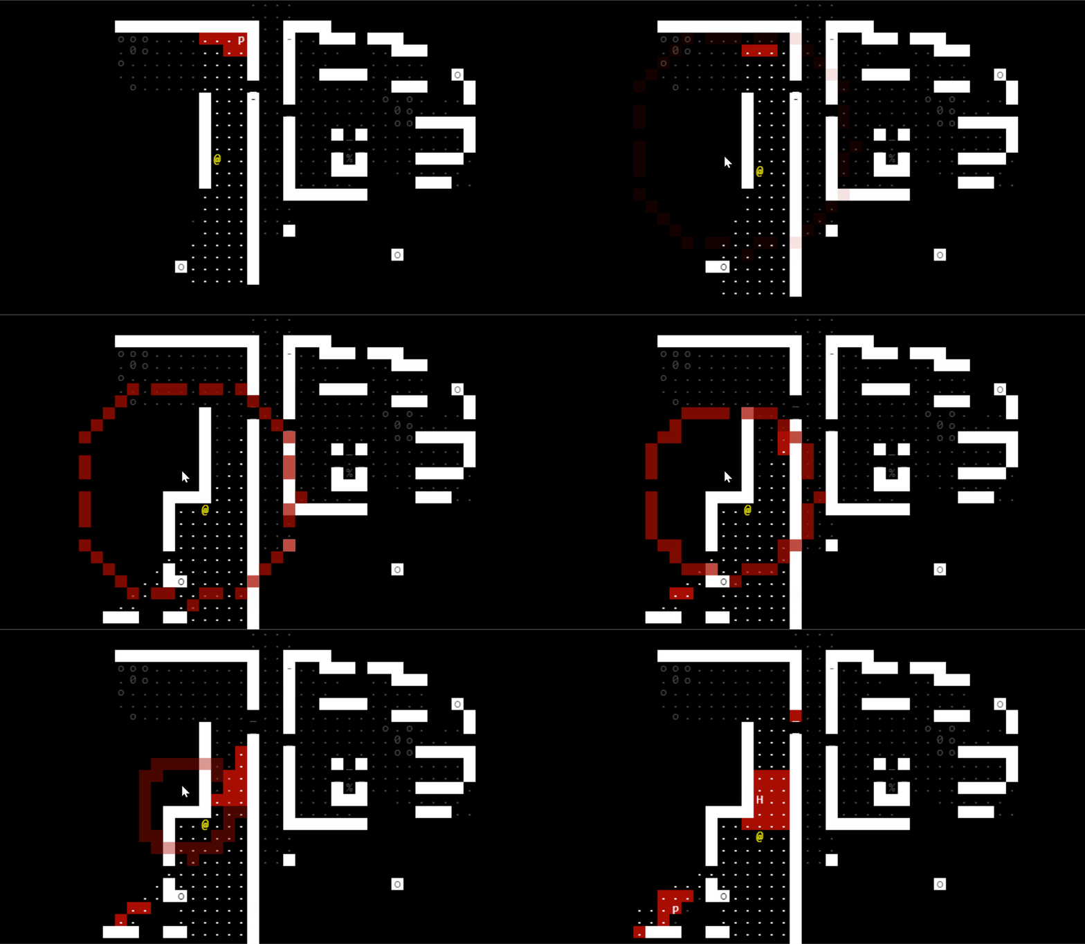
patrollers ... patrolling

You can see the patrollers exhibiting the different behaviors. And apparently they can bounce off each other?! I didn't know that. But it makes sense -- they're marked as "impassable" in the level model. 

If the player can see a space, they can also see its "lighting" value. Which I'm using to represent enemy vision in red. If you step into a red space, you take a damage. So your goal overall will evading these red vision spaces. I'm proud of the brighter red spaces where vision overlaps.

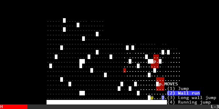
Now movement. This is the core of the game concept, and it's complicated. So I'm going to start by explaining it in prose and then show you what the UI looks like right now. I'm not totally sure it's good and it may need a lot of work to be fun. Or it may never be fun! But at least it's new!

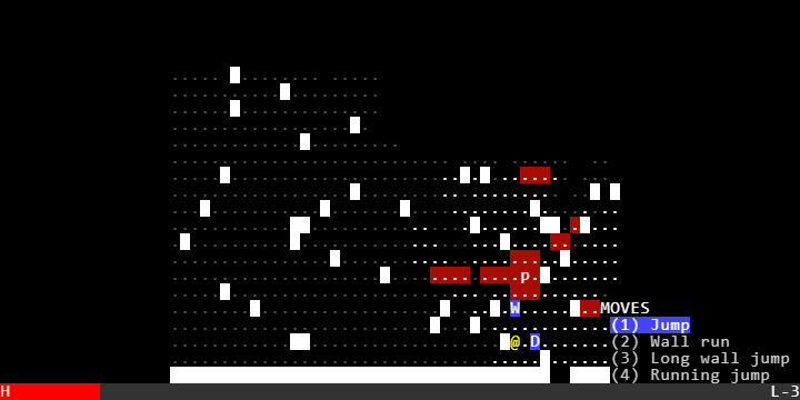
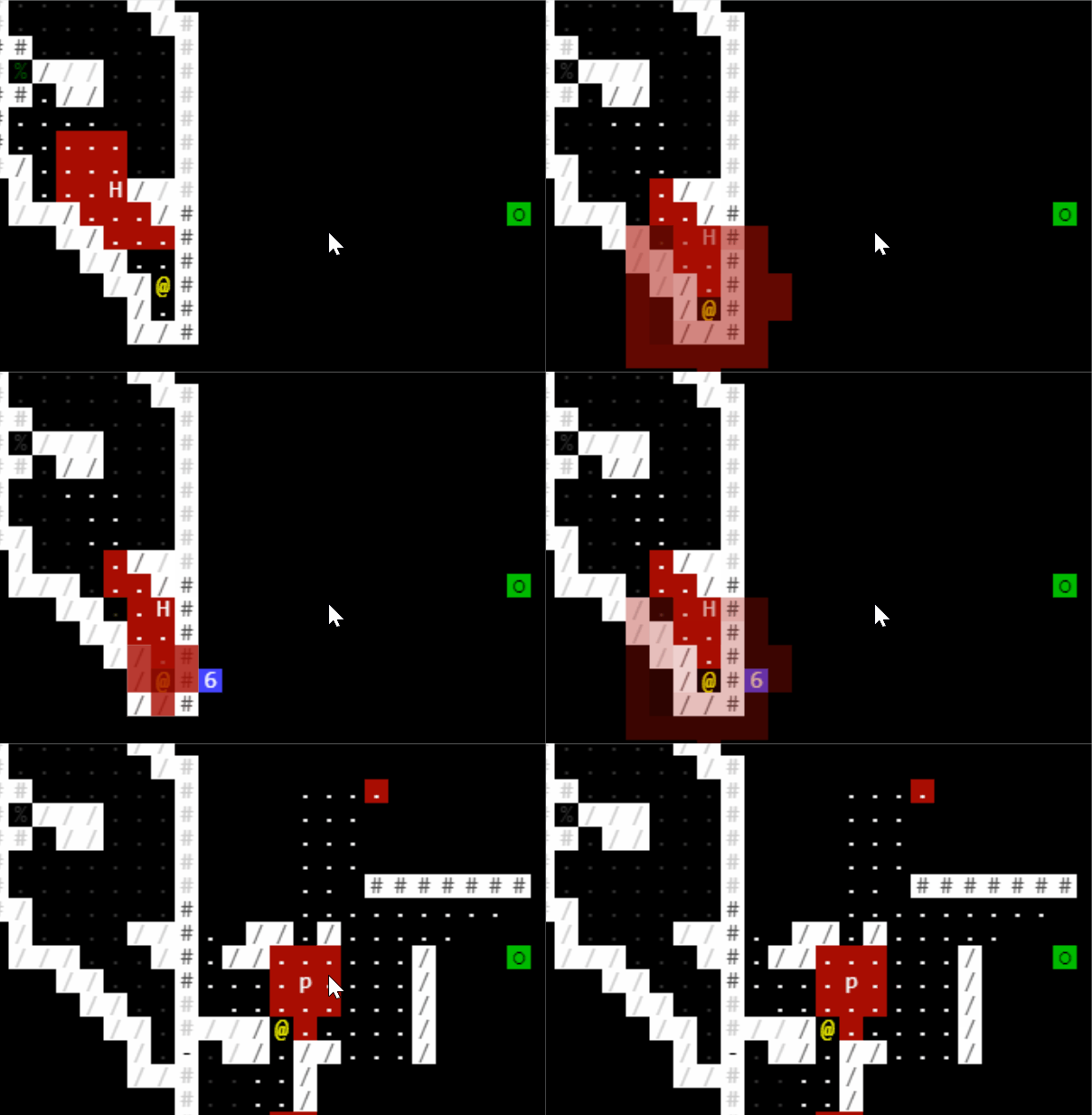
You have a collection of movement abilities. Each ability has a "path" and potentially some environmental requirements. The most simple is "jump." 

With "jump" selected, you can see 'W' and 'D' are options. But you can't move west (there's a wall in the way) or south (destination blocked). Jump has no requirements other than the spaces be passable.

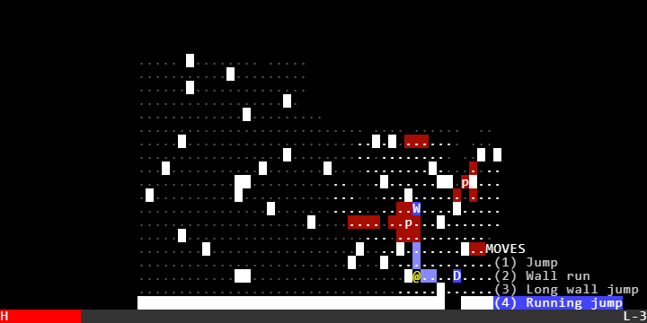
Now lets look at a trickier move -- "running jump."

So you'll notice this looks pretty similar to jump, but has a lot more range. The tradeoff is that you have to move through the other two "blue" spaces on the way to W or D. in game terms this will still occur in one player move. It's quite "fast" in game sense. But you can't do it if you don't have those spaces to "wind up" the move. And of course you can't do this west or south because it's blocked.

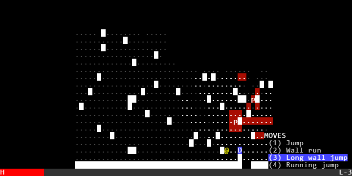
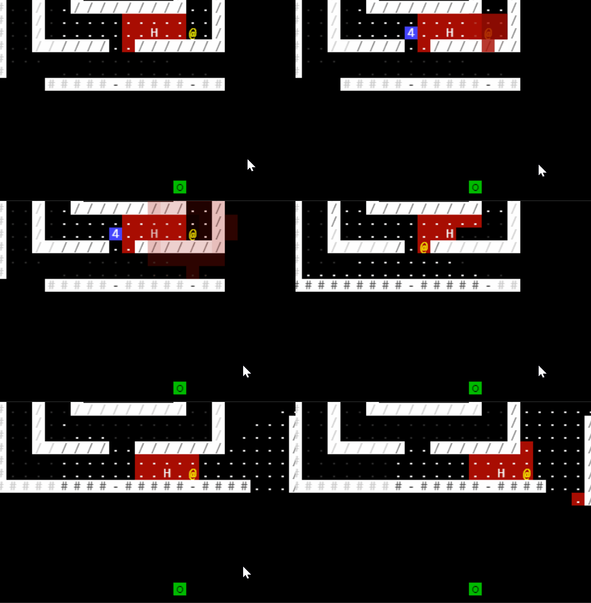
Want a more compact jump? That's "wall jump."

This move also jumps two spaces, with no wind-up movement. But it requires you have a wall "behind" you to jump off. So you can only do it to the east.

Finally, "wall run." You can skip THREE spaces, but you have to have a wall to your right (or left) all the way to do it. 

This was a bear to build, and it's still got some bugs. I'm really proud of knocking it out in day 1, including some complex modal UI to make it straightforward. It's a little hard to demo it in a video without some fancy keypress visualizer. If you want to poke at it yourself, I think this link will work for my current build. You can use keypad or qwe/asd/zxc to move, and the number keys (not num-PAD) to select the moves from the menu. You do have to use the letter keys to select the directions for the move; I'll fix that later. 

I'm  not sure yet how to limit these moves. They're obviously VERY powerful. Next up is procgen maps, and then I'll come back to balancing them. An obvious option is a basic cooldown per move system. I'm intrigued to try a combo system, where you can use, say, each move one time as long as it's "back to back." In other words, no adjusting your position with a basic move within the combo. But once you've used your movement system ALL moves go on cooldown for a while. Maybe they even require finding an item in the world to recharge. I like the theming of that; the burst of energy and speed that then dissipates and you become quite "weak." 

See you tomorrow!

(1 edit)

Day 2 & 3

I'm at this point in the process where there is enough "meat" on the bones of the game and I have a complete vertical slice and ... I don't like it much. I knew it would need a lot of tuning and if it was going to work, it requires a careful balance of environment design, enemy design, and movement design. At the moment, the mix isn't gelling. But I have more of the systems in place that will let me iterate through those designs a little faster and hopefully find the fun in this design space.

Movement

I'm pleased with this system! I have a little string vocabulary where I can express a move style. In this case, it says "if the player is starting next to a wall space, and has open spaces in front of them, they can move in one "move" four spaces away and not trigger enemies in-between.

(having issues posting the full thing ... so I'm spreading it out to get each chunk in.)

And this one says "you can move five spaces forward in one move, but you will trigger any enemy vision on spaces 1 and 2."

It properly scans all these potential moves (including their mirrored variants) and offers them as options to the player. The problem is ... you don't often need them yet? The levels are too "open" to require this kind of precise movement. I need to box the player in quite a bit more to make the moves important. But this system is feeling robust and flexible and if I can get the procgen into a better state I think I'll be able to iterate quickly here.

(1 edit)

Map Generation

I've only done a little bit of procgen work in the past, and getting this going has been a bear. I settled on just doing the absolute most simple(?) thing first. Do a binary space partition, "erode" it one step to create 2 width hallways around the partitions, and then litter a bunch of objects around inside. 

This was simple to state but required some significant refactoring of how I handled entities and maps, and a lot of reading and poking at algorithms to get it right. Too late in the process I followed the advice I saw somewhere in my reading that having an interface to generate a lot of maps quickly is really important, so I finally have that. Here it is in all its ugly glory! Itch is "squishing" it to fit, but I think you can right-click to view it in normal size.

Templates

Inspired by some Cogmind blog posts about procgen, I made a small templating system that I use for placing exits, entrances, and other junk in the levels. Similar to the moves, I specify some options for what a map feature can look like, and then try to randomly place different variants on the map until one sticks.

This works okay, though I'm finding that I need a lot more visual language to make it feel less sterile. When my design vocabulary is walls and doors and they all look the same, it doesn't feel like anything. I also want to make it more organic. I have been trying to get it to blend templates together a little, by saying "it's okay if your template overlaps with a pre-existing element as long as they have compatible types for that space." But that doesn't appear to be working reliably yet.

Vertical Slice

Along the way I got a full vertical slice done. The current design is this. You load into a level, you have to find three buttons and press them and then find the exit elevator. That's all working. The problem is its tedious, not a challenge. You're not accumulating resources as you explore, which makes exploration kinda dull. The challenges offered by the bots are not intense enough to be anything but an annoyance. And there's not enough "juice" to the visuals or interacting with the bots for it to feel like much. So the slice is "in" but it's not good yet.

Next Steps

I've got a zillion directions I could go from here. I'm not sure where to find the fun, so to speak. One change I made to support this BSP map generation style was to make the playable area a lot larger. But I'm wondering if that's part of what's not fun here? When I go back to the out of the box "digger" algorithm that rot.js has, it does feel better. So maybe I need to shrink the play space back down and really try to cram some character and hard choices into a smaller space. Push you into more direct conflict with the bots.

The other area is different kinds of bots. I'm thinking some just basic stationary bots that shoot their vision across a hallway or room at least forces you to do more than just wait for your path to clear from a basic bot. Might also need hunter bots that are punishing you for waiting too much. Or bot spawners like in Invisible, Inc. where staying on a level amps up the "heat." 

I may spend some time looking at blueprints to get more inspired about how human-built inside spaces look. There's a lot of thinking on dungeons and tunnelers in proc gen, but I'm going for a like mega-corp basement vibe. No wasted space, stuff has a purpose. Server rooms, storage rooms, cubicles, maintenance closets. That sort of thing. But I need to draw out in more detail what "good" versions of that would look like and then get to generating. 

I'm also thinking about "juice." When I look at screenshots for other games, the worlds are just a lot more natively inviting. They use color in interesting ways, the shapes are more varied. I've tried using some other characters but for whatever reason they render weirdly/poorly in the ROT.JS display. There's also an anti-aliasing that feels a little odd and I wonder if harder edges would feel good? I need to spruce up the environment and offer something more to make it feel real than what I have now. Updated the latest playable version here. Hit "m" on the title screen to get the map generator mode, and any key other to generate a new map.

(+1)

Really interesting looking project, I'm looking forward to trying the finished version at the end of week!

One thing that could maybe be interesting is to limit player movement by actually allowing the player to control multiple characters over a series of turns. So instead of a single runner you've got a little squad and are trying to get them to do things in unison together. I expect some of the not-fun stuff you're encountering is mostly due to the game sort of being "easy" at a baseline? You could also look at games like Shadow Tactics/Desperados, which is sort of where I think you're idea may be leading you.

(2 edits)

Day 4 / Hunters

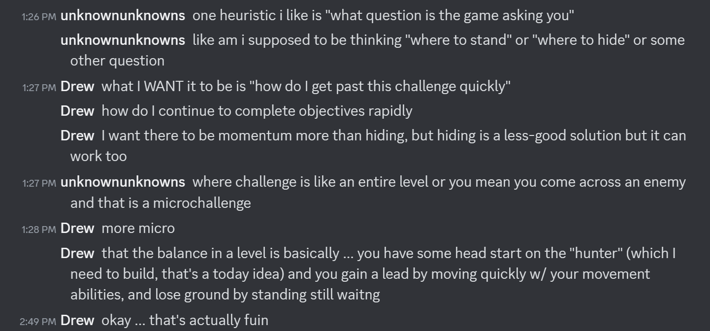
I was pretty directionless at the end of day 3. I had a long list of ideas but no clear priority. I poked around with fonts and display styles in the morning and got nowhere. I was lamenting my situation to a designer friend who asked this important question:

Between my last message and the message before I implemented Hunters! They are great.

The core insight of this conversation is that this is a game about running. And if you're going to be trying to do something quickly, there needs to be a reason. I knew I would need some sort of "food" type mechanic so you can't linger indefinitely. I thought that might be a hunter bot or a bot spawner. But when I mocked up a simple "follows you" bot it became immediately clear that if you can't kill the bot that's chasing you, you have to move. And move fast. If there were no other enemies in the level, this would be no threat. With other patrollers, you often need to wait until they're in a position you can bypass easily without taking damage. If you don't have enough of a lead, the hunter will be on you quickly.

This makes the movement abilities useful. They offer you greater than one space of movement for one "tick" of the game state. You want to use them as often as you possibly can. Which in turn makes the environment useful; you need to be thinking about how to get into situations where you can most efficiently traverse the space. I still have all the movement abilities on zero CD so you can chain them together over and over again (which you'll see me do in the gifs) to build advantage. That is probably too generous to the player, and it'll be more fun to have to juggle cooldowns a little bit. 

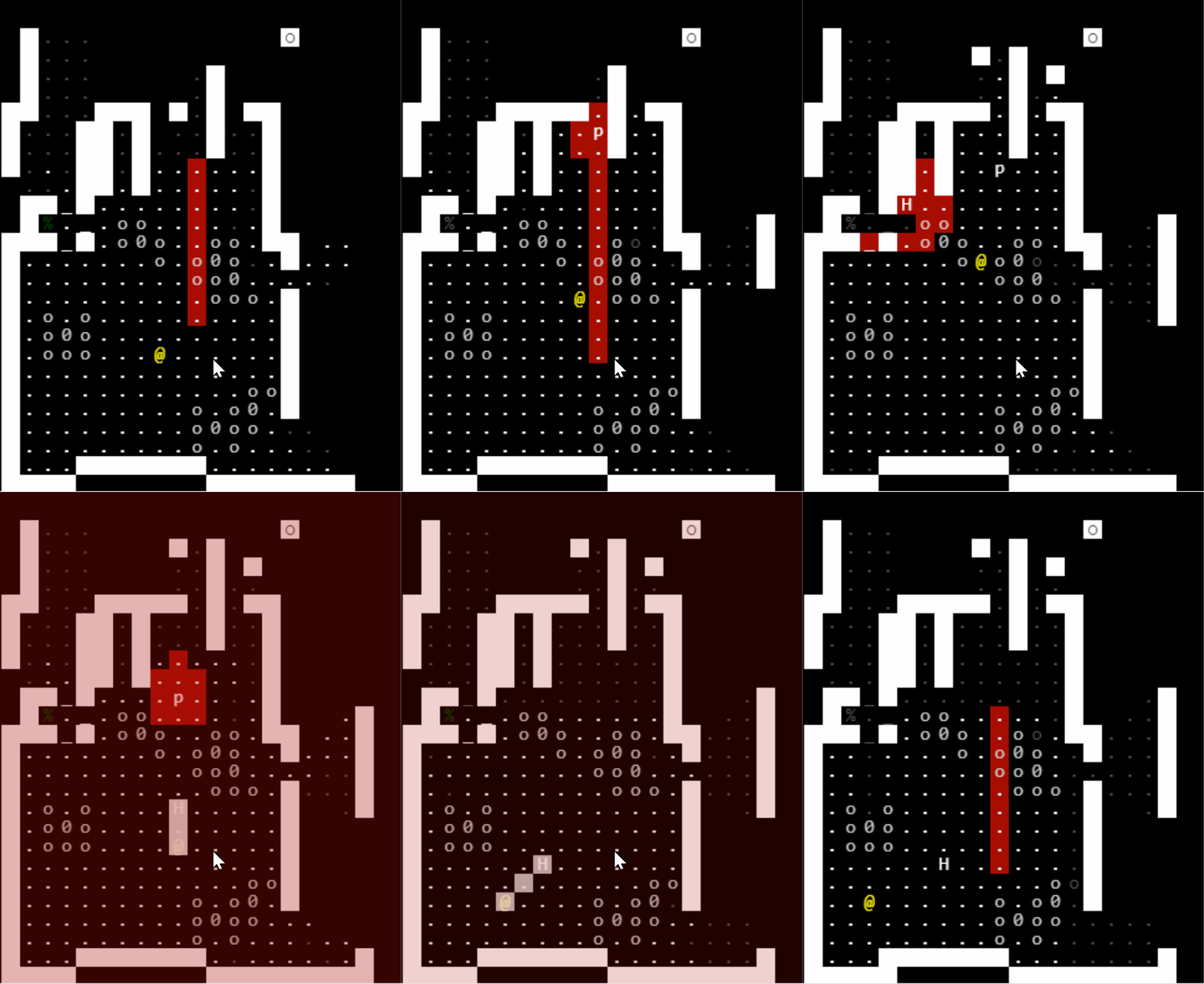
The hunter spawns in at the elevator the player spawns from after a delay. Here's how it looks. You'll see it pop in, I head right and get a little stuck, circle back, and then manage to make some distance with moves. I took some damage on the way (ending a round in a red square) which is not ideal. One cute addition -- hunters can open doors, but they're slow at it. So it behooves you to close doors behind you as you go.

Animation

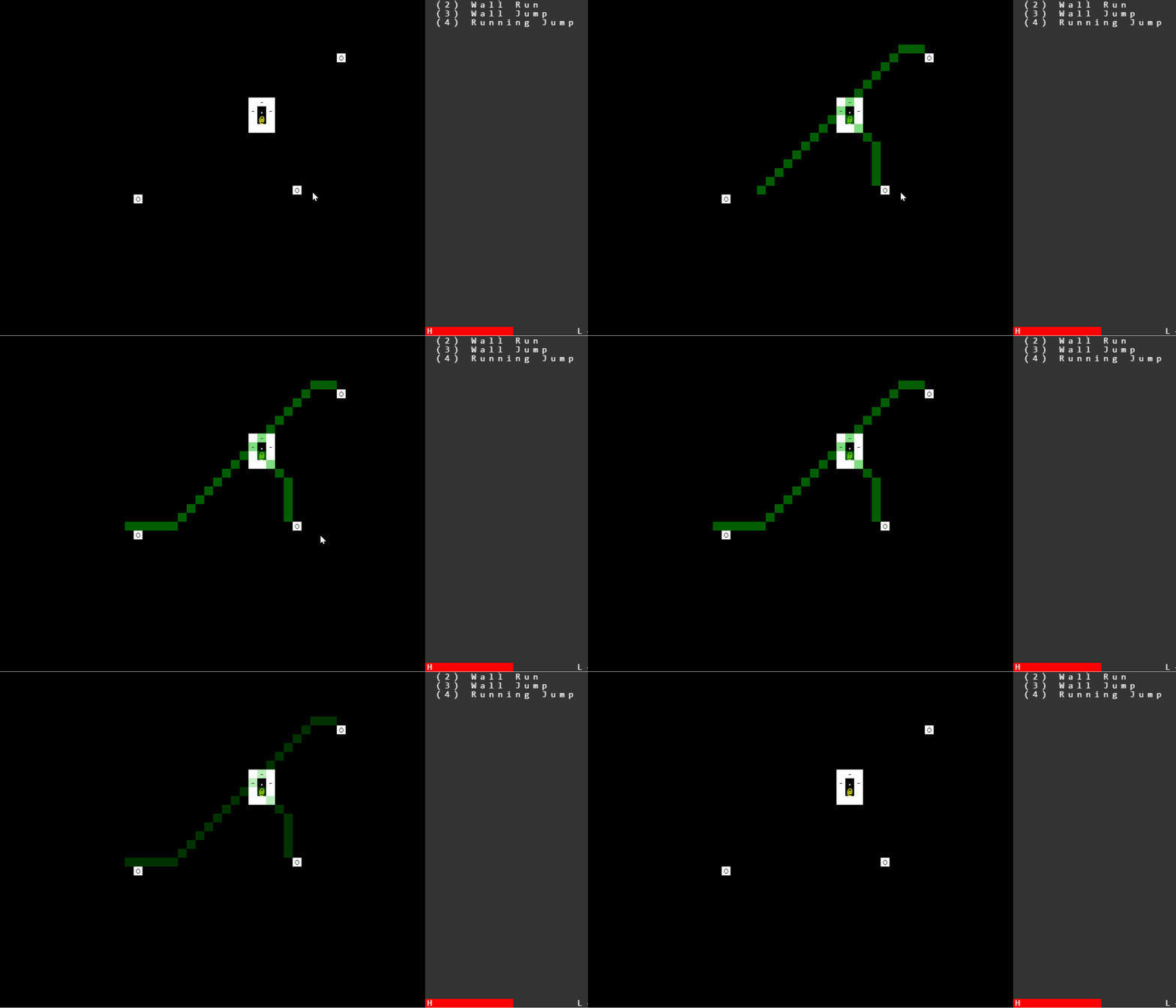
One upshot of realizing the essence of the "running" concept was that searching for objectives was not realistic. The hunter is so much pressure that one or two dead ends and your run is over. So I decided to reveal the buttons you need to press to escape at the start of the level. I took this as an excuse to do a little animation pointing them out to you.

I also added a little "ping" when you stop that shows how far away the hunter is from you. This triggers when you "pause" which I like for thematic and practical reasons. If you are pausing, it reminds you the hunter is closing in. And mechanically, if you want to know how far the hunter is you have to "spend" a turn to find out. You don't get a precise location, you just get a radius. Sometimes if it's pathing to find a door it may be "near" in radius terms but not in moves. 

Both animations are janky and low frame rate and a little busted still. I coudn't get rotjs to natively handle transparency. I was too in love with this idea to let it go, so I figured out I could just place another native HTML canvas object on top of my main game window and draw transparent rectangles on there that line up with the same tile dimensions/locations as the game. It's highly un-optimized though, so I can't get much of a frame rate on it. But it meets the functional needs of the game, at least, even if it's not pretty.

Next Steps

  • Make taking damage more visible, probably using the overlay system flashing red.
  • Consider taking damage having some consequence on the attacking bot; it probably makes sense that if the hunter "hits" you it has to power down for a couple of turns so you can get ahead again. Otherwise when it gets in range you die REALLY fast.
  • When you've hit all 3 buttons, reveal the exit like how buttons are revealed on level entry.
  • Need to stop executing moves if you hit vision during the move; right now running jump is way too strong because you take damage but aren't interrupted.
  • Add some new movement types.
    • I think I need a "burrow through wall" option with a really high cooldown. It's a bit of a get out of jail free card, but without it I fear there will be to many feel-bad deaths.
    • I don't find I use wall JUMP much, just a lot of wall run.
    • I think I need objects that you can "vault" but not see over. In other words, not walls between rooms, but something tall within the room that you could get over but not see over. That will create more options for evasion but not be as powerful as "burrow."
  • Back to my nemesis, level generation. 
  • (Reach: start thinking about tutorialization; some simple levels that teach the core concepts of movement and damage and objectives.)
  • (Reach: add some more visual variety. Walls and floors are so boring! Need some varying color and symbols to add character. And more types of tiles, too.)

(3 edits)

Day 5 - Animation & Map Gen

Long long day, I'm beat. But I think I'm on track for a "successful" ending, which is great!

Spent the morning on some polish, and I'm really happy with the progress. It's not beautiful, but it's functional and has the tiniest bit of juice to it. Bots now visually shoot at you if you end your turn in their sight, and then disable themselves for a few turns to recharge. Good balance mechanic, good visuals.

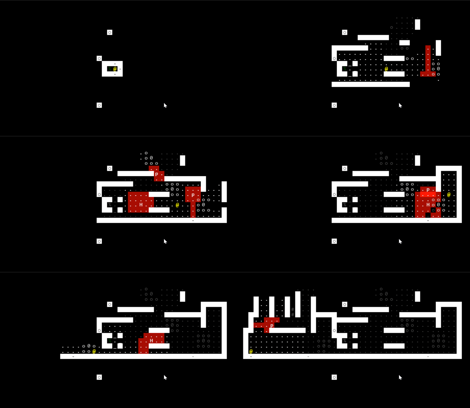
Then the afternoon. Back to map gen. Spent a while looking at images like this to see how spaces are really laid out.

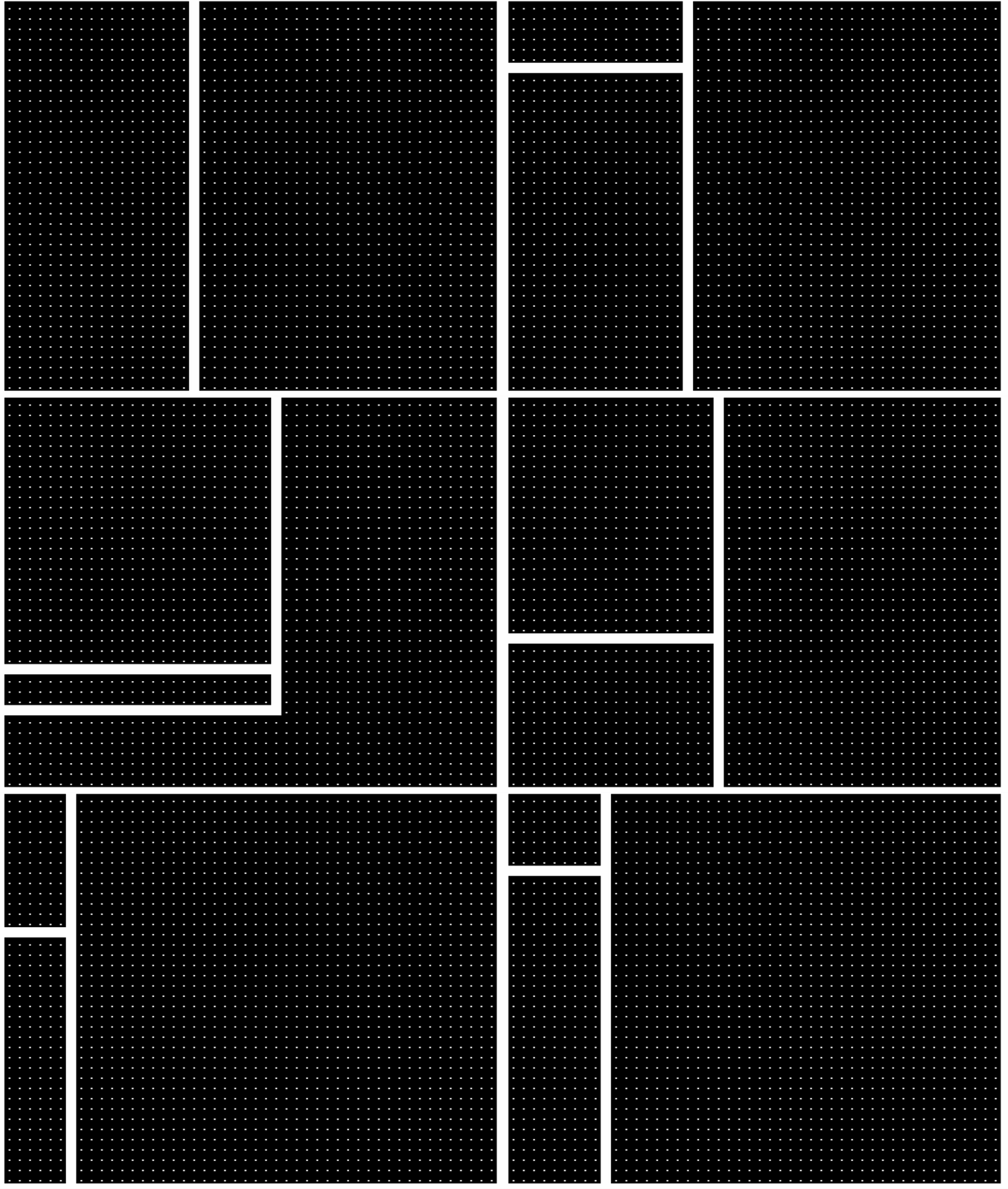
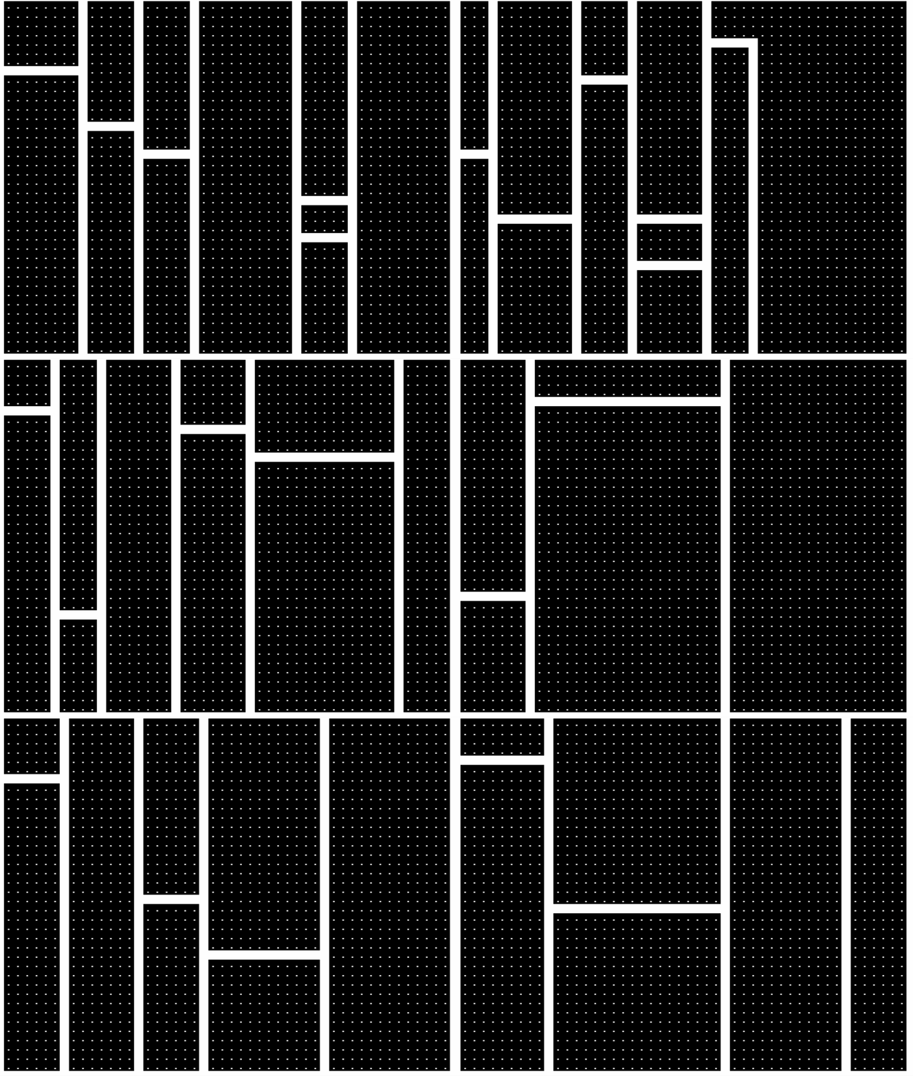
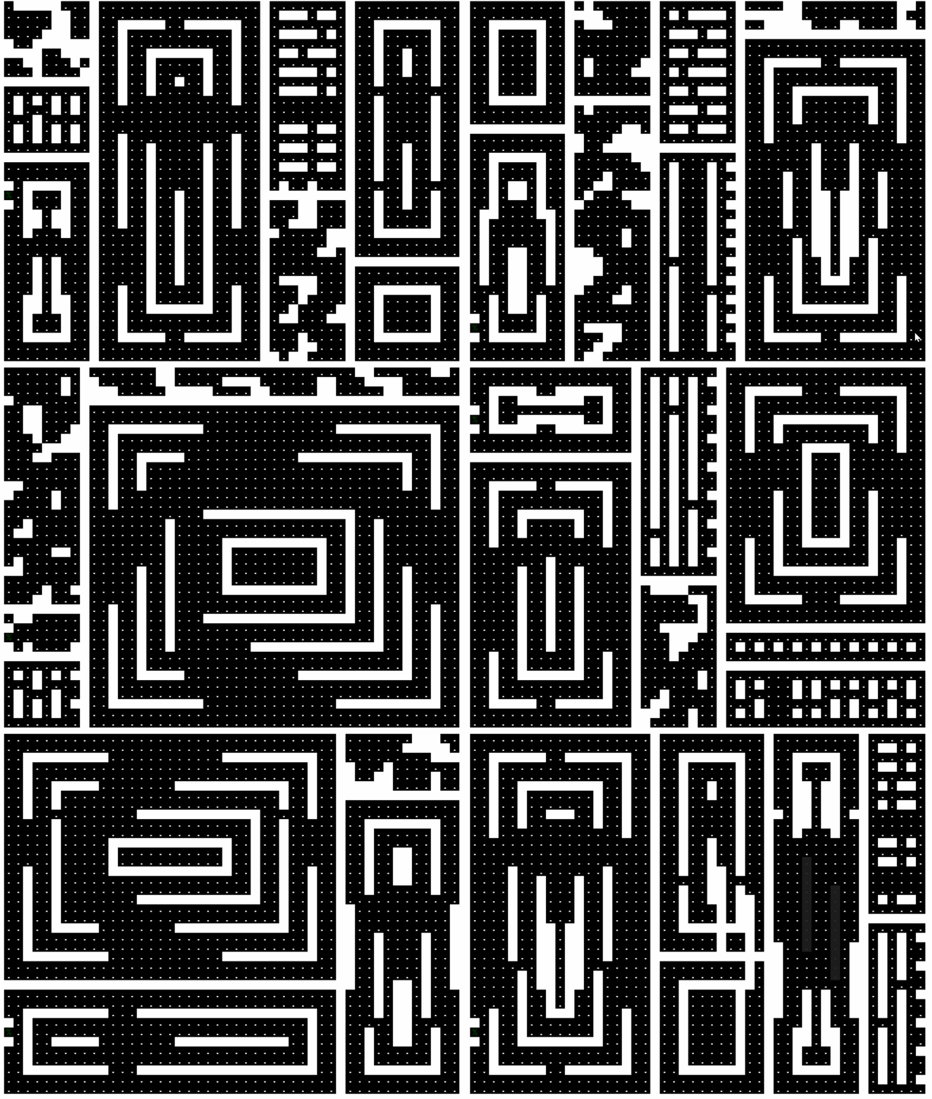
And from there, just really ground out some new styles of maps. I'll share some variations along the way.


Admittedly a big jump between those last two. I thought I'd saved an intermediate one, but apparently not.

I'm ending the day with the new map generation plugged back into the main game. Its door generation is awful, though. 

Next Steps
  • Fix the doors. Maybe using a cost based version of pathing that strongly prefers to go through the inter-room walls.
  • Knock out more of what my algorithm calls "partition" walls.
  • More room "fillers"?
  • Add back in enemies.
  • Consider more enemy types for challenge.
  • Add cooldowns and some more move types and associated UI for that.
  • Tutorial???
  • Title screen graphics???
(5 edits)

Day 6 - Signature Moves, Validation, and Garbage Collection

I got my first "win" screen today with all mechanics in place! So we're at a complete state with a day to spare. 

My main charismatic feature today was the addition of move cooldowns. We talked about how hunters are the driving character pushing you forward and the special moves are your way to stay ahead. Well, now that resource is limited so you gotta make it count. The philosophy that developed today was that moves should be common but not constant. You should want to use them more or less as often as they come off cooldown, but it should feel impactful when you do use them. So a lot of the moves got more powerful, but more rare since you get them less often. This also forces you to want to FIND uses for your cooldowns. This is especially the case for move (3), which is less flexible (you have to have a wall behind you to do it) but I find myself creating the scenarios to use it and get it on cooldown.

Two moves added today really brought the game together. The first is "burrow."

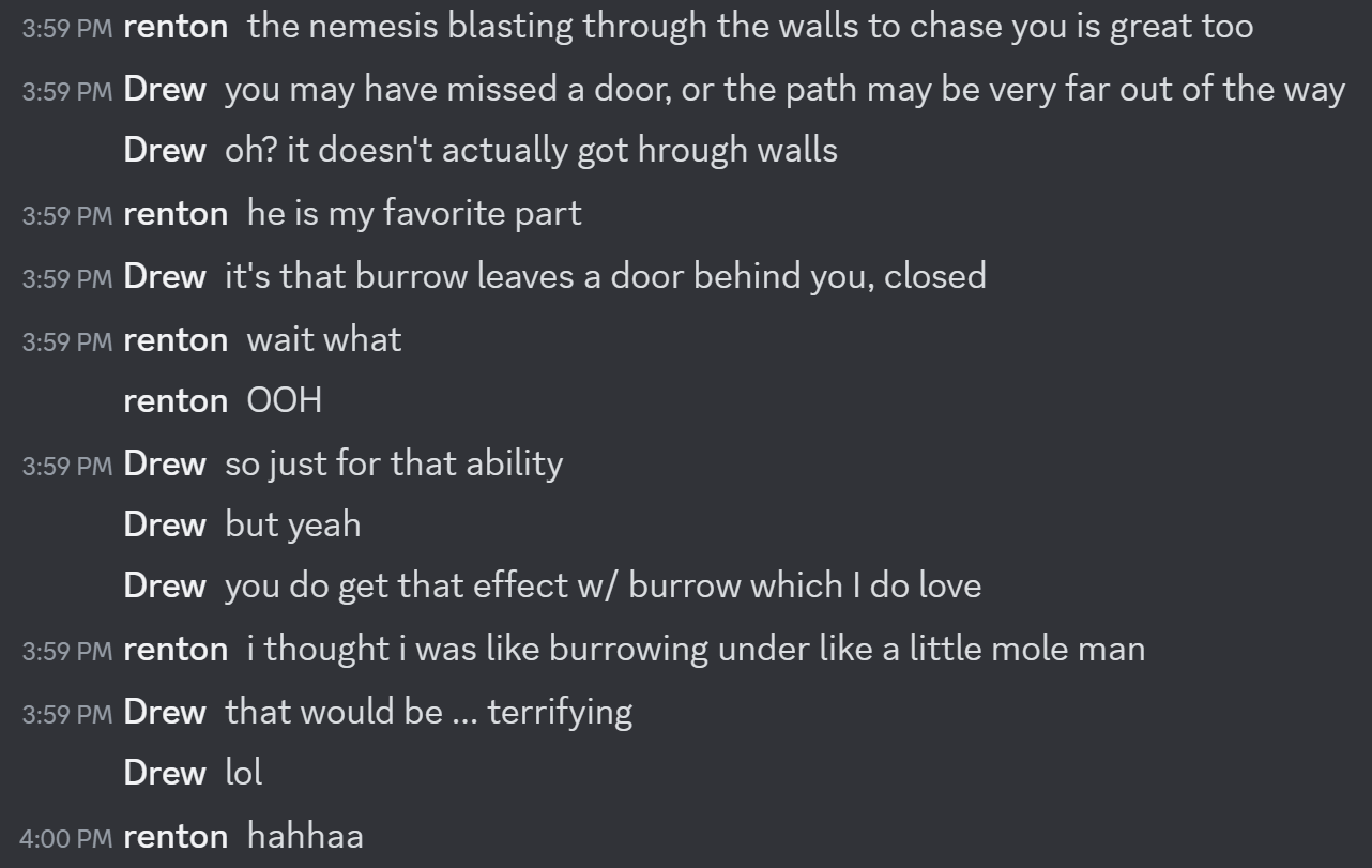
Hunter bearing down on you in a dead-end location? Back against the wall? BURROW! It moves you two spaces through a wall. There must be a free space on the other side. When you burrow, you leave behind a closed door. So if you burrow yourself into a dead end you CAN get back the way you came. But hunters will be delayed; they're slower at opening doors than you.

This move really brought the game to live. The level generator is now more prone to creating dead ends, and this gives you a way out. Most importantly, it feels cool. It's got a very long cooldown; it's a once-or-twice-per-level type move. But it can save a bad situation, or hasten your escape if you're close to the exit where your cooldowns will refresh.

Storytime My 7 year-old kid is very curious about this whole process, and I've been offering him chances to playtest. He has MANY suggestions (all day, all the time) and really gets the game systems. I built burrow (and some other stuff) and then went to the kitchen while he played. A few minutes later he darts into the kitchen to report "I just totally tricked a hunter with burrow!!!" and walked me through how he burrowed in a way that saved him from the hunter and how tickled he was at choosing a good location to burrow into. Seeing him connect with the mechanics and have that feeling about the move was really special. A core memory of the jam.

The other move is NOT my 7yo's favorite. He insists it's basically impossible to use. But I promise you it is not! It is "enemy jump." Basically, if you can get the spacing right between you and an enemy, you can hop over them!

A bit like burrow in that it's a "reversal" move versus a "get ahead" move, but it has very different spatial constraints. It's good in more open areas, and you have to really set it up proactively. Consequently, it's lower cooldown than burrow and you can conceivably use it often if you can engineer the circumstances right.

These two moves have really sealed the game into "fun" territory for me. It's legitimately hard, and certain situations and choices can be run-ending. These "problem solving" moves make it feel more fair, though.

Validation

The other aspect of my game that really had an impact on my kid was when he was about to win a run and discovered that the exit was blocked by faulty level generation. That moment brought legitimate tears to his eyes. He was so excited to advance a level he'd never advanced to before and then ... a wall. Literally. 

So my most computationally complex task today was building level generation that both had a pretty high success rate at building winnable level designs, but also building a mechanism that could PROVE they were winnable and re-generate if they weren't. Learned a lot about how to do this structurally. I wasn't set up for it. Most critically, I discovered I actually needed to be able to CREATE bad levels to test my validator, and expose a lot of metadata about what was causing the validator to view a level as good or bad.

Garbage Collection

Finally, I ran into a bunch of bad assumptions I'd made early on when I was only doing one level a time. I wanted to string together some number of levels with increasing difficulty. But when I was testing I'd only really play the first level. When I loaded into the second level, I discovered all manner of bizarre bugs including phantom enemies from previous levels still existing and shooting at you periodically. Some studious garbage collection, and the phantoms were cleaned out.

Next Steps

The final day dawns! My priorities:

  • Tutorial. I have a vision of some hand crafted starter levels that introduce you to the structure of the game and the movement mechanics. This may be more ambitious than I can achieve.
  • Scaling difficulty. At the moment, all 3 levels have the same generation. I may add more enemies as you go deeper, more buttons to press, and so on.
    • Level generation at the moment is also pretty high variance on difficulty. Sometimes the buttons are near each other, or you at the start. Sometimes you spawn with an enemy "looking" at you. Cleaning up these very easy and very hard situations may also help me layer on more difficulty later. 
  • More enemy types.
    • Thinking primarily a bot that sits in the wall and doesn't move. A sort of "tax" on your move CDs because you have to have certain moves available or you can't get past without damage. 
  • Graphics for the title card.
    • Something more exciting for winning than a few words saying you win?! We can dream.
  • JUICE!
    • Animations on the title card
    • Animating enemy vision, so it "pulses" 
    • Some sort of animation when you move that makes it feel more satisfying
    • etc.
(+1)

excited for this

(5 edits)

Day 7 -- Polish!

That's a wrap! My first #7drl is done. Final game is available here.

My morning was tutorialization. Having played some entries from previous years, I felt like this was commonly a major gap. You'd get dropped into these worlds with a lot of mechanics and it can be hard to figure out what's going on except through repetition. I had an idea about a simple tutorial level that would introduce the key movement and enemy behavior concepts. The hardest part was dealing with spaghetti code issues that made it difficult to have what amounted to a separate instance of the game. Once that was cleaned up, crafting a tutorial was really satisfying. My one regret is that my system of "triggers" that post instruction messages had zero awareness of player actions. They were purely positional. So it's quite possible to complete the tutorial not having done much of what the tutorial suggests you do. Maybe a future engine design will have a better tutorial trigger system built in.

The other key updates for the day:

  1. Laser color gets darker the farther it is from the source. Gives the player some sense of how far off an enemy is, even if they can't see them. Plus it adds some more visual depth.
  2. Speaking of depth, added some slight variation to floor and wall colors. 
  3. Added little animations when the player uses special moves. One play-tester reported it felt a little flat when you used the abilities.
  4. Added a new enemy type, sentries.
  5. Added some difficulty scaling between levels. The farther you get, the more enemies and enemy types spawn. Plus [REDACTED].
  6. Added some thematic animations to the title screen so it didn't look quite so sad. 
  7. Implemented a truly janky "reset" mechanism if you want to dive back into another run.
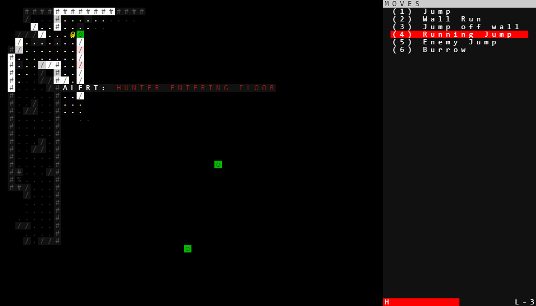
  8. Added notices when the hunter enters the level. 

[REDACTED]

Late in the day, I was doing some play tests with folks, focused especially on the tutorial. One player from the discord played more of the main game, and had this to say.


From this misunderstanding spawned a key new idea. I won't describe it here, but you'll find it on L-1. I probably shouldn't have implemented an idea as disruptive as this on the final afternoon, but it's really cool and adds some extra flavor to the last stage. Overcoming it feels even better than before.

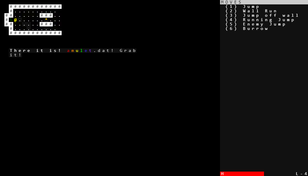
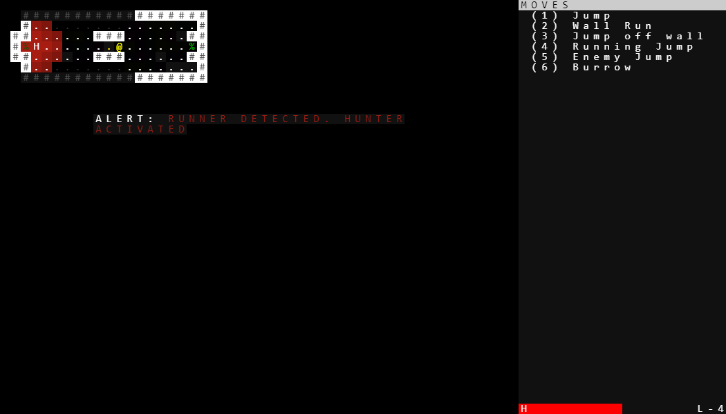
Not much more to say than that! I'll leave some more screenshots here just to memorialize its final game-jam state.