Indie game storeFree gamesFun gamesHorror games
Game developmentAssetsComics
SalesBundles
Jobs
TagsGame Engines

Strive for Power

Fantasy Slave Management/RPG Erotic Game · By Strive4Power

[NSFW] Working on Modular Images

A topic by dreiak created Jan 23, 2019 Views: 1,755 Replies: 13
Viewing posts 1 to 13

I am working on making modular versions of the characters that are much easier to modify, and create multiple sets for various changes and scenarios. Its a little bit harder to make each element, but once it is done it is infinitely more useful, and I can also do an infinite amount of detail refinement as well, so completed elements can be improved on so long as I have the original layers (which I do in the PDF).
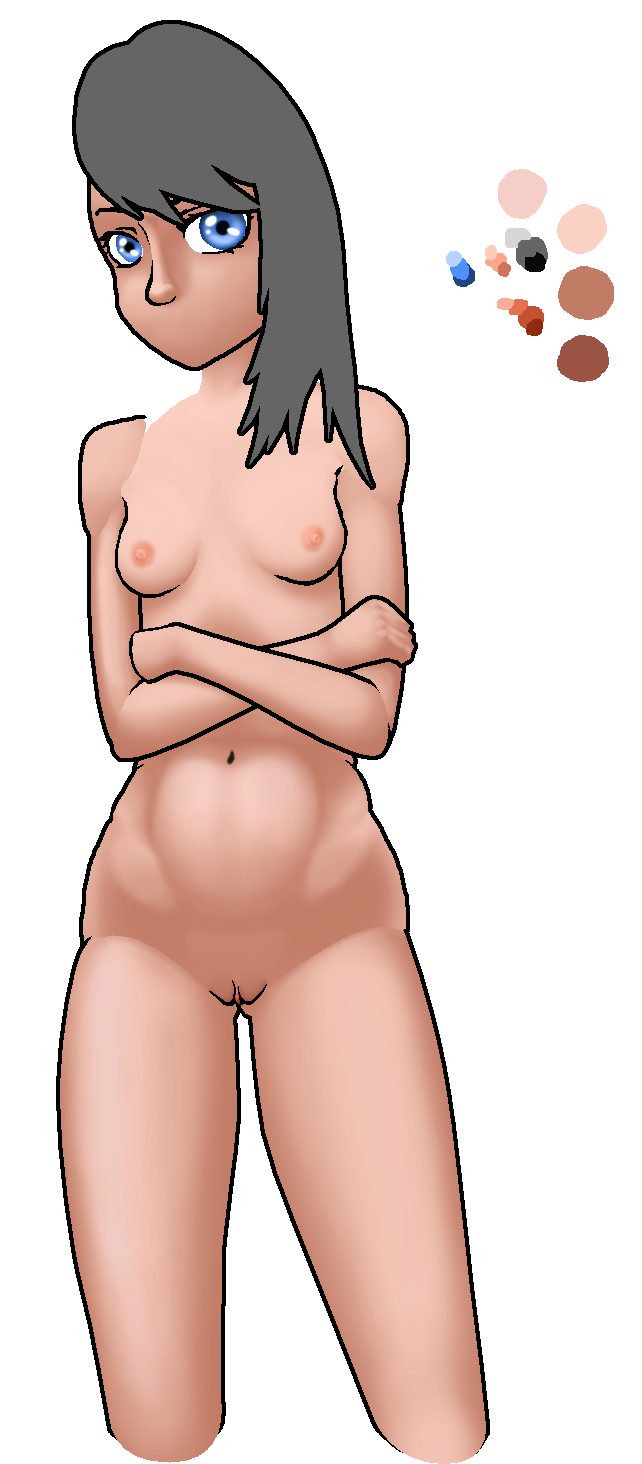
I am curious if there are any other artists who want to try and make images that have interchangeable elements that can be refined. It might be possible to share PDF's. I like to work in higher resolutions so I can scale images down to improve quality so that I can sort of make whatever size adjustements I want without quality loss, and that is also why I am not using vectors or anti aliasing. I am also working to try and match the original art style (or at least the best looking parts of it) at a lower overall cost, and that has been primarily though traditional single layer blending for an element, than using clever masking to make the outlines, and I should be able to then rescale elements and have them mesh up reasonably well. Obviously this is very much a side project WIP, and so not all of the elements have finished product blending. The least noticable is definitely the 9 elements that make up the lower body, whereas the upper body elements are not blended at all, as it has to be iterated on many times to get it right, and properly smooth looking despite having hard edges between elements (hard edges mask better, learned this the hard way). Also, I made a super quick prototype to show element swapping. You can see the hard masking for uncompleted elements, but I just wanted to demonstrate a proof of concept.

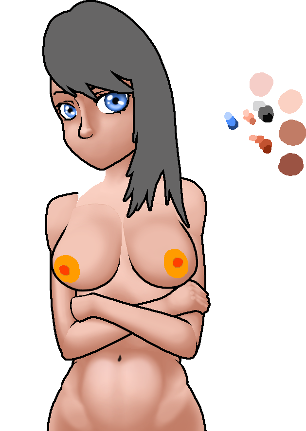
Todays Progress on Cali (for now). I got impatient, and just wanted to get every element in there, even if it is just a mask right now.

(1 edit)

PDF?  Do you mean PSD?  PDF is an export format, it's not designed to be modified (which is why it's such a pain to modify them).  PSD is the default photoshop filetype.  Enormous filesize, very easy to modify (with PhotoShop or GIMP).


"I want without quality loss, and that is also why I am not using vectors or anti aliasing."

...  That requires a more complicated response.  Do you have Discord?

(2 edits)

My bad, I do mean PSD. I do have discord, but not on this computer. I am really doing this as a total side project in a way to get better with some techniques with photoshop. I am decent enough, and have been pioneering some ways to do multiple sprite sets, and this method has been the fastest so far, which is nice, but I haven't completely tested how interchangeable it is in terms of scavenging pieces for completely different characters. For sure though it lets me make tons of small changes to a character archetype though, such as I can very quickly change skin color, hair color, or resize or reshape some of the pieces without having to redo all the blending, the blending is a bitch though, because it is VERY hard to get different independently blended  segments into easy to use blocks that that aren't obvious.
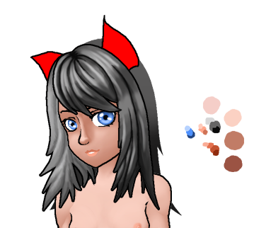
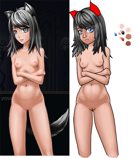
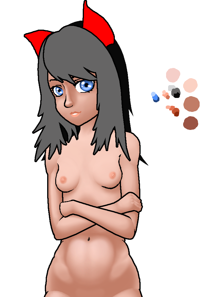
I had some setbacks. I totally didn't like the direction the hair was going (see left side), and so I decided to completely redo the style, but I am still experimenting to find a technique that looks good. Also doing this with a mouse sucks. I miss my wacom tablet. The edges aren't as hard as they look either as this is still much larger than the intended final resolution, even scaled down a bit. The actual size I am working with is 2x1024 vertical, so 2048px, of which I am not using 100% of the workspace because at that resolution I can draw all the characters at scale for a uniform appearance, and when they get shrunken down, the hard edges will be smoothed, but have a nice crisp sharp appearance. This doesn't work as well with soft brushes or anti aliasing.

Corta is making something similar (for completely unrelated reasons) using Flash, which is vector based graphics instead of raster graphics.

https://www.patreon.com/posts/character-21511554

Vectors are built for scaling.  SVG, specifically.  Scalable Vector Graphics.  Photoshop recently added support for SVG.

That said I've had a hard time finding anyone who likes SVG as much as I do.

I like vectors, and that was what I tried origionally. The PROBLEM is that it takes an ungodly amount of time to make something good. I went back and forth trying to blend vector with non vector, and basically the conclusion I came to is this. Single layer is the best, fastest and easiest to blend, but its a bitch if you change your mind about something. Vector lets you reuse stuff to your hearts content, and scale objects as much as you like, which is in theory nice, but I often times ran into issues trying to rescale vectors and had to do quite a bit of modification.

So what I ended up doing is just working in high resolution with the assumption of scaling down (no loss in quality in final result) to gain the sharpness, and detail I want, ditch vectors as an element, but I do still use them to mask, and in areas where mouse is just too damn hard to get good lines, but at the end of the day, EVEN WITH MOUSE AND KEYBOARD, it just never looks as good, and is never as fast as what you can do freehand. So I have chopped up the pic into many many small segments, the same way you would with flash, but I am doing it in a way that tends to look a lot better than flash, because the elements aren't designed to be animated, just modified, and I can very quickly iterate on things. I also over many experiments found clever ways to not need vectors the way I originally thought I would to do many things, like recolor, and once I have a good mask, I can do a simple color and palette swaps and a lot more really than I would have expected. If you are working on doing similar things, I can share the PDS file. IMHO the biggest issue is just getting some baseline stuff created, and once you have a decent library, it wouldn't be hard to make "randomly generated" characters, even if it is done by hand in essence, it lets you make a really large pool very quickly. That was my intention initially, was to make a basic character set for one character, and then see how long it takes me, or how many elements are reusable on the next. I suspect actually that a lot will carry over. I will likely have to completely make different body types such as thin, fat, athletic, and possibly tall, short, adult ect, but having a handcrafted look just looks way way better overall, and I always appreciated that hand drawn look over things that look overly CG.

Update, I spent maybe 10 minutes to make this, as my interest in side projects is sporadic, but to give an idea of the length of time to make updates, it really is much much faster to freehand, and learn to use the painting tools really well, and I think it looks a lot better than vectors unless you invest HUGE time to make the vectors look just right, and even then the blending will just never really be perfect, but I have (nonetheless) seen some incredible work from some dedicated people before, just look at forza liveries.

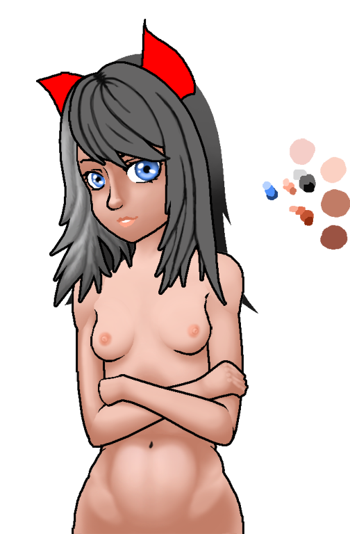
At any rate, here is a small update, showing first pass at how I was shading the hair, which I just don't like, and pass 2. I think Pass 2 looks good at least in the scale its designed for, and I EXPECT that it will eventually look even better. I don't want to merge any layers just in case I want to play around with added layers of detail.

I love what you're doing. My first experience with this sort of graphics in an indie-game was Free Cities, so I know it can be done extremely well. You're off to a great start clearly.

I do notice that your Cali has a much rounder face than Mav's, and the only feature that's "off" is her nose. Your blending has improved and her hair is +++.

Looking good.  You bring up some excellent points, and I'd love to contribute.  I don't have Photoshop, just the freeware equivalent~ish GIMP.

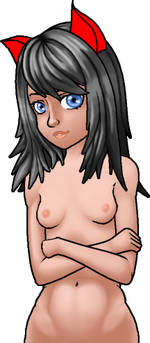
You are correct. I didn't just set out to make a carbon copy, I altered things to fit my own personal preference a bit, but also to fit into a piece that is more universally useful. I have been lazy the last few days, but put a few more minutes into the head. Redo on the upper lip, added some detail to the eyes, finished up a first pass on hair.

I am missing a piece of the shoulder (entirely) lol, it looks decent without it, but I am too much of a stickler to leave it out, I am missing the ears, and tail, and I could theoretically start making a first pass on clothing, and I want to iterate a few alternate body parts, such as (bare minimum) a standard and pregnant version, but maybe also experimient with shorter / taller / age modifications ect, but chances are I won't do that until I have another character somewhat templated, since I want to see if I can use "mature parts" from another character to age up cali. TBH I haven't planned that far ahead.

If you want access to the PSD file, let me know a good location to post it, and you guys can give it a go making bits and pieces. If there is something you like, or want to use, you can copy it into your own file, and post it. It should theoretically be possible to build a library of parts, outfits, ect.

I could actually very easily make cali's face a bit more narrow like the origional, but I wanted to make more of the parts and get them more into a final state before I decide which aesthetics I keep, and what changes I make.

In terms of the nose, that was intentional too. I had contemplated doing a more "dog / wolflike" nose, but ultimately the reason I made the nose a bit bigger was simply because of scaling, and if I make it smaller, there is much less detail, and I didn't want the aesthetic to be overly "anime" but the other reason is that the blending actually makes the nose look bigger than it is, I haven't actually done a final pass on that, because I didn't have all the geo in, and again, blending pieces which aren't actually connected is hard, so chances are the nose will look a bit smaller when I get around to fixing a bit of the shading.