As one of the artists in our team, still I spent most of my time drawing, but then I turned to making our game showcase slides.
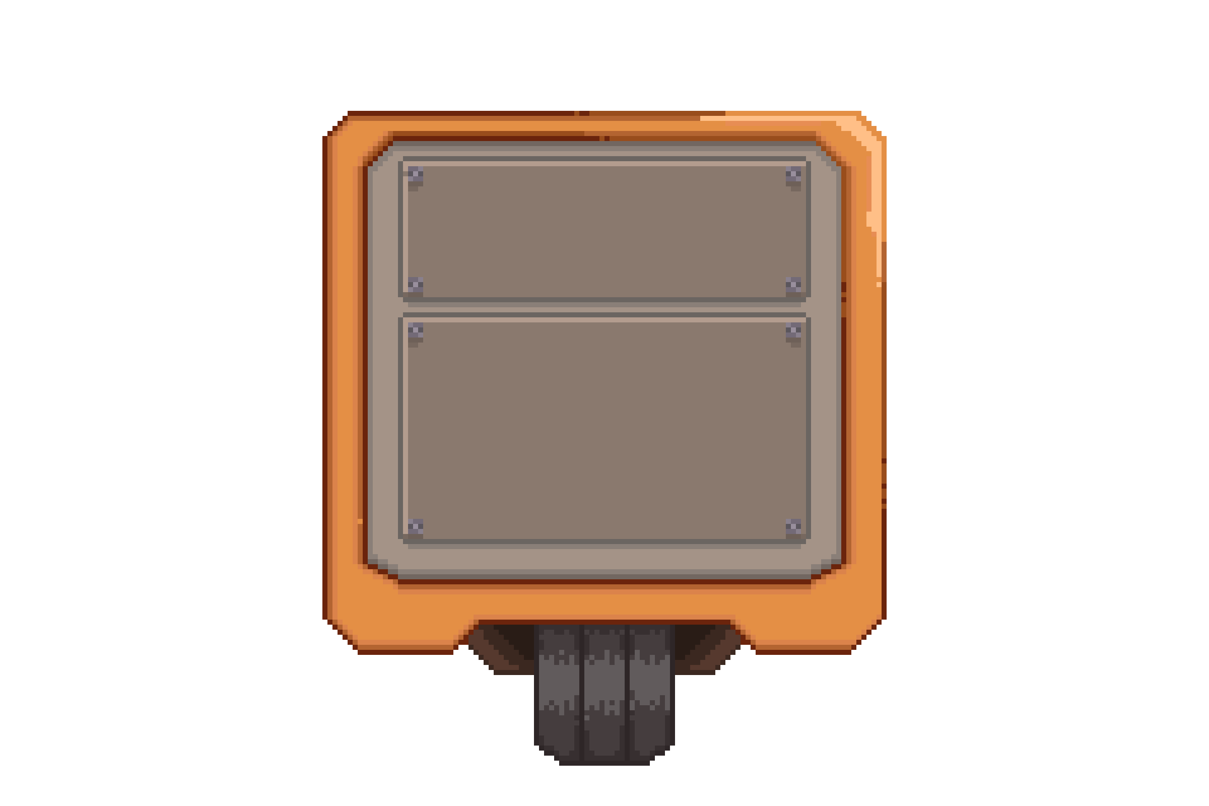
When I was designing the interface, I opted for simplicity and clarity. The pause and resume icons were pretty easy to create, the only thing to keep in mind is to ensure every player feels instantly familiar with these functions. With the pop-up window and maintenance screens, I had to think about the in-game experience. How does a robot receive and process information? How does it communicate its needs? These designs reflect a blend of human usability and machine aesthetics—functional yet fitting within the game's world.
Choosing the palette for the repair sides was a balance between functionality and form. The green and red sides are not just colors but symbols. They guide the player through the repair process, acting as visual cues for the tasks at hand.
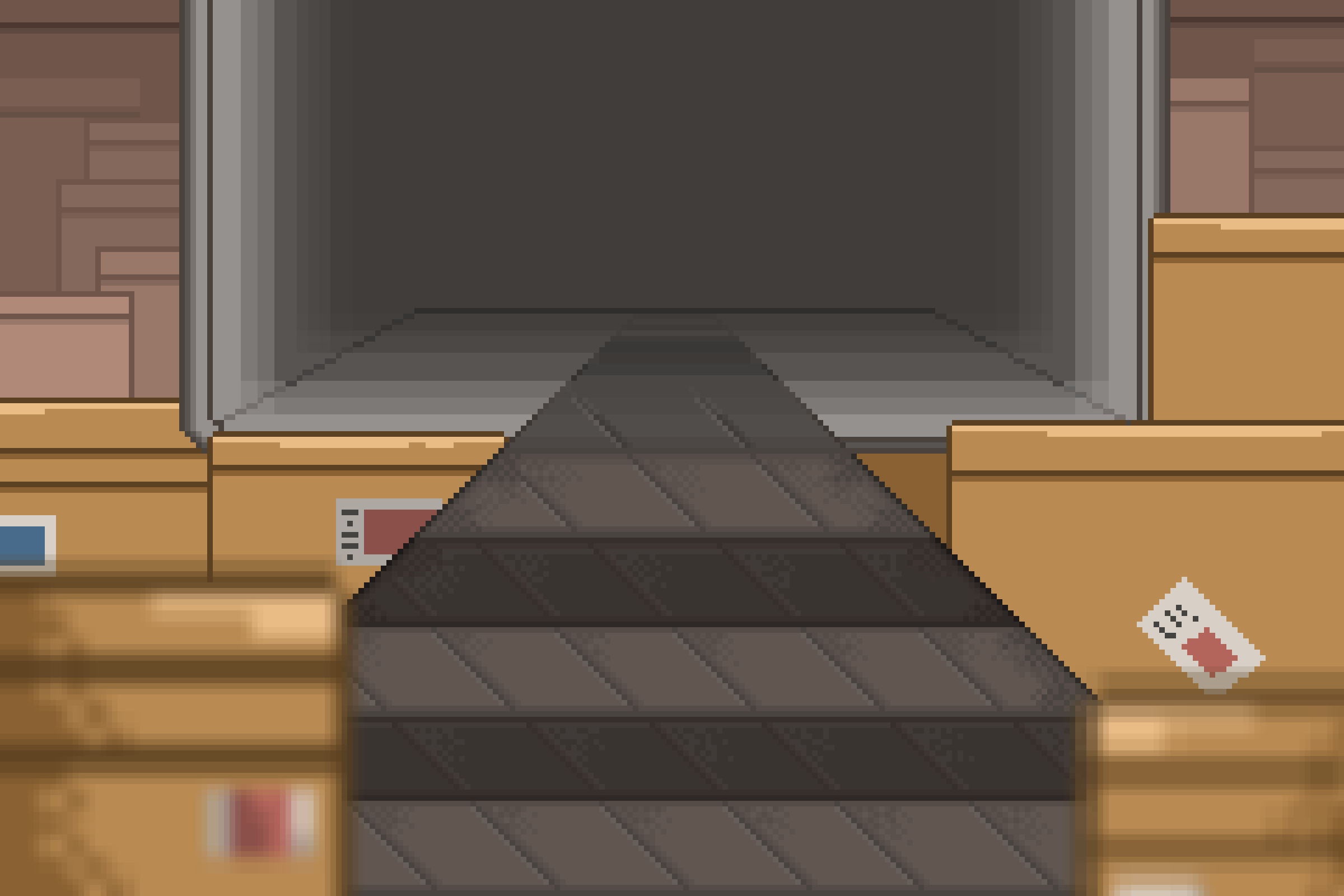
As I pieced together the visual elements of our game, my focus was on ensuring that every asset served a purpose. The challenge was to make the complex simple—the details of the game mechanics had to be understood at a glance. I spent hours tweaking the title screen and repair screen, ensuring that all indicators communicated effectively without words.
Iterating on the design has been a continuous process. Every asset from the title page to the game interface system has gone through multiple versions. Each iteration brought me closer to that balance between visual appeal and game functionality. It’s been a journey of constant learning and adapting.
This dev log serves as the last milestone marker for me. It's incredible to look back at the initial drafts.


Did you like this post? Tell us
Leave a comment
Log in with your itch.io account to leave a comment.