Play hot garbo
Mr. Macbeth's Cave Adventure's itch.io pageResults
| Criteria | Rank | Score* | Raw Score |
| Theme | #73 | 4.095 | 4.095 |
| Music | #78 | 3.571 | 3.571 |
| Overall | #83 | 3.794 | 3.794 |
| Originality | #108 | 3.762 | 3.762 |
| Is the graphics 1 bit? | #133 | 4.714 | 4.714 |
| Gameplay | #150 | 3.286 | 3.286 |
| Art | #183 | 3.333 | 3.333 |
Ranked from 21 ratings. Score is adjusted from raw score by the median number of ratings per game in the jam.
Please enter the age limit.
7+ unless you are a pro gamer
Write down what effects you used.
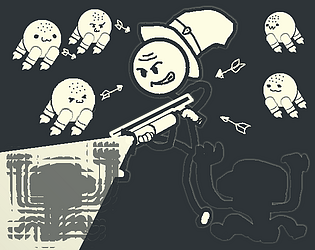
Fake transparency implemented via the use of dithering effect with a shader
Leave a comment
Log in with itch.io to leave a comment.





Comments
One of my TOP 5 games for this JAM!!
Really loved the art coupled with the dialogue sounds. It really makes the game feel alive.
The jump is too short initially and it took me a lot of tries to figure out that you have to shoot downward after jumping and use that momentum to jump higher. This is a bit tricky to execute as well.
While shooting multiple dark enemies, only one of them got executed per shot, even tho the were all in the light, but the same was not the case for the light enemies for some reason. Maybe they have a different health?
Apart from these bugs, the game is really fun and I think more people would love it if it was a tad more fast-paced with the jump fixes. Great job!
The damage of the light attack actually varies depending on range. I just kinda implemented it and forgot that it exist :p
Also you can just press shoot and jump at the same time to reach max height. Check out the movement guide in the dev logs if you need more tips for the movements.
What worked:
I really like the firing modes of the gun. It is really fun to propel yourself around recklessly. It's wacky and goofy in a good way, reminding me a lot of Newgrounds type games (Battleblock Theater, No Time To Explain, Castle Crashers).
What didn't:
It's a bit tedious having to check every dark corner for enemies. It really slows down what feels like a fast-paced game.
I would have liked to see interaction between the two firing modes. As it stands, each one activates by itself, but I kept wanting to light boost, dark swing, dark swing, then light boost up a ledge when I fell a bit short. This suggestion is entirely up to you of course since it drastically changes the game. I think this could be implemented by having the firing modes set to separate timers so you can't spam either one, but can activate them one after the other. Also on this note, I'd have loved if the light blast gave you more of a midair boost, but I understand why it doesn't since it seems heavily momentum based.
Checkpoints would be appreciated. The main area is short enough that it's fine, but it doesn't feel good having to restart
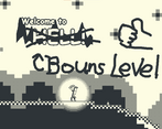
hellthe bouns level.Bugs:
Didn't see any
Great job!
Actually I do feel like the mechanics of both attacks need further improves. I originally planned to make the dark attack a constant beam that has wind-up time and cannot change direction while attacking but I was afraid that I will not have enough time playtesting.
As for now, I have many more ideas for completely different dark attacks that need to be tested: a whip made of dark energy that allows you to grappling hook on walls and enemies and swing beneath them, a semi-auto rifle that creates mini blackholes on hit, or a reversing bullet coming straight from the movie Tenet. I'm very lazy though so I'm not sure when will I actually go test them out :p
I liked how powerful the character felt with the crazy weapon range and huge jumps. The controls take some getting used to. One annoying thing was that you would get knocked off a platform when using the light attack due to the knock back. The enemies hiding in the dark were thematic, but it was a little annoying checking every dark corner for them. Maybe subtle sound cues in the dark could alleviate this problem. I enjoyed the sound effects and music, it felt very wacky and suited the game well. Overall nice submission to the jam.
The character’s mechanics are inspired by the railgunner from Risk of Rain 2. Both the railgunner and the protagonist of my game wields big, powerful gun while also having very high mobility.
As for the fact that the knock back from the weapon can knock you off platforms, it is a super intended part of the base mechanics. :p You can usually overcome the knock back force by simply moving in the opposite direction the force is pushing you. You still need to be careful, though.
As for the sound cues, the enemies do make a unique sound when they notice you. Prolly not enough, though.
Good work, light missions very cool theme
cool, i love the sound fx
Thanks 😊 I found them on Unity Asset Store for free
Honestly didn't beat it, but really tried. Perhaps feature checkpoints?
As for mechanics, it's really fun realizing how things work by yourself, and it requires like 2 mins.
The first submission I played that actually feels like a complete game. Also speedrunable!
Literally the only things I can note is that only white enemies have that circle effect after death & level restart would look better with some transition. And again, checkpoints😅😅
The masculine urge to not stop to shoot enemies and just outjump them all... Too bad I have skill issue.
Final rating: my pfp + happy smile
Thanks for your feedback! For real, though, the reason why I didn't put any checkpoint is because I didn't think of how difficult this game would be for new players.
As for the circle death effect, I'm not sure what you are talking about. Every enemy has the same dithering out effect when they dies. It's just that the cave is mostly dark so the dark enemies' death are less noticeable. The circle effects are for the white enemies' projectiles.
By the way, the reason why I use a Henry Stickmin character as my protagonist is simply because I don't want to spend much time designing my character. If I'm going to make a full game, I definitely will create an original character. In this case, what appearances and personalities should this character have?
I had fun with the game
I loved the mechanic used, having two ways to shoot gave a unique view per game, and having two types of enemies helped to highlight this mechanic. Missing something that better shows who was hit, maybe making the enemy that took damage blink is an option.
The level design is also very good, it gives a challenge, but it helps to understand what I can do with the mechanics.
I had several tries until I managed to finish it, it was almost at the end when I died, so that made me want to play differently. By combining the jump with the dark shots, the jump was very high, so the game becomes a true speed run challenge, with precise jumps, and a high risk of failure.
It's very challenging, but it's very rewarding comes the end.
I love watching speedruns. That's why I have kept speedrun potentials when designing the base mechanics and the levels. I even intentionally left some exploits where you can just accumulate enough speed and skip everything 😏
Also, have you watched the promo video I made? It's pretty bad but still kinda funny imo. I wonder if this video makes people want to play my game more or less...
I saw it, and I thought it was fun.
I think the voice acting highlights the game's humor (even if it's of dubious quality). And the story works well with the page description.
But I thought it was a little too long, usually a promotional video tries to hold the viewer more. The dialogue scenes were a little long, taking up space in the gameplay.
Nowadays it's quite difficult to get someone's attention on video, it's common for people to lose their attention to something that takes a while, but I believe that after someone finishes watching, they might actually want to play the game.
Ik that tutorials in a game jam are a risk because of the limited time, but I really wish this game had any sort of tutorial because I spent way too much time just not knowing what I was expected to do which was a very frustrating feeling. Though once I did figure out what I had to do the game was tons of fun to mess around with and chain together! But I don't think I would have gotten to the point where I knew what I was doing without smashing my head against a wall as my intro to the game especially due to the amount of obstacles in the game's intro, I felt the game expected too much from me for an intro stage.
This is not to take away from the rest of the game because the rest of it is really fun!
I made the common mistake of expecting people are born to know how to do everything 😫
I have been indulging myself in a game that is notorious for its lack of guidance for new players (the goofy game with funny scugs), if that explains anything.
Do you think that making a video tutorial will be able to save this?
I think a short video of you just playing thru the first stage would help a lot! That way players have a reference of how the game is supposed to be played
Guys please stop praising the voice acting! These voice lines are not made by me!
If you really wanna praise these voice acting, please check out the actual creator of these voice lines:
https://assetstore.unity.com/packages/audio/sound-fx/voices/hero-character-voice...
Good game with great mechanics! I think that it would be good to have some indications to where the enemies are, like some sound queues or effect before the player is attacked by them, and like the other comment, some sort of damaging indicator would be great.
The enemies actually make sounds when they notice the player, but maybe that's not enough because you still won't know where they will come from...
As for the sound queues, the dark enemies instantly attack you whenever they are close enough, so I don't think a sound queue will be possible. Just be careful when you push these bouncy ball reincarnations into walls because they are going to bounce back and give you a surprise.
I'll consider making these enemies mid-to-late game elites when I make it into a full game :p
This game is underrated! Really liked how u implemented the theme and I like the voice acting!
The voice acting is just a free asset on the Unity asset store, though -_-
Excellent entry. Love how you implemented the theme in several ways at once, as a tool of movement and combat, well done. The ennemies maybe lacked a bit of juice to make it clearer that the ray was damaging them but the voice commentary was a great touch.
Actually, the voice lines are from a free asset on Unity Asset Store 😅 I’m going to make a credit list to properly give credit to everything that helped me made this game
And yeah, when I was coming up an idea for my game, I wanted to be super precise to the theme while also being different from everyone else. The simplest way to do so would be implementing every interpretation of the theme into the game.
So we got:
1. Use a flashlight to brighten the dark.
2. Light and Darkness being two contrary concepts.
3. The protagonist has both power of light and dark, just like Moira from Owervatch.
All of them being implemented into one game.
Great mindset, I love when the theme is the main driving force behind design decision