Indie game storeFree gamesFun gamesHorror games
Game developmentAssetsComics
SalesBundles
Jobs
TagsGame Engines
A jam submission

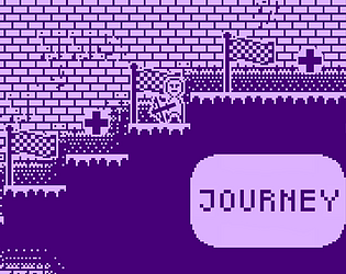
JourneyView game page

A platformer in the a 1-bit style, where you fight your way to the end.
Submitted by Nate Sawant (@natesawant) — 6 hours, 51 minutes before the deadline
Add to collection

Play Journey

Journey's itch.io page

Results

CriteriaRankScore*Raw Score
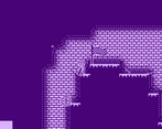
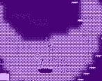
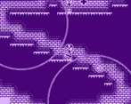
Graphics#123.7783.778
Overall#143.5093.509
Fun#143.1673.167
Use of Theme(s) (does the game have reflections, radioactivity, and/or dragons?)#163.6113.611
Creativity#173.2783.278
Sound#212.9442.944
Bitness (is the game 1bit?)#254.2784.278

Ranked from 18 ratings. Score is adjusted from raw score by the median number of ratings per game in the jam.

Leave a comment

Log in with itch.io to leave a comment.

Comments

Submitted

The movement of the main character could have used a little animation,  otherwise felt good. Does have a level of difficulty to it as the skeletons shoot at you off screen before you get close. Could use a mechanic that only allowed that skeletons to shoot within a certain range!

Submitted

I loved the art and the sound design made me nostalgic for some reason. The use of the radiation theme also was creative. Keep it up :D

Submitted

The controls felt good and smooth however I found it pretty hard to fight the skeletons because they would keep on shooting me when you couldn't see them and I would often die before I could reach them

(1 edit)

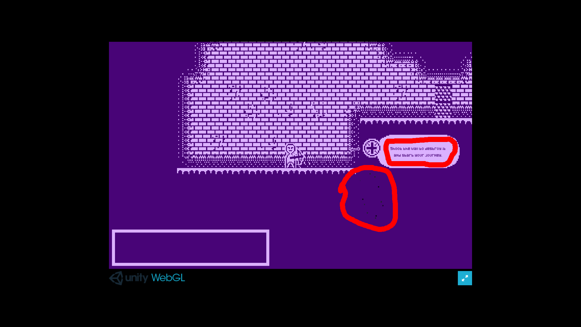
I really liked your game mechanic, I thought it was very creative. Your art was amazing for being one-bit. The sound effects were very fitting. The game when I first opened it I thought it was a top-down shooter, but I was happy when I realized it was a platformer. If I am extremely picky your game was not one-bit because of the particles the arrow left when it hit something. The games tutorial text was very hard to read (For me). Overall strong entry, good job, and keep it up!  Here is a screenshot of what I mean by not one-bit and the tutorial hard to read: EDIT: I do not think those black particles are due to dithering.

Developer

Yea I realized that the particles don't make the game truly 1-bit. I used the particle system, and spent hours trying to figure out why the colors were off, and decided to work on other things instead.

Submitted

Difficult in ways that feel artificial and unnecessary at times, and the radioactive zones in particular seem kinda forced. The sound effects were good but the landing sound and the radiation noise were both very loud compared to everything else.

The rest of it is neat though; the graphical assets are wonderful--colors could have been higher contrast but I'm a sucker for purple so no real complaints here on that--and I thought the level design in particular was super interesting. Very good stuff, especially given the time constraints; good work!

Submitted

Great artwork. Was a little difficult to see the enemies at first but solid game otherwise. Well done!

Submitted

It's hard to see enemies and their projectiles.

Nice graphics though.

I somehow managed to fall off the screen in my first play... I'll give it another try :D

Submitted

very hard game = good