Play game
Grey Space 2018's itch.io pageResults
| Criteria | Rank | Score* | Raw Score |
| Mood | #23 | 3.220 | 3.364 |
| Arts | #27 | 3.395 | 3.545 |
| Audio | #39 | 2.350 | 2.455 |
| 2 Colors | #60 | 3.743 | 3.909 |
| Gameplay | #62 | 1.915 | 2.000 |
| Theme | #67 | 1.480 | 1.545 |
Ranked from 11 ratings. Score is adjusted from raw score by the median number of ratings per game in the jam.
Team1
Vincent Beatty
Leave a comment
Log in with itch.io to leave a comment.


Comments
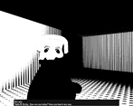
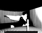
The amount of content you made for this game, especially considering you came in late, is really amazing. The shader looked really cool, and the fact that you had time to even make a cutscene is something I don't see a lot in game jams.
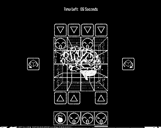
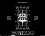
However, I didn't care much for the gameplay itself. I found the "press button to select item, then press different arrow to place it" to be really hard to quickly grasp, especially since they were so closely aligned at the bottom (making it feel like pressing that button would place that block in a Coulomb automatically). The inconsistency of the bombs were also really annoying, especially because it was hard to properly account for the risk of the bombs carried by, say, building a section of frowny faces you'd want to get rid of. Finally, I felt the game had too long of a time between 'cash-out' points where I could clear the board and get the points I've built up. Too many times I would be leisurely placing blocks only to run out of time, or I would rush, get a bomb, and wipe out half of my progress. Either way, the end result was the same: I ended the game with a score of zero. I know you designed parts of it to be purposefully annoying, but I think you went a bit too far with it.
Also, personally, I would have made the happy faces white with black outlines and the frowny faces black with white outlines, just to make it easier to differentiate them at a quick glance.
Some concepts I liked from most important to least important:
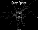
* The UI of the game looked nice. I like how the buttons enlarge when they are hovered on. Moving objects is always eye appealing to me. The main menu was especially nice as objects were moving around in the background.
* The soundtrack fit the eerie mood of the game. I liked it because it was disturbing to me. The strange and horror like sounds really fit the creepy and scary mood of the game.
Some concepts I did not like from most important to least important:
* The tutorial is poor. The tutorial is just one big chunk of text. Rather than teaching the player step by step by letting the player interact with the game's mechanics (as most good tutorials do), the game expects the player to read one big chunk of text, memorize it, and incorporate it in the gameplay's mechanics. This type of tutorial is bad because a player can easily forget the information from this type of tutorial and a lot of players, including me, will have a boring time reading the tutorial. Make the tutorial more fun. Since the tutorial was poor, it took me a long time to learn how to play. I was very frustrated when I did not understand how to play and I did not have fun with the gameplay because of the tutorial.
* If I delete arrows in gameplay, there seems to be no way to restore them back. Sometimes, I might be able to delete all the arrows without filling out all the boxes. This results in me having only two options: 1) waiting until the timer ends if there is a timer or 2) Just exiting out of the game mode. I hate this feature and this makes the game boring.
* Though the UI looks nice, it does not function very well. First of all, there are some buttons in the UI that do not function when clicked on. These buttons are the no button (which is spawned by clicking on the exit button) and the help button. Another problem with the UI is that there seems to be no back button to a menu that pops up due to the result of clicking a button. For example, if I click on the Arcade Mode button, a menu with three buttons will pop up: Easy, Normal, and Hard. I may change my mind and want to pick the Casual Mode, but there is no way for me to exit out of the menu with three buttons that popped up.
* When first opening the game, the player is prompted a configuration window. The configuration window allows the player to change the screen resolution. When a player first plays the game, the player may change the screen resolution to create a smaller window for the game rather than playing with the default screen resolution. This may cause some of the elements in the game to not be visible on screen when the player is playing, as the window may be too small to show them. I would strongly recommend removing the configuration window in Unity because allowing the player to change screen resolution can crop some objects in the game out of the screen. Also, depending on your UI settings, it may even organize your UI differently when changing the screen resolution. I saw this happen to the title of the game in the main menu. In addition, you may also want to remove the configuration window because of the input screen in the configuration window. The input screen may confuse some players due to there being a lot of information. The input screen is not exactly explained too well, and it can be overwhelming and a burden to players. Also, your game may allow the player to change the values of the game's controls in the input menu. I am not sure about this. However, if this is true, please note that there really is no good reason for a player to want to change the values of the controls in the input menu. This is because the game's controls are so simple and common in many games. Many computer games have the player use the space bar to do important actions. Another problem is that if the player is able to make changes to the controls of the game, the game's tutorial will still show the player that the default values of the controls are the values of the controls even though that might not be true. If the game does not allow players to make changes to the controls of the game, then there really is no point in having the input menu. The input menu's only beneficial function is to allow the player to make changes to the controls to the player's liking.
* The name of the game is Grey Space, but when opening the application, a different name is written next to the Unity icon in the application. This name written next to the Unity icon is clearly not a clear formal name for the game. This inconsistency between these two names looks unprofessional and this frankly ruins my immersion into the game.
Hi D-Studios,
Thank you so much for the feedback on my game, it is very much appreciated.
I am so happy you enjoyed playing grey space and hope you try out a game or two of mine in the future. Considering this game was made in roughly 20 hours (I joined the jam well after it had started) I submitted it knowing there was a bug or two but I would just like to reply to some of your feedback:
[Re: The Tutorial]
I would have loved to incorporate an interactive tutorial into the game but unfortunately due to time restraints I was only able to produce written instructions. In the future I will definitely aim to make learning the game more of an experience. Also I am sorry you couldn’t remember all the information listed in the instructions.
[Re: Disappearing Arrows]
This is a gameplay element designed to irritate the player and force them to pay attention or become permanently disadvantaged. They do not return under any gameplay conditions as the game is not designed to be easy to play. In fact the in-game UI is intentionally made to be disorientating and distracting.
[Re: Unfinished Start Menu]
The Start Menu was made right at the end of the Jam with roughly an hour to spare before the deadline. The “Help” button just straight up doesn’t work... this was supposed to be an interactive tutorial. Rather than using a back button in the Start Menu I instead linked each sub-menu’s return function to the ESC key instead.
[Re: Configuration Window]
I did not know you could remove the Config Window... Will investigate.
[Re: Different App Name]
I didn’t even realise it was different. 😜
Very good, the randomness of the bombs is a little annoying, the cutscene was VERY fun, I might try and make a whole game in this style someday.
if you do please link it to me. Will be very keen to give it a go 🙂
Strange game, I liked the creepy look of the "narrative" part, but the game itself is hard to understand and there are some bugs that break the experience (like trying to put a face in a column that is already full).
Hi RubenMG,
Thanks for the review bro and I hope you enjoyed the weirdness of it 🙂 Just to clarify, the "glitch" in question is actually a gameplay mechanic... What I have just realised though is that my spelling is terrible as I think I spelt Column in the instructions as Columb 😂😂😂
Chur,
- Mow
Oh, sorry I didn't notice it as a gameplay element, I'll give it some more time to see what I'm missing ;)
In all honesty there is not much to the whole game. I’m mostly happy with the smoothness of the interface and how “complete” it feels (well to me at least) considering its only about 20hours worth of work. 😁