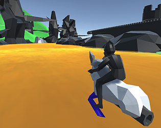
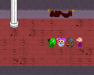
Thank you for the feedback! I completely agree, I spent so much time building the game that I forgot to make it fun or challenging. I'm glad you thought the concept was cool though.
NickHenley
Creator of
Recent community posts
Nice game you've got there! I really enjoyed your interpretation of the theme, it's a lot different from a lot of the games I see here. That said, I wish there was more to do at night - if you avoid the ghost's line of sight you can just sit in a corner and do nothing all night long, which is a bit boring. Maybe having a big ghost chase after you like in Spelunky so you have to keep moving at night?
It's not an egg, it's a sphere! The camera's FOV is just so high the top got stretched out. I used it to keep track of the beat and I guess I just forgot to hide it lol. And I try to never have a lose condition in my game jam games - I think it's just too much to ask a player to pick up and master a completely new control system in a matter of minutes. Eliminating the lose condition means players of all skill levels are able to see my complete vision of a game while leaving them feeling, at worst, underwhelmed, instead of frustrated at being unable to get to the end (and it also means I don't have to worry too much about balancing the difficulty or about programming silly mechanics like "respawning" :) )
If this doesn't win the jam then I don't know what will. This was the best entry I've played by a wide margin! Everything came together really well - the music was great, the controls were great, the shaders really added another layer of shine to this game! My only complaint is that it's a bit too hard - I think my high score is only about 40%, though I am notoriously bad at bullet hell type games.
Super great game! I think it was really creative that you staggered out the beat like that instead of doing a straight beat like a lot of other rhythm games. And I really dig the music! You're right, it is kind of funny that we both use the same off-kilter beat in our hardest song! Wanted to add more complexity to the game beyond just spamming more notes, eh?
Personally, I'm not a fan of the controls. I guess it makes sense to make the game one-handed, but I could never manage to remember which button jumps and which one switches sides. And it felt like I had to be airborne before I even crossed the white boxes, which meant I had to press a fraction of a second ahead of the beat, which felt awkward.
I'm sorry to say, but I'm not feeling this one at all. I have no idea what to do once the paddle goes crazy, and that's only after about 20 seconds of gameplay - 10 of which is an unskippable cutscene. I'd definitely like to see a walkthrough or a playthrough, because maybe there's some deep meaning to this all? But I'm definitely not going to see it by myself.
I like the idea, and sometimes it is fun to chill out and mess around with a little sequencer-type thing. But I felt this was really basic and lacked depth. Others have said to add some gameplay, but I'd say to add more complexity to the sequencing. Have an array of 64 loops to mess around with instead of just 16. Allow the player to build a couple of patterns and play them back in sequence. Stuff like that.
On a technical side, I found the audio started to clip when too many notes very being played at once. And that G# on the black cat is completely dissonant with the rest of the C Major scale.
I think you have very good production values, from the music to the visual flair (I especially like how the shapes morph - very nice!) But for whatever reason I just couldn't get into the swing of things. I felt like I hit a lot more of the notes than the game said I did, I just didn't know when exactly I needed to hit the note. Also, the connection between the shapes on screen and the buttons I need to press didn't come naturally. I think I would have preferred to see it more like Gitaroo Man does, where the shapes fly in from the direction you need to press.
I dunno, I'm not feeling this one. Maybe my computer is just too old, but I had a really choppy experience that never quite clicked with me. On the Web version, the soundtrack and the notes became really desynced, too, so I barely managed to get a 25% hit rating. It was better in the Windows version, but I came across a bunch of weird little glitches. After the first song was done, it would immediately start a new round with no music and no notes. I'd press Escape, but it just froze the game without showing any kind of pause menu?
Very nice game! Good visuals, nice feedback, bopping soundtrack. My only complaint, like I see below, is that you used a horizontal button layout to control a vertical action. Also, maybe I'm just slow, but when there were two notes at once it took me a while to figure out I was supposed to hold with one hand and tap with the other - I thought it was an either/or type of deal.
I think this is a pretty cool idea, but it's just too difficult to play right off the bat. The notes came too fast, the shapes were too complicated to match right away, and like The Data Boys said below, trying to match a square shape with a linear set of inputs is confusing. Although I don't agree with the WESD input they suggested - that might make more sense logically but I think trying to actually press all those buttons at one would be fairly difficult. How about turning the shape 45 degrees and using a conventional WASD / arrow key input?
I used the GetAsyncKeyState command to check if each button was being pressed, then moved the player accordingly. I ran all the game code in a semi-infinite loop with a very short Sleep to limit the framerate, with DoEvents enabled to allow key presses. I think I commented the VBA code if you want to take a look with ALT + F11. At the start of the project I imported the GetAsyncKeyState and Sleep commands from somewhere outside of VBA - I think they're system-wide properties?
Have you bypassed all the warnings PowerPoint shows like enabling editing and macros? Sometimes it helps to open the VBA code for some reason. If it still doesn't work, then I'm afraid that's all I'm willing to do at this point. PPT Jam was a long time ago in a program not at all suited for game development, so I'd rather move on to new projects at this time.
I, also, could not get the .ppsx to run and had to use the html version, which feels a bit like a copout. I understand it's a last resort, but there are so many subtle things you can do in PowerPoint to give each screen some life and not feel like... well, like a slideshow.
I think the story is very charming so far, but there's something about the dialog that just seems off in a way I can't quite describe. Some of it just seems so unnatural, like no human being not reading a script would ever say it.
Like others have said, there seems to be some missing features (like music and hyperlinks), and a lot of the humor fell back on meme / internet culture references. I get that there's an audience for that kind of thing, but even then I thought it was rough in sections. Like, naming it Entitled Goose Game and making a goose with a Karen haircut demanding the manager? That's fine, I suppose. But just taking the official Steam page's artwork and adding a monocle to it? Randomly transitioning to an Undertale-like boss fight complete with Sans Undertale's glowing eye? That's more the territory of those sketchy mobile games with names like Super Hero Big Gun World Vampire.
From a gameplay side, there's a bit of a bug in the boss fights where you can die to a black bar with that fade effect before it's completely faded in - or in some cases before it even appears, leading to some very confusing deaths.
You definitely have some great graphics, and so far your game is the only one with audio in it, so it has a great atmosphere that makes it rise above the rest. Unfortunately, I have no idea what I'm doing or where I'm going. Looking through you slides, it looks like there are a lot of rooms that look exactly like one another, and I got to say that's pretty bad design. Each room needs to be unique, otherwise the player will quickly get lost. Even something small like adding a candelabra or changing the camera angle would help the player orient themselves better - "have I passed through this room before? No, that had a sconce in it and this one has a set of armor."
I thought this was a really charming game, and the jump to ludicrous speed helped with the replay value (I got endings 1 and 5). My only gripe was that the font used for the ending screens was a bit difficult to read.
For the future, I wonder if it's possible to save it as a standalone .ppsx file to prevent people from just scrubbing through the slides to see all the endings.
I liked the theme and the concept, but I felt the content itself was a bit disappointing. I think the clues could have been better worked into the main text so I would have to read it and comprehend the narrative instead of just disinterestedly clicking through slides waiting for something to fly onto the screen. Similarly, there could have been a lot better clues for the puzzle instead of just a math quiz. What was the name of your first game? On what day did you meet with your boss? Maybe something from the file's metadata to really sell the hacking bit?


