Play game
Space Breaker's itch.io pageResults
| Criteria | Rank | Score* | Raw Score |
| Theme | #19 | 4.125 | 4.125 |
| Arts | #30 | 3.313 | 3.313 |
| Gameplay | #30 | 2.938 | 2.938 |
| Mood | #44 | 2.688 | 2.688 |
| Audio | #45 | 2.188 | 2.188 |
| 2 Colors | #57 | 4.000 | 4.000 |
Ranked from 16 ratings. Score is adjusted from raw score by the median number of ratings per game in the jam.
Assets
Music : leavv - within
Leave a comment
Log in with itch.io to leave a comment.


Comments
Great job! It's really fun to play and it has a lot of attention to detail. If you fixed some of the gripes mentioned below and added some sound effects, I think it would be perfect.
yeah i started the post jam version before the complaints sorry
The game is pretty chill and the music fits well with the art style! The menu is neatly polished and easy to navigate.
One small complaint, though, my eyes started hurting a little because of the blocks at the bottom and the top once they started moving faster, they got too distracting, perhaps it would be better if they were invisible.
i try using a motion blur shader on it in the post jam version
I'm reading in the other comments things about music, but I couldn't hear any playing on my PC, don't really know why.
The concept is simple and fun, but there is something I didn't like. It would be better if the objects to avoid were not white asteroids, they can be a bit confusing. Something more unique would make more clear the difference, like planets or ships.
thanks for the feedback i still dont know why everyone says the music stops it works well when im testing it
Some concepts I liked from most important to least important:
* The UI's graphics looked good. It was clean and polished.
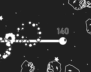
* The graphics and explosion particle effects looked great and it fit the game.
* I like the +1 sign and the score written above the player's head in the gameplay. It was a nice touch of polish and it makes me feel more immersed into the game. These UI elements make the game feel more polished, clean and professional and I like this as it makes me feel good.
Some concepts I did not like from most important to least important:
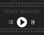
* There are some concepts that I do not like with the UI menus. First of all, I did not know that the button with the arrow graphic in the menu titled "Space Breaker" would exit out of the game because I did not understand the button's graphic's message until I clicked the button. Second, when using the back button in the menus titled "How To Play" and "Credits", it goes back all the way to the menu titled "Space Breaker". I would have liked it to go back to the menu titled "Menu" as this would be more convenient for me as I wanted to explore other options in this menu.
*There is a glitch in where the music stops when you go the menu titled "Menu". The mood of the game is really ruined when the music stops.
* I did not like how the rules and controls of the game were explained. First of all, they were hidden inside a menu. The instructions should be more accessible, at least for the first time the player is playing. Also, the instructions on the rules of the game were pretty confusing. The instructions were saying to avoid crashing into white asteroids and do not properly explain why, and then the instructions say try to crash into all asteroids during the last sentence.
*I would have liked the player to be controlled with the mouse instead of using two buttons on a keyboard. This type of game is well suited to use a mouse as there is not much that the player does. The game would be much more fun with the mouse rather than using two arrow keys. You could have the player move vertically using the mouse's vertical movement.
* Finally, the gameplay lacks entertainment. Personally, I do not really like a lot of endless runner games these days because they lack objectives. Sure, in this game I could try to get a really high score, but this game fails to keep me motivated. When I was playing, I barely cared about crashing into white asteroids. This game did not keep me motivated to try in this game as there were not many strong incentives. The background is also too cluttered and it is very distracting. It sometimes makes it hard for me to play well.
thanks for playing i'll try everything to fix the music problem and im adding more things to avoid and some enemies in the post jam version along with a controls menu to choose keyboard or mouse
Very finely presented and neatly solved. What bothered me:
The music stopped never to come back during the first 10 seconds.
The menu buttons are not cleaned from the messy borders, making it more than 2 colors.
The health is not displayed, making the player not know how high are the stakes.
the health is the bar that goes down when u hit a white asteroid
the menu buttons are like that because of the game engine messing up and its just 2 colors (everything is two colors thats why the health bar is hard to notice)
im not sure about the music though, tested it myself and it worked perfectly can you tell me exactly what you did that the music stopped to help me solve the problem
never mind i just fixed it all
made the buttons better (no gradient at edges)
made the music loop forever
made health bar more noticable