Play game
Monster Spells's itch.io pageResults
| Criteria | Rank | Score* | Raw Score |
| Fun | #54 | 3.000 | 3.000 |
| Overall | #76 | 2.750 | 2.750 |
| 90's | #77 | 2.846 | 2.846 |
| Sound | #86 | 2.462 | 2.462 |
| Graphics | #88 | 2.692 | 2.692 |
Ranked from 13 ratings. Score is adjusted from raw score by the median number of ratings per game in the jam.
Leave a comment
Log in with itch.io to leave a comment.


Comments
Welcome to 3D game development! :)
There was something smooth about the writing that I cant describe. I liked the music and the general visual setup of the level.
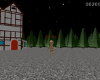
That house does look like it has way too many polys and the amount of trees would have called for some sprite work. Though again, you did leave everything with flat colors and unshaded :)
Lowering the resolution would help in making this feel more retro. In the typing games I've played the difficulty comes from longer words and more words to type on screen. Your approach of enemies moving faster is cool but easier. Still, good job on the game.
I'm always a sucker for typing games. Graphics need a lot of work, and they didn't really feel 32bit to me, but the typing was solid. Having some alternative motions to the enemies depending type would have gone a long ways to spicing up the game play.
I'm terrible at typing games ToT my score was 1500 and I was already just mashing the keyboard because there was no failure for pressing the wrong key haha :)
Flashing lights: When you lose, the game shows three red flashes. Those could perhaps be an issue for people with photosensitive epilepsia. So I’d probably either slow them down or reduce the amount of flashes to two.
Graphics: The 3D models looked nice, and I like that some things were left untextured. But once that camera did move, that floor texture shaked quite a bit and even flickered parts of the screen black for a moment.. And maybe that building could have been more detailed. I mean, if you model the shape of a window into a model and the lighting makes it possible to see that you have geometry for the window frame, making it brown instead of white wouldn’t have taken more polygons. And solid-coloured polygons were pretty fast to draw on 32-bit hardware.
But I got a different idea, maybe a bit crazy, but I it would have worked on real hardware so it’s not unrealistic: When the camera isn’t moving, use a prerendered backgound. You can have as many details in that as you want as long as they fit into the game’s resolution (which should probably not be more than 640x480). And when the player loses and the camera starts moving, it’s always following the same path, and there don’t seem to be changing elements, so that might as well be a prerendered video.
So how would you display the monsters if the background was a 2D image? Then you coud even have more detailed monsters.
The text itself to be typed looks like text typed on a typewriter, which fits the game. It’s also pretty high-resolution, although I guess text made of polygons could be kinda high-res.
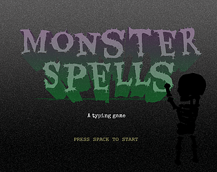
And the title screen looks spoopy like the game itself.
Sound: The music feels fast-paced, like the player has to type fast. Which they do.
And no sound effects. You could have had a death sound or maybe even a sound that played for each letter you typed right and another sound for each letter you typed wrong. Maybe even have it so that each letter in a word makes a different sound than the previous one, like notes playing a tune. And if you want it to be more interesting, you could have some different music for the title screen and endscreen.
Fun: I feel like the waiting between words could be shorter. And English is my third language. I don’t have words like raths at the tips of my fingers. (That word’s from a poem, isn’t it?)
Also, being able to replay the game without having to reload the page or the frame would be nice. Like after it shows the score, maybe allow me to restart it by pressing space, or if really you want to make sure I’m not pressing space by mistake you could say
type "new" to retry. I kinda doubt console manufacturers would like a game that requires resetting the console to restart it. And yeah, I think this is a type of games that people would be likely to want to play more than once.Another crazy idea I had while playing was that as long as you avoided words that sounded very similar to other words it could maybe make sense to have an option to hear the words and type them instead of see them and type them. But I wouldn’t force players to do that, lest deaf people come after me.
90’s: The graphics could probably have worked on a 32-bit console, and I’d think it should be possible to make them look even better and still be able to run on those. Especially if you take advantage of prerendered graphics or 2D animation.
In terms of controls, I think this feels more like a PC game than a console game, but it could still be from the nineties. (Because you wouldn’t be likely to connect a keyboard to a 32-bit console, but if you had a 32-bit PC from the same era, you’d have been more likely to have a keyboard for it than a controller for it.) In fact, PC games were probably more limited than console games when it came to playing FMVs.
I noticed some banding, so I thought I’d mention the PS1 could make smooth gradients with dithering. And it also had a truecolour mode (24-bit) which might be a bit hard to use for gameplay (it’s not compatible with realtime 3D or transparency effects), but it might work well for the title screen.
What I liked most: the animation and title screen. What I’d suggest changing: add an option to replay the game after it ends.
The music and spooky environment really do remind me of those wacky 90s flash games! I'm not sure what words I was expecting to see in a typing game, but I was happy they were pretty random and goofy! Great execution of this idea. I loved it a lot!