Got to the engineering wing and killed a ton of zombies and one cyborg. The horror element works really well and I'm a huge fan of it. The zombies were scary at points, especially the duct crawlers and ammo was appropriately scare. The game was playable without the flashlight, so maybe make it darker if you want it to be more vital. The standing zombies were pretty easy to kill with just the hammer because of their basic movement and crowds of them didn't crowd the player making more than one not challenging either. Why is the options button the first on the menu, I feel play should be first and options third. Your controls page is missing ctl for crouch. It wasn't obvious that the player could climb ledges especially without animation. The text story dialogue worked nicely and the inventory UI was fantastic. I was actually disappointed that the game ended in the engineering wing because I did want to see more which is a good thing. Great job so far and I look forward to more. Hope you find a name for your game lol.
A very atmospheric survival FPS that manages said atmosphere well despite some of the blocky graphics. The System Shock 2 and Doom 3 vibes are certainly there, and with some updated graphics and mechanics this game could reach levels of spook even beyond those titles. Being able to hear the footsteps of distant enemies certainly helps build tension as you enter new areas.
Aiming feels nice and shooting feels responsive, a must for an FPS, and melee combat is a tense circle-strafing dance. Platforming and climbing make exploration feel more engaging than one would expect, and seeing both the rusted vent and the notch where the hammer is was enough to tell me that climbing was a mechanic.
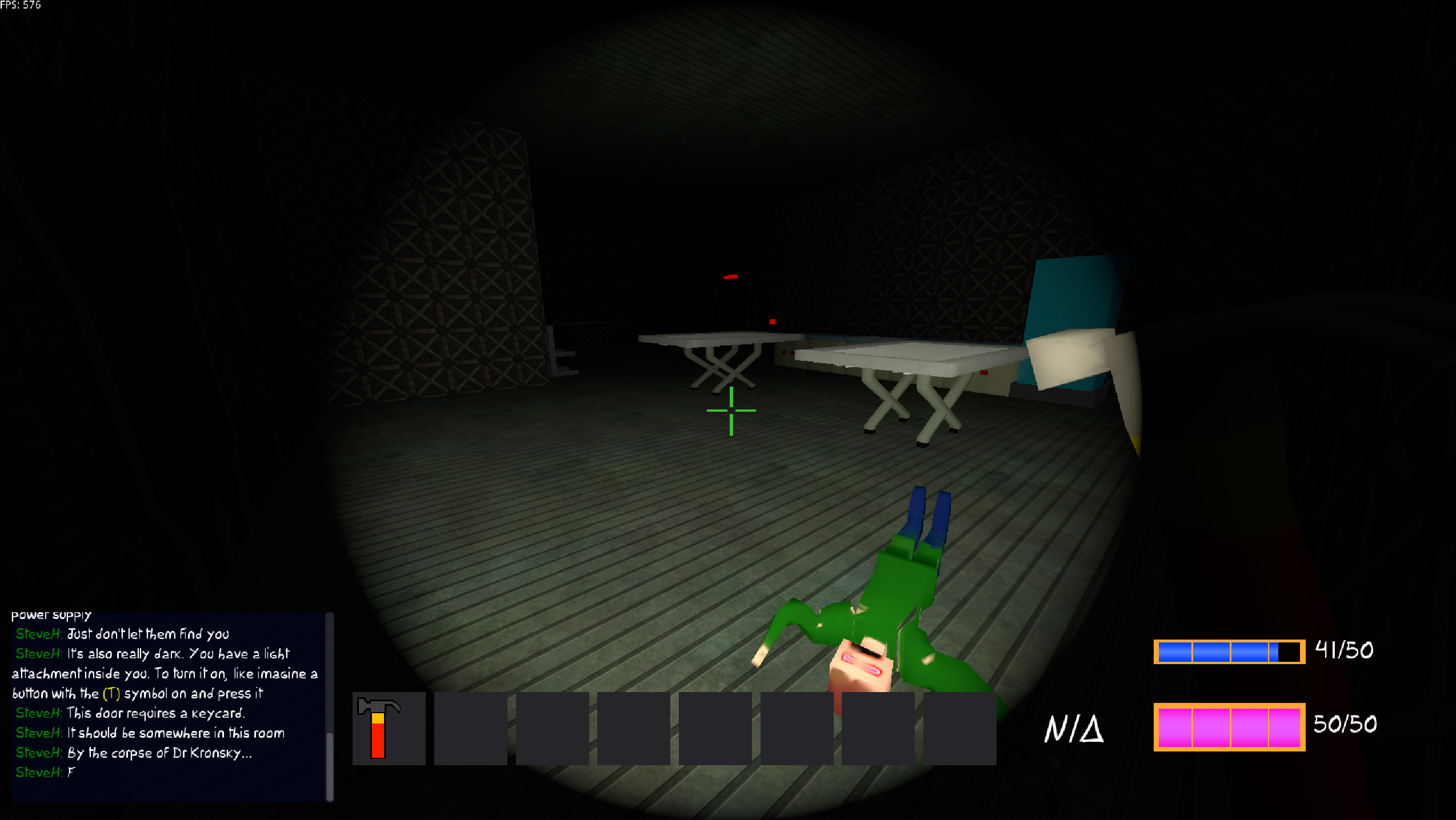
As for complaints, the flashlight battery seems to drain entirely too quickly. I spent most of my time playing in complete darkness trying to salvage what little light I had. I also spent a majority of my time at 10 HP because the ventilation shaft enemies seem to deal unavoidable damage.
I liked it, has a nice Atmosphere to it, creepy, but not to much thanks to the simply Artstyle. Would probably be a lot scarier (maybe too scary) with some higher details. The Inventory is sweet, combined with the blocky level geometry and rather oldschool feeling movement, it comes together rather well I think.
I think the Play and Options options in the Main menu should be reversed, play at the top and options as third. I didn't want to use up my flashlight battery, so I kept spamtoggling it to avoid any battery usage. Its fine keeping it that way I guess, but since you're a Cyborg, wouldn't slowly fading nightgoogles maybe make more sense?
Elevator Area should have different textures inside to make it more clearly an elevator, currently just looks like a generic part of the Room. A bit more chaos in the random doodads would make sense if this is supposed to be a more horror-y game. Theres corpses and maniac cyborgs around, but all the Spare PCs and Chairs are stacked evenly next to each other?
Finding the Hammer took a bit of time, and didn't make a lot of sense for it to be there, but I wouldn't say its too hard to find, incentivises looking around and makes it clear what you're going to be doing for the rest of the Game.
Only thing I really had a problem with was climbing out of the ventilation shaft into Security, thanks to the crouching entrance height. But I probably just tried it wrong by trying to crouch once hanging, instead of looking upwards when moving, so might not be hard at all and I'm just stupid.
I did however clip out of the Ventilation shaft once while trying to climb it, so theres your Bug.
I'd give more feedback if I wasn't retarded and couldn't figure out how to get through the second door after restarting multiple times due to battery running out. I tried interacting with it as well as the black box to the right, the computers and the vents.
Movement feels good. I like the ui and how the npc dialog looks reminiscent of chat in multiplayer games. Only complaint is that the font makes certain letters hard to distinguish
I appreciate the feedback. There is a mechanic where you can climb objects by jumping into them. The solution was to search for a bit, find the hammer, smash through the vent and climb into the other room. I'll think about how to make this mechanic more intuitive.
Comments
Got to the engineering wing and killed a ton of zombies and one cyborg. The horror element works really well and I'm a huge fan of it. The zombies were scary at points, especially the duct crawlers and ammo was appropriately scare. The game was playable without the flashlight, so maybe make it darker if you want it to be more vital. The standing zombies were pretty easy to kill with just the hammer because of their basic movement and crowds of them didn't crowd the player making more than one not challenging either. Why is the options button the first on the menu, I feel play should be first and options third. Your controls page is missing ctl for crouch. It wasn't obvious that the player could climb ledges especially without animation. The text story dialogue worked nicely and the inventory UI was fantastic. I was actually disappointed that the game ended in the engineering wing because I did want to see more which is a good thing. Great job so far and I look forward to more. Hope you find a name for your game lol.
A very atmospheric survival FPS that manages said atmosphere well despite some of the blocky graphics. The System Shock 2 and Doom 3 vibes are certainly there, and with some updated graphics and mechanics this game could reach levels of spook even beyond those titles. Being able to hear the footsteps of distant enemies certainly helps build tension as you enter new areas.
Aiming feels nice and shooting feels responsive, a must for an FPS, and melee combat is a tense circle-strafing dance. Platforming and climbing make exploration feel more engaging than one would expect, and seeing both the rusted vent and the notch where the hammer is was enough to tell me that climbing was a mechanic.
As for complaints, the flashlight battery seems to drain entirely too quickly. I spent most of my time playing in complete darkness trying to salvage what little light I had. I also spent a majority of my time at 10 HP because the ventilation shaft enemies seem to deal unavoidable damage.
I give Untitled FPS Game: >You WILL serve us/10
Thanks for the feedback.
I liked it, has a nice Atmosphere to it, creepy, but not to much thanks to the simply Artstyle. Would probably be a lot scarier (maybe too scary) with some higher details. The Inventory is sweet, combined with the blocky level geometry and rather oldschool feeling movement, it comes together rather well I think.
I think the Play and Options options in the Main menu should be reversed, play at the top and options as third. I didn't want to use up my flashlight battery, so I kept spamtoggling it to avoid any battery usage. Its fine keeping it that way I guess, but since you're a Cyborg, wouldn't slowly fading nightgoogles maybe make more sense?
Elevator Area should have different textures inside to make it more clearly an elevator, currently just looks like a generic part of the Room. A bit more chaos in the random doodads would make sense if this is supposed to be a more horror-y game. Theres corpses and maniac cyborgs around, but all the Spare PCs and Chairs are stacked evenly next to each other?
Finding the Hammer took a bit of time, and didn't make a lot of sense for it to be there, but I wouldn't say its too hard to find, incentivises looking around and makes it clear what you're going to be doing for the rest of the Game.
Only thing I really had a problem with was climbing out of the ventilation shaft into Security, thanks to the crouching entrance height. But I probably just tried it wrong by trying to crouch once hanging, instead of looking upwards when moving, so might not be hard at all and I'm just stupid.
I did however clip out of the Ventilation shaft once while trying to climb it, so theres your Bug.
Fun Game.
Thanks for the feedback tomo
I'd give more feedback if I wasn't retarded and couldn't figure out how to get through the second door after restarting multiple times due to battery running out. I tried interacting with it as well as the black box to the right, the computers and the vents.
Movement feels good. I like the ui and how the npc dialog looks reminiscent of chat in multiplayer games. Only complaint is that the font makes certain letters hard to distinguish
I appreciate the feedback. There is a mechanic where you can climb objects by jumping into them. The solution was to search for a bit, find the hammer, smash through the vent and climb into the other room. I'll think about how to make this mechanic more intuitive.