I'm not a big fan of JRPGs, and so I didn't get very far. Getting through the tutorial was grating because everything was front loaded, the cat looked like a dog and got in my way of leaving the house, and I found that in the smithy, the hammering animation was slow and looked strange and the music didn't start back up upon opening the pause menu. Furthermore the game has no way to swap which monitor it's plastered across, and no way to leave full screen mode.
Ruins of Eliwar dark souls edition, I see. Decent atmosphere.
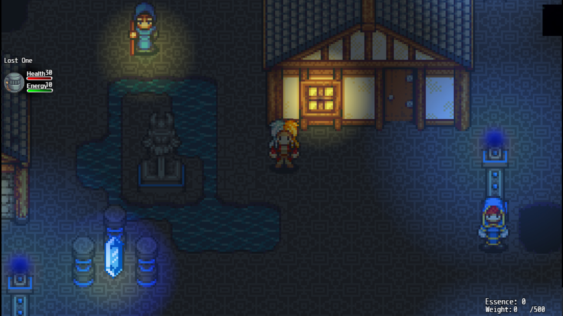
- The HUD sometimes flickers in, for example when you start the game you see it briefly flickering on and off again before anything else
- "Who's skills" -> "Whose skills"
- When I get the menu for memorizing skills I can see a bunch of options that probably shouldn't be available yet. (Also the HUD seems to briefly flicker in and out when you select Lost One and then go back)
- The Health and Energy labels seem quite close to the number values in the HUD
- I see you again want to control when the player is allowed to save. I still find this annoying. At the very least make some sort of information that allows the player to know that autosave triggered.
- The weight and essence labels having no alignment doesn't look nice
- It's weird how on the one hand there is no real intro, yet there is still a very long sequence of running around and doing errands before being able to venture forth and do something
- Also a lot of things are introduced at once, I would recommend maybe unlocking them one after another
- The going to sleep effect seems to be fairly long
- Cursor movement between enemies can be counterintuitive. I am currently in my first encounter with a bat at the top and a spider at the bottom but I have to use up to go down in the selection and down to move up.
- For AoE attacks the battle cam sometimes moves too far to the right and enemies move out of focus
- For spells that use items it would be useful to know how many I have at the time of casting
- Add an End Game to the title menu since the game is full screen
- Overall I feel like the beginning before you enter the first dungeon is overloaded, and then you enter a very slow grind for materials
Thanks for the review aura. Do you think in the end the gameplay loop could be salvaged? If not I can take the framework and use it to make something less convoluted without losing too much progress.
I mean sure, it's a classic go-into-dungeon-get-materials-do-crafting-loop worked for other games so I don't see why you wouldn't be able to salvage it. What I would recommend is to try to identify key features that make your iteration of this loop special and fun and try to structrue the other features around that.
The Item Menu is still the default, clashes a bit with the rest of the Menu reworks. Selection of Partymember for Skill display goes too high up and down, covering the whole Screen height, not just the Character Area. Also Characters have no Menu Sprites (yet?). Same as with the Item Menu with the Skill Menu, Status Menu and Equip Menu etc. SkillTree Menu has a weird Signal-Strength Button above the Dark Knight Skills selection, and overall looks very placeholder-y at the Moment. Gems seems to have too many Windows, but maybe that'll make more Sense once I got any Gems.
No Intro, Door to the House jitters as I move, but I think the last Part is RPGM Specific.
Sprites in general are rather Shaded, but the Floor isn't, feels odd. And the Background is way higher Resolution then the Rest, which clashes. Door should open and have the Character move in, not just teleport, thats lazy.
Moving with Mouse should be disabled completely, it doesn't fit the Game, and the flashing Square aesthetic for it also doesn't work very well.
You can walk on the Walls in the House. HUD is also a different Resolution then the ingame Sprites.
The Sheets(?) On the Bed are not properly alpha-d. The upper part of the lower White/Yellow Sheet is displayed above the Player instead of below.
Storage System has the same clashing UI as the Rest. Don't know how much thats needed either.
There seems to be some Lag while moving occassionally, no Idea what causes that.
Menu has a different Music then the Map. Cuts of very apruptly, don't know if any fo that is needed.
You can walk on Curtains, Benches and various other Stuff, not going to mention more of it, check your Collisions. Also can'T talk to anyone in the Church(?)
Cancelling my choice on the stay/move on chooses move on, should choose stay.
Your HUB-Map is too big, theres nothing interesting there, so the Houses could be closer together. And the overall Terrain could be a lot more interesting. If its some kind of floating Gathering in the middle of nothingness, why square Tiles for the Floor? Broken Edges, floating Debree, ruins, theres a lot you could do there.
Smiths animation is way too slow.
The Guy leading you through the Tutorial should greet you as you spawn and serve as an Intro. It feels odd allowing me to immediately move through the Town, but still looking everything behind being forced to talk to the Tutorial Guy. Its good to see that at least some basic Skills don't require any Ressources it seems, so Mages and Stuff are still useful even if I ever run out. At least a bit.
Ciara apparently learned Bless, but it never showed up anywhere. So I have no Idea what it does.
If I rest in the House with my Party, shouldn't it have more then 1 Bed? Also it would be really nice if the Characters had more Personality and/or more options besides the forced 3 to recruit. So I could customize it better.
HUD doesn't fade out together with the Rest on resting, but gets turned invisible during it.
The Memorizing Skills Window is buggy. If I exit it with ESC it should select the finished option, not Ciara. It should also allow me to quickly swap between characters instead of having to go back and forth between the different SubWindows all the Time.
Traversal-Screen is bad, I'm assuming Placeholder. In Battle, the Status Screen doesn't fit the Rest, it feels to empty, its too far upright, the Background-Fade doesn't stretch all the Way to the Bottom of the Screen.
I understand limited Spell uses, but limited uses of Phyiscal Slash etc? Feels odd.
Battle Animations are over designed. You don't need all that Zooming, the whole Screen and everything is clearly visible anyway. Also inconsistency on the detail Level and Pixelsize of Characters and Backgrounds.
Wizard does no Damage with Spells aswell. Rogue doesn't move on using his ability. Warrior uses his limited uses Skill as his basic Attac. So after attacking 4 Times he's useless. Since no other Character does meaningful Damage, Its a slow grind from here on out. With a no damage healer, no Damage Wizard and low Damage Rogue. If not for 2 no damage Damage Dealers and 1 completely useless Tank, the Combat would actually be fairly balanced.
Combat also does never give XP. Its fine not using it, but then don't display it everywhere. Just remove it entirely.
Oil ran out during sleeping, I guess I should've disabled the Lantern manually beforehand? I also now have a Weight of 1578/NaN instead of 3000 or whatever it was before.
Accidentally died after waking up from sleeping by staying in one Place too long or something while typing on this. I'll end here, I'm assuming the Rest will be continuing in the same Vein as a DungeonCrawler as the first Floor does.
So, these sorts of JRPGs are not really my thing. So in terms of talking about the gameplay, I don't think I have much to say. It does feel like the game could be tightened up quite a lot. In walking around, there is a lot of jitter of things like doors and torches. I thought for a bit that the doors were shaking, like something was trying to get out. There are fairly regular frame rate hitches, which feels bad for a 2d low resolution game. The look of the sprites and houses is cute though. A bit of an intro would really help orient the player, too.

Comments
I'm not a big fan of JRPGs, and so I didn't get very far. Getting through the tutorial was grating because everything was front loaded, the cat looked like a dog and got in my way of leaving the house, and I found that in the smithy, the hammering animation was slow and looked strange and the music didn't start back up upon opening the pause menu. Furthermore the game has no way to swap which monitor it's plastered across, and no way to leave full screen mode.
Ruins of Eliwar dark souls edition, I see. Decent atmosphere.
- The HUD sometimes flickers in, for example when you start the game you see it briefly flickering on and off again before anything else
- "Who's skills" -> "Whose skills"
- When I get the menu for memorizing skills I can see a bunch of options that probably shouldn't be available yet. (Also the HUD seems to briefly flicker in and out when you select Lost One and then go back)
- The Health and Energy labels seem quite close to the number values in the HUD
- I see you again want to control when the player is allowed to save. I still find this annoying. At the very least make some sort of information that allows the player to know that autosave triggered.
- The weight and essence labels having no alignment doesn't look nice
- It's weird how on the one hand there is no real intro, yet there is still a very long sequence of running around and doing errands before being able to venture forth and do something
- Also a lot of things are introduced at once, I would recommend maybe unlocking them one after another
- The going to sleep effect seems to be fairly long
- Cursor movement between enemies can be counterintuitive. I am currently in my first encounter with a bat at the top and a spider at the bottom but I have to use up to go down in the selection and down to move up.
- For AoE attacks the battle cam sometimes moves too far to the right and enemies move out of focus
- For spells that use items it would be useful to know how many I have at the time of casting
- Add an End Game to the title menu since the game is full screen
- Overall I feel like the beginning before you enter the first dungeon is overloaded, and then you enter a very slow grind for materials
Thanks for the review aura. Do you think in the end the gameplay loop could be salvaged? If not I can take the framework and use it to make something less convoluted without losing too much progress.
I mean sure, it's a classic go-into-dungeon-get-materials-do-crafting-loop worked for other games so I don't see why you wouldn't be able to salvage it. What I would recommend is to try to identify key features that make your iteration of this loop special and fun and try to structrue the other features around that.
The Item Menu is still the default, clashes a bit with the rest of the Menu reworks. Selection of Partymember for Skill display goes too high up and down, covering the whole Screen height, not just the Character Area. Also Characters have no Menu Sprites (yet?). Same as with the Item Menu with the Skill Menu, Status Menu and Equip Menu etc. SkillTree Menu has a weird Signal-Strength Button above the Dark Knight Skills selection, and overall looks very placeholder-y at the Moment. Gems seems to have too many Windows, but maybe that'll make more Sense once I got any Gems.
No Intro, Door to the House jitters as I move, but I think the last Part is RPGM Specific.
Sprites in general are rather Shaded, but the Floor isn't, feels odd. And the Background is way higher Resolution then the Rest, which clashes. Door should open and have the Character move in, not just teleport, thats lazy.
Moving with Mouse should be disabled completely, it doesn't fit the Game, and the flashing Square aesthetic for it also doesn't work very well.
You can walk on the Walls in the House. HUD is also a different Resolution then the ingame Sprites.
The Sheets(?) On the Bed are not properly alpha-d. The upper part of the lower White/Yellow Sheet is displayed above the Player instead of below.
Storage System has the same clashing UI as the Rest. Don't know how much thats needed either.
There seems to be some Lag while moving occassionally, no Idea what causes that.
Menu has a different Music then the Map. Cuts of very apruptly, don't know if any fo that is needed.
You can walk on Curtains, Benches and various other Stuff, not going to mention more of it, check your Collisions. Also can'T talk to anyone in the Church(?)
Cancelling my choice on the stay/move on chooses move on, should choose stay.
Your HUB-Map is too big, theres nothing interesting there, so the Houses could be closer together. And the overall Terrain could be a lot more interesting. If its some kind of floating Gathering in the middle of nothingness, why square Tiles for the Floor? Broken Edges, floating Debree, ruins, theres a lot you could do there.
Smiths animation is way too slow.
The Guy leading you through the Tutorial should greet you as you spawn and serve as an Intro. It feels odd allowing me to immediately move through the Town, but still looking everything behind being forced to talk to the Tutorial Guy. Its good to see that at least some basic Skills don't require any Ressources it seems, so Mages and Stuff are still useful even if I ever run out. At least a bit.
Ciara apparently learned Bless, but it never showed up anywhere. So I have no Idea what it does.
If I rest in the House with my Party, shouldn't it have more then 1 Bed? Also it would be really nice if the Characters had more Personality and/or more options besides the forced 3 to recruit. So I could customize it better.
HUD doesn't fade out together with the Rest on resting, but gets turned invisible during it.
The Memorizing Skills Window is buggy. If I exit it with ESC it should select the finished option, not Ciara. It should also allow me to quickly swap between characters instead of having to go back and forth between the different SubWindows all the Time.
Traversal-Screen is bad, I'm assuming Placeholder. In Battle, the Status Screen doesn't fit the Rest, it feels to empty, its too far upright, the Background-Fade doesn't stretch all the Way to the Bottom of the Screen.
I understand limited Spell uses, but limited uses of Phyiscal Slash etc? Feels odd.
Battle Animations are over designed. You don't need all that Zooming, the whole Screen and everything is clearly visible anyway. Also inconsistency on the detail Level and Pixelsize of Characters and Backgrounds.
Wizard does no Damage with Spells aswell. Rogue doesn't move on using his ability. Warrior uses his limited uses Skill as his basic Attac. So after attacking 4 Times he's useless. Since no other Character does meaningful Damage, Its a slow grind from here on out. With a no damage healer, no Damage Wizard and low Damage Rogue. If not for 2 no damage Damage Dealers and 1 completely useless Tank, the Combat would actually be fairly balanced.
Combat also does never give XP. Its fine not using it, but then don't display it everywhere. Just remove it entirely.
Oil ran out during sleeping, I guess I should've disabled the Lantern manually beforehand? I also now have a Weight of 1578/NaN instead of 3000 or whatever it was before.
Accidentally died after waking up from sleeping by staying in one Place too long or something while typing on this. I'll end here, I'm assuming the Rest will be continuing in the same Vein as a DungeonCrawler as the first Floor does.
Thanks for the thorough review Tomodev~ Really appreciate it, and this gives me a lot to work on
So, these sorts of JRPGs are not really my thing. So in terms of talking about the gameplay, I don't think I have much to say. It does feel like the game could be tightened up quite a lot. In walking around, there is a lot of jitter of things like doors and torches. I thought for a bit that the doors were shaking, like something was trying to get out. There are fairly regular frame rate hitches, which feels bad for a 2d low resolution game. The look of the sprites and houses is cute though. A bit of an intro would really help orient the player, too.
Anyway, keep it up.