Play game
Idol's Tower's itch.io pageResults
| Criteria | Rank | Score* | Raw Score |
| MUSIC | #24 | 4.029 | 4.029 |
| SOUNDS | #60 | 3.714 | 3.714 |
| DESIGN | #81 | 3.829 | 3.829 |
| OVERALL | #83 | 3.886 | 3.886 |
| VISUALS | #101 | 4.086 | 4.086 |
| THEME | #107 | 3.771 | 3.771 |
| INNOVATION | #154 | 3.543 | 3.543 |
Ranked from 35 ratings. Score is adjusted from raw score by the median number of ratings per game in the jam.
Leave a comment
Log in with itch.io to leave a comment.


Comments
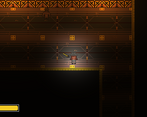
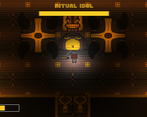
Really love the temple like aesthetic of the game. The combat is pretty nice along with your use of the jam's theme, only the parry was a bit janky. Great work!
Love the combat, swinging the sword looked & felt great. I did struggle with the parry. The tile artwork is amazing, love the level of detail. Works really well with the moody lighting. Great work.
Thanks for the feedback! The parry is a bit janky right now, but we are working to improve it! Expect an update as soon as the jam's over!
Good game! The atmosphere is awesome! My only complaints are the sprite animations and the fact that the buff control didn't seem to work:( Nonetheless good job!
Thanks for the feedback! Could you tell me what was wrong with the buff control and sprites?
Super impressive game! I really love the atmosphere, the art and music is fantastic. There're so many cool mechanics you have here and I really enjoy playing around with it.
Overall, this is a great, well-polished game and I really enjoy playing it! Great job!
The gameplay, visuals and overall mood are all spot on and feel really great. I really enjoy how the mechanics all play off together and provide a very expansive set of tools to play with.
That said, I felt that the early levels didn't really cultivate within me the want to really experiment with those great foundations. Instead it seemed more optimal to race through with the vignette on high parrying and slicing away.
In that way maybe focusing the early levels a little more could help to encourage players like me to really explore the great set of systems you've built.
But if you nail that progression, I can't help but think these mechanics would make a great little indie.
Thanks for the feedback! You mentioned that it seemed optimal to race through the levels with the vision reduced. Do you think it would be better if the combat was more heavy, and making a lower time to kill and giving the player less health? Also, what did you think of the boss? You only talked about the early levels, just wondering what you thought of the later ones, haha.
I think perhaps just tightening up those early zones to make the gameplay a little more focused may help. To give an example, for the first door that required a key I realised I could just dart past the enemy to grab the key then rush to the door instead of engaging in combat. Which I think I did because the majority of the level up to that point had been about dodging threats (the arrows) rather than facing off against enemies.
I do like your idea of making everything hit harder (both player and enemies) as that would up the necessity to really take ones time and engage meaningfully in combat--and would force me to take on the enemy before grabbing the key, for example.
Unfortunately I didn't make it to the boss so I can't comment on that, but I like the design which I did see.
Ultimately, I'm not the ideal tester for a game like this as I tend to shy away from 2D experiences so do take my wordsd with a grain of salt.
That said, I really do think you have some great base mechanics and a solid art style which are the strongest of foundations for something truly great!
Thanks for the response!
Duuuude this is an awesome game! Everything is soooo pollished and is also super original, the visuals, the music, the gameplay.. I love the mechanics of the sword and the light, very innovative and it also works. it is a fantastic overall, greetings mate!
An impressive art style and loved the music. You have added a very good tutorial. Also loved the elevator thingie, it was so cute, and swinging the sword was my favorite part. There are many things in your game that are really adorable. Loved the implementation of the theme of the game jam. Overall, it's a super impressive game with a great art style and level design. Great work!!
Please play and review my game if you get some time, thank you!
You nailed the atmosphere of your game, it's immersive and engaging. Tutorial layout was well done, I liked it. Some things that can be improved though are the control scheme, as I found myself using "space" as my preferred dash button. Maybe other players have this issue as well. It's just a common muscle memory. You can try using "Alt" for parry, it's near the thumb.
Alongside with the parry, maybe have a basic "block" mode, where the sword stays in place when the player holds down the button. And would eventually break when enough hits are taken.
As for the challenge, it's pretty hard when it came to the cannons, because sometimes they're off-screen and takes you out before you could react. Basically it needs countdown sound cues before they shoot. You already have the visual for it, just need the sfx. 😊 Also, good thing it doesn't restart all the way to the beginning after death, and that to me is respect for other people's time, which is nice! Although I accidentally hit ESC, and all my progress was lost the first time. So maybe change that to a pause menu/screen.
I wanted to keep playing the game and ultimately face the boss you crafted, but sadly I had to move on and try the other entries too. But I had a blast playing it! You did very well, great work!
Thanks for the feedback! We plan to add a circle around the turrets telling the player how far their range is. And yes, I like the idea of a block action! As for the esc, that was mostly an afterthought in the last hour of the jam so that people didn't have to alt-tab to quit the game. I'm glad you liked it!
Thanks for the feedback man! We already added a pause menu, also a timer. Some other cool features coming soon :)
Very good game! one of the best I have played thus far! Below my video review:
27:35 Idol's Tower
I really liked it...the design and of the game and the music are excelent...but I couldn't figure how to parry....and I've tried everything =(
To parry, just hit middle mouse or the space button.
Thanks...for some reason I couldn't really figure from the tutorial image =)
Yep sorry, it wasn't too clear, I agree.
Amazing game! Parry felt a bit janky at times but was for the most part okay. Music, visuals, SFX and theming were all spot on. I didnt understand how it related to the theme though. I like the sword swinging, reminds me of my old scratch projects. :)
Thanks for the comment! The theme was "less is more" so we gave the player MORE speed and damage when they choose to have LESS vision.
oh i didnt pick up on that, good job!
Thanks, I'm glad I could clarify.
Good game. Beautiful graphic, music and sounds. Nice sword swing mechanic. Well done!
You have some really solid stuff in this game! The art and music was really cool! I love the combat style of the game, but it felt like the parry would sometimes not work at all and other times it would. Very cool game broske!
Thank ya! im glad you enjoyed :3
Great art and sound. I don't really like the combat though.