Play game
The Value of a Home's itch.io pageResults
| Criteria | Rank | Score* | Raw Score |
| MUSIC | #336 | 3.000 | 3.000 |
| VISUALS | #374 | 3.333 | 3.333 |
| OVERALL | #412 | 3.133 | 3.133 |
| DESIGN | #412 | 3.000 | 3.000 |
| SOUNDS | #448 | 2.667 | 2.667 |
| THEME | #467 | 2.867 | 2.867 |
| INNOVATION | #631 | 2.400 | 2.400 |
Ranked from 15 ratings. Score is adjusted from raw score by the median number of ratings per game in the jam.
Leave a comment
Log in with itch.io to leave a comment.


Comments
The minimalistic artstyle looks really nice and it fits the theme really well. But I think the gameplay itself could've some more polish, but overall it's pretty good, I enjoyed it!
Yeah I'm probably going to come back to it and improve/ add mechanics. Thank you so much for the feedback!
I think what makes your game important is how simple it is and still nails the platforming experience. Right now the game is quite basic but that's what it can be expanded upon. For example. The way your final boss worked was better than all the previous levels. Good game! The way you handled the theme and created something like this is great!
Thanks for playing! I agree the gameplay is a bit too simple and I might come back to improve on that soon. Again, thanks for the feedback!
It has nothing special on it but simplicity is the key and this game nails it right. Its so simple that makes it kind of clever and fun game. Nice work buddy
Thanks for taking the time to play it! Glad you appreciated the simplicity.
A very cool minimalist game with a very interesting narrative. I wasn't a big fan of the music or the sound effects but that's just my personal opinion. Aside from that, I really liked the game. Good job!
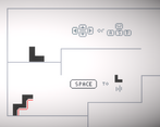
First things first, the cutscenes were the highlight - very well done on those! The tutorial graphics were also great, and movement feels awesome! The bosses were a bit clunky, but when it came back as a normal enemy that was an awesome surprise! The jump sound effect could also be a bit louder, but that's the smallest of gripes. The storytelling in such a minimalistic way was fantastic. Awesome job! I'd appreciate it if you checked out my game, Dr. Maniacal's Monster Maker, as well!
I'm so glad you enjoyed the cutscenes! they are very new to me, so it's a relief to hear that they were ok. I'll make sure to check out your game too!
Interesting game! I enjoyed the story and the feeling of progression throughout the game. I like how you reused the boss as an enemy later in the game as well as had different types of projectiles. I was a little confused by what the graphics meant but I enjoyed it overall.
If you wanted to improve, I suggest optimizing the game for speed running by putting the enemies on a timer of when to shoot and adding some sort of high score based on time for the main menu.
Overall, fun game! Check out my game if you get a chance!
Thank you so much for the feedback! I agree, it should definitely have some sort of scoring system to make it feel more complete/ finished. Great suggestions!
Very simple but fun game. One thing is that I fell off the map when fighting the boss, but other than that, very solid submission. Well done!
Thank you so much for the feedback! I'll see what I can do about that problem.
Really interesting! Simple visuals and interesting mechanics. I pressed shift all the way through the game, as there is not really any downside to not doing that. Maybe just set it as the default speed. Would be cool if you would become different shapes, allowing to move different objects, but you'd probably need more time for that.
Thanks for the feedback! I see what you mean by never needing to let go of sprint, maybe add a sprint cool down? Again, thanks for the valuable comment!
very nice art, like the game.
check my game out!
Interesting stuff! I like the parts where you can push blocks to create platforms for yourself. Also the minimalist visual design matches the theme and is interesting! I think it would be cool to lean further into the block-design. Maybe you could attach to other blocks and build more complex bridges and platforms?
I agree, I had some plans to use the shape of the character a bit more, but sadly due to time I decided to do what I could to finish the project and make what I had more polished. Thanks for the feedback!