Suuuuuper cool game. I love it
Play game
Strength Quest's itch.io pageResults
| Criteria | Rank | Score* | Raw Score |
| THEME | #2 | 4.500 | 4.500 |
| DESIGN | #18 | 4.167 | 4.167 |
| OVERALL | #26 | 4.250 | 4.250 |
| SOUNDS | #91 | 3.583 | 3.583 |
| MUSIC | #106 | 3.667 | 3.667 |
| VISUALS | #191 | 3.833 | 3.833 |
| INNOVATION | #287 | 3.167 | 3.167 |
Ranked from 12 ratings. Score is adjusted from raw score by the median number of ratings per game in the jam.
Comments
That was a very creative game! I didn't realize anyone would use the theme like that. The game's graphics were great. Gameplay was so fun (No wonder I spent so much time playing it.). The game seemed really polished and it just feels like a lot of hard work was put into this. Thanks for this game!
Please take some time to play and rate my game as well. I would really appreciate it. Thanks!!
I put my best points in Design and Theme! Great work!👏
This is one of the games that I've spent too much time playing, around 40 mins! Kept on going because I just had to finish the last boss (floor 3), the loss of blood truly gave me courage. 😂
Very fun strategy/card game that looks like a lot of work was put into it, well done indeed!
And did you say it has bugs? Didn't feel like I encountered any!
Such a great game! I'm going to dock some points in innovation, since this is so similar to Slay The Spire it's unreal. But also... HOW did you pretty much make Slay The Spire in a week!?!?! It's so polished and cool as well. Honestly, I loved it!
Great entry! Feels very polished especially for the time period that we had to work in. The music and art combined really well and the gameplay was enjoyable. The progression felt spot on as I added to my deck. I like the health/damage mechanic, but I think it would have been nice to deal some damage from full health. Dealing 0 makes the first turn of a new floor a bit odd as you have to stand there and do nothing to voluntarily get whacked haha. But honestly, this has been one of my favourite games from the jam that I've played so far and to provide three entire floors to playthrough is very impressive.
Great work :)
Awesome game, always love to see a roguelike deckbuilder! Liked the mechanic of balancing health and damage, led to some cool gameplay of trying to keep your health low to do a lot of damage but not too low as to where you die. (that definitely didnt happen to me anything, no sir)
A few things were a bit confusing when first playing the game:
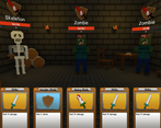
- The armor bar for enemies was blue and was under the health bar so I thought it was a mana bar and was wondering why I wasn't dealing damage
- It isn't clear that armor only lasts 1 turn, so I would stack armor, not really paying attention, and then notice it was gone
That said, I really do like the mechanic of armor only lasting 1 turn, because it makes the game this kind of back and forth between you and the enemy. Cool entry!
Hey, thanks for you comment, at first I wanted to change tue blue color for the armor but I realized a gray armor bar on a gray background wasn't the best choice !
I've quickly implemented a tooltip system, you can hover on some things with your mouse, so if you hover the armor icon you see that it is removed the next turn. In roguelike deckbuilder games the armor never last more than 1 turn, that's why I didn't made it more obvious, in future projects I will pay more attention on details like this :p
ya this is coming from someone who hasn't played any roguelike deckbuilders (but really enjoys playing them in game jams), so I'm not too familiar with the customs! I just thought maybe the perspective of a total scrub could help LMAO
Also when I think armor I think of a yellow bar above the health bar, but that could just be me
You can't imagine how many hours I have in Slay The Spire and any other deckbuilding games.
And I always wanted to one too. Congrats on your start!
For only a week, this is quite impressive. You probably played all the popular roguelike deckbuilding games so I won't criticise this. I am sure you already know what is good and what is not.
But you have my thumbs up!
I don't like anonymous votes, so here is my rating.
Keep up the good work !

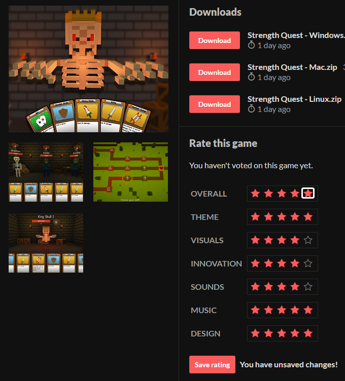
A pretty bare bones rogue-like deckbuilder with a really cool twist. It's missing some nice features of deckbuilding rogue-likes like being able to look at your deck, look at your passive bonuses, or indicators to see who you're targeting. Additionally, there seem to be some bugs like sometimes the cards appear larger in hand and the Nurse Call card costs 0 energy but requires you to have 1 energy. However, I love the mechanic of damage being based on how my hp you're missing. It's a really cool twist and I could see this being expanded out into a full game.
Also, the 3d models look quite good. Overall, a visually polished game even if some of the cards have very simple art. I really enjoyed it. I'm really impressed that deckbuilding rogue-like could be made in just 7 days.
Another bug, the Vampirism card seems to heal for 10. It still deals 5 damage though.
Bugs... I don't know what you're talking about 👀
Seriously, each day I had to repair the cards mechanic because it not longer worked, but that Nurse Call bug is new to me, I checked the data of this card and the energy cost is 1 so it's odd to see 0 on the card. Same for the vampirism card which is not supposed to heal more than 5, I guess I messed up somewhere... I apologize for my mistakes and hope you appreciated your experience overall !
Thanks for the comment, the cards you get in reward after winning a combat are totally random. And in combat the cards are given randomly too, I just tried to make some kind of discard pile and draw pile, in most of the time it's working and you can get the same kind in the row (except duplicate cards). But the code is far of being perfect and sometimes you get the same card after ending the turn.
Why not working on something in the future, since I started I work by myself
This is a really fun game, and I enjoyed it a lot! Only issue is that I had a bug where the cards just kept getting smaller and smaller the longer I had them, so that in later levels, I couldn't see about half my cards.
Other than that slight bug, it's a really solid card game!
Ahhhhh man, I had this bug when I was trying to upload a WebGL version of the game, that's why there is only downloadable versions. I tried several fixes with my friend but the only thing I know is there is something with the screen resolution and the fullscreen. I wish I knew why the other UI parts are scaling properly but not the cards, I'm really sorry for the inconvenience !


Leave a comment
Log in with itch.io to leave a comment.