Indie game storeFree gamesFun gamesHorror games
Game developmentAssetsComics
SalesBundles
Jobs
TagsGame Engines

Pope_PiusXIII

68
Posts
1
Following
A member registered Jan 22, 2021 · View creator page →

Creator of

Recent community posts

The level design is really good and the game is overall polished. However, once I turned the place upside down, I entered area 4 and got stuck down in the "bottom" of the area down the narrow pit at the "bottom". Is there a way to reset because I was just stuck there.

The game is also really tough. It was satisfying to get through but many jumps were very tight and there was a lot of trying to land on narrow platforms.

Regardless, overall a good game.

It's a fun little game. The camera perspective made it quite tough to see the guards. Additionally, the game always starts on the lose screen. Otherwise though, I had some fun with it.

This was a fun little game. It's overall very solid and well polished.

How does "less is more" fit into the game though? Additionally, the jumping felt difficult to pull off on edges. Maybe coyote time would really help there. 

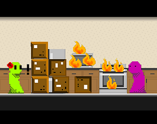
It would be nice to see how much I've burned after putting myself out. The first time I reignited myself, I didn't know why I immediately burned up. Some way to know how close you are to burning up after putting yourself out would be helpful.

When you push objects, they slide along the ground after you stop pushing them.

Those were only some small issues. This is a really great game though and I enjoyed setting myself on fire in order to solve puzzles.

That was a fun little game with great atmosphere, sound design, and art. It was a fun challenge.

What does "less is more" have to do with the game though? I just took the souls one at a time to the center. Then I tried gathering them all at once and there wasn't anything different (though I died before I got them all).

What was the third ending? I died, got all the souls to the center, but idk what the last one is.

Overall, great job with the game and especially with your artwork.

Yeah, the second set of levels was really cool. It took me a bit to realize they were the same as the previous levels since they were changed so well.

Wow, this is almost a complete game. It's well polished, has good sound and music, has progression, has an options menu, has skins, features a leaderboard, it saves your skins you've unlock, and it's quite visually appealing. I'm really impressed that this was completed in just 7 days. Well done. 

The only issues I can come up with is that it's sometimes hard to tell which tile certain items are in. If you get stuck without any torches with some enemies, you just have to wait as they slowly whittle down your health in order to kill you. Finally, there isn't much to give inevitability in the game other than food becoming less and less effective. Being able to fully heal after each level makes it really hard to die if you just rush through avoiding all enemies (which are very difficult to kill and give almost no reward for being killed). Also, it would be nice to be able to turn in place.

I didn't mean to give a full paragraph of criticism. I suppose I'm treating this game like it's a full release because it is that kind of quality. Amazing job with this game.

I really liked this game. It was fun and using hp to shoot was fun and interesting.

However, I'm not exactly seeing where the "less is more" is in this game. You don't gain anything from having less health or less of anything. Additionally, charging up the attack didn't seem very worthwhile. It was mostly just a slower way of attack. It costed the same amount of health and took a similar amount of time to charge it. If it were noticeably more damage efficient, health efficient, and/or time efficient, I would make more use of it. 

Otherwise, the gameplay is really solid and the game is well polished. The visuals were pretty bare bones but the game was very clear and communicated itself really well. 

The boss fight was pretty cool. You're able to progress it as quickly as you want.

I really enjoyed this. Great job!

I'm going to play your game now.
Here's my game so you can rate it: https://itch.io/jam/blackthornprod-game-jam-3/rate/900004

Here's my list of games I really liked from the game jam: https://itch.io/c/1382045/my-favorite-blackthornprod-game-jam-3-games
Alternatively, you can play my game: https://itch.io/jam/blackthornprod-game-jam-3/rate/900004

Here's my list of games I really liked from the game jam: https://itch.io/c/1382045/my-favorite-blackthornprod-game-jam-3-games
Alternatively, you can play my game: https://itch.io/jam/blackthornprod-game-jam-3/rate/900004

I really, really want to love this game. It has such great ideas and I love the concept for it. However, there are a few major things holding it back:

The enemies which spawn in the middle of the room can immediately attack you resulting in incredibly hard to avoid damage.

Attacking is quite inconsistent. Pressing the attack button sends your positive emotions at where your aiming but only so far from wherever they are. It's likely they won't reach where you're aiming and might be too far to really help. 

Are enemies supposed to deal two damage? It's difficult to tell since you start with 5 health and get drops for single hearts.

Sometime, I can kind of get caught on walls if I walk into them just right.

These are all very solvable issues and I would love to see this game expanded on. There should be more mechanics to encourage fluctuating between using many and few positive emotions at once. Additionally, I'd love to see the different emotions do different things.

This is just such a great base to work off of and I love the idea. I hope you'll be able to continue the project.

Wow... just wow. This is a very complete package of a 3d platformer. It's very polished, visually appealing, features great music, is fun and satisfying to play, and has a cute little narrative portrayed through no dialogue. Was the "less is more" in this game just its minimalist approach? Additionally, the checkpoint placement was really good throughout most of the game. There were only two cases where I felt like there could've been a check point, one of which, was the final sequence (the top of that ledge with the vertically spinning obstacle should've been a checkpoint).

That was amazing. Great job with making this. It's very impressive for being completed in only 7 days

This is a great puzzle game which makes great use of the theme. I love the use of color for the puzzles. This is one of the best games of the jam but I do have some feedback:

The music is very quiet. I didn't realize there was music till I looked at someone else's comment.

pushing the blocks around when you move into them makes jumping on them and navigating around them really difficult but also doesn't add anything to puzzles. It sucks to set up your puzzle solution and accidently bump a block into another and mess up your colors so that you have to restart.

There seems to be a bug where changing the color of a block also changes nearby blocks of the same color. I had a red block on a purple switch. I split up a blue block and put it on the purple switch with the red block to press it. However, when I did that, the other blue block became purple for an unknown reason.

Does the game lack a way to quit/close the application? Pressing escape would just cause my mouse to appear on screen.

Other than this, I loved the game. It was really fun.

Wow, what a remarkable game. Well polished, good sound design, fun and challenging, good humor, and is simple to play. I'm unsure about not being able to stop but thankfully it doesn't make the game feel clunky. I could only get to 39. This game is tough.

I highly recommend checking out my game. It's incredibly similar to yours only you play as the hoarder themself and have to find places to throw out your stuff.

This game has some amazing artwork and design. I love the idea of it.

There are some problems I noticed. I rated the game highly so I bring these up out of love for this game:

On the title screen, if you mouse over the how to play button, you have to go over halfway up onto the play button to press play, otherwise, you'll go to the how to play menu. Same for the exit menu. The button stays selected if you move your mouse quite far above it.

For the fire warlock, the cards which just deal damage to you look like they say they "deal damage too you" since there is a bit of flame next to the "to".

I would like something to keep track of how many cards have been burned/destroyed.

Showing the ending life totals at the end of the game would be really helpful. I ended the game by healing the fire warlock and suddenly it went to the win screen so I couldn't see the ending life totals.

The card which allows the purple warlock to heal with its ability instead of deal damage doesn't really do anything. Either way, it changes the difference in life totals by the same amount.

The grammar on many of the cards is off.

Overall, the isn't a ton of thought which goes into how you play each turn since there aren't many variables. However, overall, this is a great game which fits with the theme incredibly well. I'd love to see how this could be expanded upon.

(2 edits)

I really like this game. It works with this theme really well. You're trying to clean up everything and trying to do so in the minimum amount of steps.

The dark levels were strange at first. There wasn't anyway to find the optimal path without some trial and error. However, they're the same as the previous four levels so I could just remember the previous paths. You can't lose anyway so this is a very minor nitpick.

The game was really easy though. There sadly isn't much nuance which goes into doing it in the optimal amount of steps. I still enjoyed the game and it is very well polished.

I highly recommend checking out my game. It has a very similar premise. You play as a hoarder trying to very quickly throw out all his stuff.

These are some impressive visuals. Everything glows and there are great particle effects. Additionally, what you did with the title screen was really cool. It's tough getting the ai to just play the game on its own (I've done something similar in a game before). Cool touch having that happen in the background.

There are a few things I'll give criticism on though. The game could've used some kind of explanation/tutorial. Additionally, spawn rates on enemies didn't ramp up at all. This means the game didn't have any sort of inevitability and could drag on. Finally, it was unclear what was going on with speed at first. A bit more of a gradual increase in speed as you lose health would've made the "less health is more speed" relation clearer.

I did like the mechanic of "less health is more speed". More speed at first is really helpful. However, as you take more damage, it becomes too much. 

Good job with your game.

A solid game. It was interesting shooting those platforms to set up the level for myself. Additionally, the game has good pixel art.

There are a few oddities with the game. There is no sound but that isn't a huge issue. It's a game jam after all. However, some of the platforming felt odd since I would need to sort of lift myself onto high platforms with the barrel of the gun. It felt rather unintuitive since the gun walks on its feat. Additionally, it's unfortunate that some of the obstacles are set up so that you can't really know how many times to shoot a platform before advancing. This results in shooting it, looking ahead, going back to adjust, and repeating this a lot. It was a little tedious.

Overall though, this is a pretty good game. Good job.

Wow, this was a very cute game with a nice little message. I'm really impressed with the environment and the way you used the theme. The music was pretty nice and the game featured a good amount of sound effects. The walk backwards to the start was a nice conclusion to everything.

There was some clunkiness in the game. The first thing I noticed was that, if I moved for more than just a tap of the movement button, I would continue moving even after letting go of the movement button. Additionally, many animals would float above the ground as they walked. Additionally, some of the sound effects were a little too loud compared to others or too repetitive, like the dogs barking.

These were only minor issues though. My character drifting after letting go of the movement button stopped being noticeable after awhile and I overall loved the experience. One of the best games of the jam.

(1 edit)

The art for the character looks stretched. If you want a pixelated look, you'll want to change some settings in Unity on the image itself. 


Pixels per unit will determine how big the image is. Play around with that to find the right size.

I recommend setting filter mode to point (no filter) so Unity doesn't try to apply anti-aliasing or otherwise blur between the pixels to try and improve the quality of your art.

Setting the format to RGBA 32 bit worked for me to make sure Unity didn't alter the image in any other way.

You get to these options by selecting the image in your Project window. If you have any questions, let me know. It's very helpful to play around with these settings when you first start uploading your art to Unity so your art assets can be consistent.

I'm a fan of the minimalist visuals. However, I'm unsure about what this game is supposed to be honestly. The first room lets you either lose by falling or shooting your mom. You win by just breaking the window and approaching your mom. After that, your brother steals something from the birthday party. You chase after him, there is an enemy which can kill you but you can shoot him. You go through a very long unskippable cutscene and can either kill him or just take the item he has. You use that item to get by someone with a flash light and return to the room with your mom. If you killed your brother, you lose, otherwise, you win. If you die at all, then you return to just after your brother steals from the birthday party.

I'm not sure what this was supposed to be. I assume it's supposed to be nonsensical but idk for what reason.

Even time you die, you have to go back through the dialogue with your brother and it just drags on for too long.

The sound effects were way too loud compared to the music.

I think there was some coyote time when jumping. Good job getting that in if so. Once again, great job with the visuals though.

Thank you for the feedback. This was my first time making music for anything. I actually squeezed it in on the final day in a few hours since I couldn't get Bosca Ceoil working for awhile. I'm glad it turned out as well as it did.

Thank you. My avatar is actually a monster in the monster taming metroidvania Monster Sanctuary. The game had some design contests for community designs to get into the game and this design is what my fiance and I came up with. It won the contest by being chosen by the devs and this is the version drawn by the game's artist.

Thank you, I'll definitely watch that video.

It seems the game doesn't work well on PC, which is unfortunately what I played it on.

idk if this is how the mobile version works but the attack button would just cause some projectiles to appear momentarily and move in the horizontal direction I was going. Pressing it again would cause them to reappear momentarily still only moving horizontally. 

Additionally, restarting the game would return me to the exact situation I was in before. If I died to an enemy, then I would return to the enemy being right on top of me.

This game is hilarious. One of my favorites of the jam.

I only have a few complaints. A controller is required to play. There is some kind of bug preventing the use of just a keyboard. Additionally, it's possible for new crowds to start coughing at you from off screen without you getting a chance to know they're there.

Otherwise, I really enjoyed myself. Dodging people coughing corona virus at you is great and the green clouds really sell what's going on. How did you get the clouds to look the way they do? They're really cool.

The sound effects are also great. The coughs of the crowds and the fact that they were speaking some gibberish also helped portray the scenario. 

Amazing job.

A tiny yet quite fun game. I'm really impressed with the art and there are nice little sound effects too. The instructions on the title screen are unfortunately too small and scrunched down so that they're hard to read. They almost look like a nice border along the bottom rather than text. Additionally, once you press play, there isn't any way to go back to look at them if you missed them.

That's really my only criticism though. Overall, great job with the game. I love the character you control. It's walking is cute and the arm which comes out to punch is great. I also like this game as a metaphor for how to meditate.

It's a pretty cool idea to make a minimalist souls game. However, I'm really unsure how this works. Clicking to dodge didn't seem to do anything. There wasn't any animation with it to make it feel like anything. Additionally, most of the time, attacking would result in getting hit and my attack getting cancelled. I could parry but that would just involve me spinning my sword in front of the enemy until I decided to attack, in which case, then they'd finally attack back to cancel my attack.

I reached the second bonfire and gave up after a little while. There is, unfortunately, a lot of stuff going on which needs to be accurately portrayed but I couldn't really make sense of it. 

Still, neat idea and I'm impressed you were able to portray this so well with mostly just basic shapes.

Overall really great and charming game with excellent level design. I like how the level expands by you gaining jump height. My only real complaint is that the gravity was really high and the movement was quite fast with deceleration in the air so landing down on single block platforms was really tough. Otherwise though, amazing job getting this done in 7 days.

Good visual design really sells a creepy atmosphere. I was intrigued to beat the game even after accidently resetting my progress by pressing the menu button. 

I read the comments and it seems the game is unbeatable as of now. That's unfortunately, I was excited to see how the game would turn out. Additionally, it's unfortunate to hear that your translator didn't translate the prompt correctly.

It's quite annoying that you keep moving when airborne, even when not pressing a directional button.

Overall, I had an interesting time with the game. Good job with your artwork in the game.

An interesting game is great visuals. Losing more and more vision and control as you progress through the maze is pretty interesting, though, it can get pretty tedious. 

What was with the enter the password thing though? There was no place to enter text. Additionally, is the password that word in the bottom right corner? It feels really bad to get that far and then find out I'm screwed because I didn't memorize the title screen.

I loved that the instructions were given with code. I found it hilarious but that's because I'm a programmer. That kind of tutorial could be too obscure for other players.

Overall, this is a great game. Unfortunately, it would be much more suited to multiplayer. The potential for mind games in this game is great. 

I like the art. It's simple but communicates the idea of everyone fighting over the colors and giving them less value really well. 

Additionally, this game fits incredibly well in the theme. Great job.

Overall, it's one of my favorite games of the jam. I'd love to see this expanded into a full game.

Seems like an interesting idea but, as you said, over-scoped. I highly recommend figuring out a basic gameplay loop you can complete in a day for a game jam, then expand on that so that you can get it done.

For example, in my game, I made sure to complete the ability to pick up and throw boxes and create a container to throw them into. Once that was complete, I could expand from there.

Don't be hard on yourself about not having art. That's fine. What's more important is clarity. Can the player know what stuff is? Text indicating what stuff is, controls, and other gameplay essentials will go a long way with art. You nicely color coded a few things in game just with circles, squares, and different colors.

Great job getting this submitted for the jam. Hopefully this'll just be another step towards you learning how to manage scope.

A charming game with neat music and visuals. It's a pretty basic platformer and is unfortunately very difficult and features very sparse check points. I stopped at the battle toads cart section because it was hard to tell which lanes were safe or not.

I highly recommend for game jam game to make sure to tell the player the controls and to make your game easier. It's better for the game to be too easy than for the player to be incapable of completing it in a game jam.

Yeah, I was hoping to add another level where the house had two floors. Sadly, figuring out the sound and cutscenes for the game took up my time near the end.

I had fun designing the different things to throw stuff into. I'm glad you had fun with the game.

Thanks for player. The endings are the same partially due to time constrains. However, I also wanted to leave the ending ambiguous. The character is so afraid of his girlfriend seeing his house in ruin that he ruins his house. Either way, she is surprised.

I love how you used the theme. Making each attack get weaker as you use them but buff the other attack is a great idea to encourage the player to vary their playstyle. The game also has great art.

Unfortunately, there is a bit of chunkiness to the game. Having to use up to jump is annoying. Spacebar is much more of a standard jump button. Additionally, the audio balance isn't great. The music is very quiet compared to the sound effects unfortunately. Additionally, it's too easy to sit back and use the lightning bolts against some enemies, even at 10% effectiveness.

I don't want this to make it sound like I disliked the game though. It's quite amazing for being made in 7 days. I've only seen this kind of mechanic present in the game Salt and Sanctuary before. In there, there are fire and electric spells. Using spells of one kind will "imbalance" you. Continuing to use the same element will eventually cause you to explode unless you wait or use the other element. IA similar mechanic is used to great effect here and I like that taking damage also boosts you damage. It make getting hit feel way less bad. It helps the player fail forward so they stick with their mistake and move forward.

Overall, the game has some amazing ideas and I'd love to see where it can go with some polish.

(2 edits)

Wow... just wow. This happened in 7 days. A totally complete package of a game (besides being short but this is a game jam, I won't mark it down for that). Totally polished, well balanced, visually appealing, great audio, and emotionally moving. This game was a really neat experience. The threats are well designed both visually and audibly to seem threatening.

Only issue I can see... what does "less is more" have to do with the game? Is it about falling and then rising again to better heights?

A very polished game with great audio and visuals and a cute slime you control. However, the game is honestly pretty poorly designed. Dying making the game harder easily leads into a death spiral where failing leads to more failure which leads to more failure which leads to more failure. It's not fun once you build up a few slimes.

I don't want to diminish the success of this game's visuals and audio though. They're amazing. I could believe this game was a full release due to the polish.