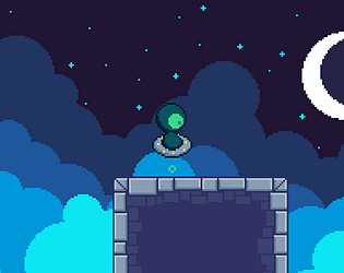
Play game
A New World - BPJ Entry's itch.io pageResults
Criteria | Rank | Score* | Raw Score |
Presentation | #16 | 3.474 | 3.714 |
Relevance to the Theme | #24 | 2.940 | 3.143 |
Immersion | #24 | 2.806 | 3.000 |
Overall | #24 | 2.967 | 3.171 |
Concept | #25 | 3.207 | 3.429 |
Gameplay | #30 | 2.405 | 2.571 |
Ranked from 7 ratings. Score is adjusted from raw score by the median number of ratings per game in the jam.
Credits
Housefire Studios - Lucky Clover Dev and Crossedkiller
External Credits
N/A
How did you/your team interpret the theme?
As the main character arrives in new areas, his DNA becomes mutated to reflect the change in his surroundings, turning to fire when he's in the molten caves, ice in the mountains of snow, and so on.
How was your/your team's experience in this jam?
Fantastic! This has definitely been one of the most fun experiences I've had in awhile, and I'd do it again in a heartbeat!
Content Warnings
N/A
Leave a comment
Log in with itch.io to leave a comment.
Comments
The hovering and floating was a pleasure to operate and it would go great with a more populated world and clearer tangible goals. Art and music were fantastic!
Thank you so much!
I was wondering about the size of the game. Usually Godot games are are 40 to 50 mb, a simple pixel game like this should be small, not 100mbbig. There might be some storage inefficiency that you might have to fix.
Great art! I love the presentation. It feels like a start to something with a lot of potential. I floated around on my hovercraft for quite sometime. I’d love to see the world filled out with more of your great art and a little more direction or at least feeling of direction.
My biggest non-complaint complaint would be that I had to switch to a Windows computer to play the game. I think a lot of people are really missing out because you don’t have a web version.
Looking forward to your next project!
I'm glad you enjoyed it! I'll definitely make sure to add a web version next time!
As C131 said, the world feels a bit empty and is a bit easy to get lost in. It's a big world, I think a bigger camera would be nice. But the presentation! Man, it's phenomenal! The art is excellent, and I like the music as well! Also, from what I understood you did everything other than the music? Huge props for managing all that.
Thats definitely understandable! I had been planning on having a LOT more NPCs to add some direction to the world but lost out on time. Thank you so much! I tried so hard to make it worth playing, even if only for how it looks and sounds!
Any chance of a web version for non-Windows folk like me?
I'll work on getting one set up!
I think your concept is good but the world feels a bit empty and it is easy to get literally lost in some sections because they all look the same. I like your art style and I think with more polish and content this could be a very nice experience. I ran into a bug where a sign was close to a wall and I hit "E" to interact but because of the "jump" I activated the dialogue and got pushed into the air leaving me unable to do anything. In your description you mentioned under the controls to move with A and S, however it was clear that you meant the D Key although this might confuse some people. You should try prioritizing polish over content as it is far more rewarding than being left with a half finished game. The animation of the player looked sick.
I absolutely agree! This is my first game jam, and I ended up trying to fit in too many things all at once. Next time I'll have a much better understanding of what I'm able to do in 2 weeks. Thank you for your feedback! (I realized too late about that one sign, my apologies!)