Play game
Slime Gluttony's itch.io pageResults
| Criteria | Rank | Score* | Raw Score |
| Theme | #833 | 3.000 | 3.000 |
| Audio | #904 | 2.600 | 2.600 |
| Graphics | #984 | 2.750 | 2.750 |
| Innovation | #1016 | 2.650 | 2.650 |
| Overall | #1057 | 2.625 | 2.625 |
| Fun | #1270 | 2.350 | 2.350 |
| Game Design | #1274 | 2.400 | 2.400 |
Ranked from 20 ratings. Score is adjusted from raw score by the median number of ratings per game in the jam.
In what way does your game fit the theme?
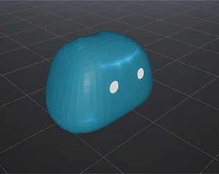
Eat over slime and send them firght for you. Alone you won't survive, but together you could escape this facility.
Don't forget to follow us on Twitter https://twitter.com/StudioMostly for the uncoming news for our game! (not from the Game Jam)
Did you write all the code yourself and made all the assets from scratch?
Free sounds, otherwise everything is homemade
Leave a comment
Log in with itch.io to leave a comment.


Comments
Nice idea. I love the integration of the audio, it fits really well with the game. The camera doesn't seem to rotate if the mouse hits the side of the screen, which makes it pretty hard to rotate, though. But that problem aside, I enjoyed it. Good job!
Amazing idea! I never thought about 'escaping the facility'. Really out of the box, and I can feel abit of SCP, even though none of the scary aspects are there ofcourse. Overall, great game and I'd love to see it improve.
Thanks for your feedback :) unfortunately we are starting to work on a 3D plateformer about grief, so we won't be able to work on this prototype anymore :/
so cool game! i really like the visuals! really nicely made!
small comment: i think might be camera steering needs some polishing, it was not very smooth and sometimes it was hard to rotate it
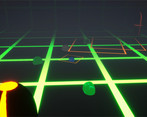
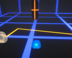
I like the way the floor looks but a lot of the visual elements seem to clash.
The controls are a bit awkward and it's not immediately obvious what you're supposed to be doing.
Fun game, really liked the gameplay aspect of gathering slime to destroy faster also the movement feel responsive and well made, the jumping on the other hand doesnt feel like it should you can get stuck on to the platforms and seem really slow, another thing that needs work is the camera movements also the slider can be changed with a or d if the mouse is over it I sometimes would bring the slider all the way down by mistake to fix this i would just put it in a pause menu for example.
The game is really fun to play but it would need a few tweeks but great job overall.
Hey, we are slowly starting to work on a new project. Check and follow if you're interested :p
https://twitter.com/StudioMostly?s=09
https://www.instagram.com/p/CL2PKBOHa2g/?igshid=th3z2pjfgg87
You already got quite detailed review, but I will write mine anyways so you can cross them to get all the info you need to make whatever you want to do with it ;)
-The graphics set up the atmosphere alright, the animations are good, the sounds is good.
-The camera is a bit of a problem, it is hard to get the right angle. Imo you could make the arrow keys controls the camera angle, that should do the trick, as there is no other use for the mouse I think.
-The UI are different from the rest, which makes it look out of place / unfinished. Too bad because if the story is quite classic, it is always a good feeling to see we are breaking free.
-Maybe add a pause panel, where we can find the controls, or go back to menu (which would means a save of progress)
Anyway good entry :)
Big thanks for the feedback, really :)
It is part of the jam ;)
Hey, we are slowly starting to work on a new project. Check and follow if you're interested :p
https://twitter.com/StudioMostly?s=09
https://www.instagram.com/p/CL2PKBOHa2g/?igshid=th3z2pjfgg87
The graphics are really nice but I struggled a bit with the camera and controls. With the mouse controlled camera, I often couldn't rotate as much as I wanted, so if I initially took a bad angle it put me into tough spots that were hard to navigate out of. Maybe add some button that automatically positions the camera behind the player. The dash could be a little more pronounced, which would make it more useful. And the split mechanic was really confusing at first. I think it would work better, if you shot the slimes forward, right at the enemies. But overall, good job and kudos for a making a 3D game, not many people do.
Thanks for the detailled feedback
The lighning looks very nice! Nevertheless the movement feels a bit to slow and heavy.
Good entry though!
I do like the game it has some great concepts and art well done!
The lighting is amazing
This game has nice graphics and is overall quite nice, but it took a while to figure out how to play and could do with a bit more of a tutorial :)
The lighting and concept of the game is really good, but the camera could do with some work
The lighting and concept of the game is really good, but the camera could do with some work
Hey, great game so far, maybe make the objective a little more clear and make the camera a bit more intuetive and you are on to something!
Thanks for the feedbacks ! It means a lot. The camera is gonna be tricky.