Indie game storeFree gamesFun gamesHorror games
Game developmentAssetsComics
SalesBundles
Jobs
TagsGame Engines
A jam submission

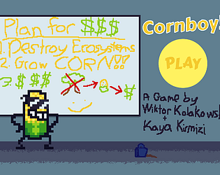
CornboyView game page

Deforestation has never been this awesome!
Submitted by WiktorK01, KayaK777 — 2 hours, 41 minutes before the deadline
Add to collection

Play game

Cornboy's itch.io page

Results

CriteriaRankScore*Raw Score
Interesting Gameplay / Fun​#24.0004.000
Smooth, Polished & Bug Free#34.2224.222
​Aesthetic (Art, Audio)#54.2224.222
Overall#73.8893.889
Likely to Release​#83.8893.889
Use of Themes - how effectively or uniquely does it engage in the jam's themes?#263.1113.111

Ranked from 9 ratings. Score is adjusted from raw score by the median number of ratings per game in the jam.

Leave a comment

Log in with itch.io to leave a comment.

Comments

Submitted

Gameplay mechanics are excellent. Enjoyed playing this game, even though I couldn't win. The increase in difficulty (or I think it is an increase in difficulty) over time is also a good idea.

Submitted

fun challenging game. would like to have some more options for movement but that could also be a skill issue on my part. like the aesthetic of the art.

Submitted

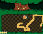
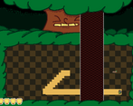
This is great! Very fun way to frame the gameplay mechanics. The one vertical attack that stretches across the whole screen isn't tree-themed, though, and I couldn't tell what the apples were at first (I think making them a more bright shade of red would help). Those are pretty small nitpicks, though. Overall, I think you've done great work with this. I'm also impressed that you made a dialogue system.

Developer

Hey, thanks for the feedback! Here's a fun fact regarding the vertical attack: this was my first time doing art for a project since I had no artist helping. While most sprites turned out fairly well, the vertical attack was a big challenge for me. It was MEANT to be a giant tree trunk stomping on the player, but every iteration i made of the sprite made it look like literal poop 💀 And the tree's facial expression while using the attack DEFINITELY didn't help. I thought maybe I was overthinking it and I could get away with it, but the first thing my friend pointed out when i showed it to them was that it looked like the tree was pooping 💀 Ultimately i decided to stop wasting my time trying to make it look good and just abstracted it to a rectangle
(The apple's coloring was from me trying to stick to basic color palette of around 6 or so colors throughout the whole level, In hindsight yeah i should've bent the rules a bit for that sprite... 😅🍎)

Submitted

You actually cooked with this. Its funny, its a clever take on the bullet hell genre, its visually quite good, and its generally well polished. I'd say my biggest critique is that some of the projectiles are unreactable if you're positioned badly, which is a drawback when you have to walk around the whole arena. That and the fact that there's only one level! You could absolutely make more and I'd enjoy playing them! All in all, great job and im excited to see where this goes next :)