Indie game storeFree gamesFun gamesHorror games
Game developmentAssetsComics
SalesBundles
Jobs
TagsGame Engines
A jam submission

DROSS // DEMOView game page

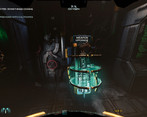
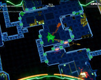
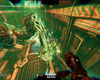
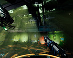
A Co-Op Xeno-Horde Procedural Rogue-like
Submitted by SALT_ (@DERELICTION2020) — 9 hours, 10 minutes before the deadline
Add to collection

Play Xeno-Horde Rogue FPS

DROSS // DEMO's itch.io page

Results

CriteriaRankScore*Raw Score
Art / Graphics#234.2864.286
Sound/Music#313.5713.571
Overall Fun#403.4293.429
Controls / UI#473.1433.143

Ranked from 7 ratings. Score is adjusted from raw score by the median number of ratings per game in the jam.

Leave a comment

Log in with itch.io to leave a comment.

Comments

(+1)

Hello, before I get into the detailed review here's my video on the game if you want to see my VOD: 

We have to go deeper to escape a Hostile Planet - Dross Demo-Gameplay - FeedbackQuest4 - YouTube

Now I want to point out that I made this video before your update, so it's slightly outdated. And I had the mindset of "testing" a game instead of "enjoying it" if you know what I mean. lol

I understand that the game is in Alpha, so of, course it won't be a complete game just yet.

During the video, I found a few exploits & bugs with collisions & physics, I was able to get behind things or use the environment to fly up to somewhere I wasn't supposed to be.

The block/parry, I kept mistaking it for some melee attack at first. It just sounds & looks like an attack & not some block.

The reason I accidently threw so many grenades at first, was because gamer habits had me think "right click" = aim-down-sights & not throw grenades. But how the game was designed, something like ads would only destroy the game. So, I'm pleased that ads were not a thing for such a game.

I found the incendiary grenade really cool, a was expecting a generic "Molotov" but instead it was something for driving away the Xenos from that location & kill the ones that didn't move away. I was just confused at why I had every grenade waiting to be picked up before level 1, except the stun grenade. Thinking now, I'm not even sure if they were any grenades, lol. But that might just be my poor perception.

During my video, I did not use the best of tactics meant for the game. I forgot all about the map, & I was not being quiet at all. This is all on me, but something about the game didn't really feel like I was going quiet. Possibly because of the music.

Most of the sounds, did not sound "good". But since this is in Alpha, I let it slide. But I want to mention about the importance of variety in sounds, even if you are playing the exact same audio, changing it each time it plays by a very small amount like the pan, speed, pitch, etc. It makes it less likely to make ears tired because there is variety. The blocking, stun grenade, & healing sounds were the most noticeable sounds that hurt my ears. The healing sound sounded like it was playing several "healing sound" on top of each other & thus it sounded horrible.

The PS4 controls were not easy for me, but that is because I'm a Keyboard-Mouse shooter. But the reason why I used the PS4 controller at first was because the PC controls felt weird at first? There was nothing really wrong with it, it was just my mouse sensitivity was all over the place & it was difficult to get it to work (restarting the game fixed this completely though). But as I mentioned in the video, my mouse wheel is broken so I was unable to switch grenades the way I was supposed to. I recommend in the future to add key-bindings but that is not necessary in the games current stage. I would say that with the controls, everything was natural, if I thought a key did something it did so in game. Same with the PS4 controls, it did everything as expected. So, there was very little need for me to "learn the controls" so I'll complement on that achievement.

The core mechanics of the game are fun, but I can't fully enjoy it in this current stage, but I see the potential. So, you succeeded in putting this in my watchlist.

So, there was a lack of animations, but that is fine in the alpha stage. The game lacks polish but that is to be expected in this stage. So overall the game was fun enough for me to want to play the full game, but not good enough for me to fully enjoy it just yet.

So, thank you for reading my review I hope it was useful to you in some way.

Submitted

So, I decided to try this, and it took me so long because I'm not a huge fan of FPS games. I'm going to consider that when I rate the overall fun/difficulty LOL I suck at aiming and hitting my targets, but I acknowledge that's my fault (not the games) haha OK... moving on...

OVERALL FUN:

1. I think you have a great game here. A lot of fun, and I like the tight hallways and hordes of monsters that come at you. Throwing a flaming grenade at them was very satisfying.

2. I found the opening a bit confusing. I like your little robot companion, but some tutorials appear so fast on screen, sometimes offscreen, they're easy to miss. While the way you do messages and tutorials is creative, I feel important tutorials would be better to actually pop up on the screen as a window.

ART/GRAPHICS:

1. Very well done. Good artwork, animations, and effects. The textures look great with a lot of details. The lighting was done very well.

CONTROLS/UI:

1. Some sort of mini-map or radar on screen would help. Or at least an indicator that something is approaching you from behind. It was kind of challenging to keep scanning around to see which direction enemies were coming from.

2.  There were moments when my flying robot companion was trying to tell me something with a dialogue box, but I was looking around and didn't notice it. I think some sort of audio queue would help here. Maybe a specific beeping sound effect alerting players your companion has something to tell you?

3. I can't tell if this was me... or your game's hitboxes. Like I said above... I'm really bad at shooters, so I already struggle with aiming in these games, but there were moments I felt like I was hitting the enemy and nothing was happening. I'm not sure if you just don't have an animation/health indicator, or if I was missing. This part did feel a bit off (hitboxes, etc). BUT... again... this also could have been me.

4. When you obtain new items... it would be nice if the item list (top left) went a bit slower. Sometimes they popped up really fast, and I couldn't tell what I actually picked up.

SOUND/MUSIC:

1. While I love rock music, it feels out of place in your game. You build such a great dark atmosphere at the beginning. I'm like, "Oh, this is going to be creepy." Then you go down the elevator and BOOM... Metallica is blasting in my ear. I feel you should really keep the scare factor going... more nightmarish music. Maybe some chase music. Save the intense rock music for a boss battle or a big, intense scene.

2. The rest of the sound design was good. Great background noises, the glass breaking while I was exploring gave me a couple scares, and the pickup/interaction audio was great.


I did enjoy this considering I don't really like these types of games. Well done and keep up the great work! Good luck with the development of this and future updates!

Developer(+1)

thank you so much for trying the demo! Best advice I would give my previous self would be not skimp on tutorials. There’s a lot of info that I need to cover, and it’s very crammed in atm. And not explained very well. 

I wanted to note that there is a full top down map, toggled with Q or dpad down. I will make sure this info is more clear thank you. It moved from the hud to a separate toggled screen. This is to stop people (mostly me) from over using it to navigate. 

Im gonna keep working hard on it, I am glad that you tried it out! Cheers 

Hi! I'm from the Feedback Quest and the VOD is up of your game if you are interested.

LINK: https://www.twitch.tv/videos/1823141067

Small disclaimed, my comments during stream and what I am about to type can be painful to read. I apologise in advance.

The game was clunky. It genuinely needs a lot more work put into it. A game that is built with hype and such speedy pacing when the battle starts, needs clear indicators when playing. I didn't spot the weapon I was supposed to pick up, the fights felt clunky, the enemies didn't feel satisfying to kill. The music was hype but somehow I clipped through the world and fell infinitely. 

The game has a lot of potential but in its current state, I can't say its a good experience but I hope to see it improved later and in a better state.

Personal Rating: 2/5. The game needs a lot of work to be good. The potential is clearly there, the feel and atmosphere as well but the lack of polish and design limits it.

Developer

thank you for checking out the game! Would you be open to trying a later update? I ask because I have been putting the newest updates that fixed collision issues, improved the tutorial to make it more clear, only on steam. I know I should be more careful, I just forgot to update the game here, so 2/5 makes sense IMO.  

Don’t worry your critiques weren’t harsh, and I know I have a lot of work to do. That’s why I keep working on it and put it in the jam so I can get help with feedback! 

I would love to try and play the updated version of the game. Please send me the link here and I'll try and get to it for my next stream. 

I stand by what I said, I believe in the potential of your game but what was presented in its current state feels too rough. Again I apologise for being harsh. 

Developer

Thank you but really you aren't being harsh at all :) I really appreciate you would give the game another look!

https://store.steampowered.com/app/2083940/DROSS/

Could I ask you to take a look at this update off stream? the controls should feel better, it should not be possible to collide through the floor / walls / most objects. Also, the volume sliders in the pause menu should now work (again) without any one sound too loud (minus the loud elevator warning)

The story behind all this was actually kinda interesting, so ill share for context. This is also why I asked you to check it again. One of my streamer friends just recently tried the game, and it was BAD! Long story short, very similar issues. His issue was a very good computer.

There was no max framerate limiter, and the player character moves faster than the physics worked and the level loaded! He was hitting the walls and objects. Kinda bouncing off of them. So, had to stop like, after a few minutes due to all this. But him and I, we went over everything and its all fixed (not just my opinion) This update also reimplements 2 different enemies.

I know it doesn't fix everything, But, this should help! Id check out the stream if youd like to send me a link and time :D

BTW, this update is also on here, Itchio. But the best place to get the most recent (for sure) would be Steam.

Thank you again!

(+1)

owhh that makes a lot more sense. Aite I'll download your updated version on Steam. I'll be sure to respond here once I've tried it. Thanks for keeping me updated and sorry for the delay on my end, I've been quite busy.

I am going through all submissions to make all developers aware of an important Google form I've made.

I'm joining the IQ folks to help organize smaller events in between the main FQ event in order to help prevent us from getting too many games in main events. Right now, I have a planned structure for these events but I would like to hear from everyone who was in this event in order to tune things better. The survey is a bit long, but it covers as much as I could think of. If you can take the time to do the survey by June 1st, I would immensely appreciate it!

You can find the form here: https://forms.gle/P9LPYwERhJtpZzteA

(+1)

Hello from tonight's stream!

This game looks very good and has amazing control of character, so much so that I had to turn the mouse sensitivity to the lowest setting. The music once you got started also rocked.

That said, I'm unsure if right click is a good choice for grenades. Things also felt rather confusing when it came to the robot. It'd stop and say something but you wouldn't necessarily notice since the game didn't make you look at it. I missed a lot of what it said as a result. Using the robot for a flashlight also felt hindering at times. Also, as a streamer, while I could stream the game fine, it still used a lot of graphic power to prevent me from monitoring my stream properly. I do think more waves of optimization would help.

Oh, also, I glitched through a wall. XD

Developer(+1)

Thank you so much for checking it out! I will work on optimizing the game for stream and in general, tho I havent found what the culprit is I think its something on the GPU side. would you have ideas for what to use for right click, or grenades? my focus was on gamepad, keyboard and mouse could use some attention.

Is there a link to the stream? I'd love to check it out! thank you again

(+1)

Link to the VOD? Certainly!

I'll have to get back to you on the right click usage.

Developer

Thank you!

Developer(+1)

I watched the stream it was great! It was a little choppy, but that’s due to me needing to optimize it more :) but a slightly lower resolution would add 10-20 FPS. 

Im keeping on working on it, seeing you play it really helps, thank you again! 

Jam Host (3 edits) (+1)

The game runs pretty well on my mid-tier PC, I honestly have no experience in the genre so I am as "fresh off the boat" as it comes in this playtest. 

Tutorial took me alot longer to pass, probably compared to average players. 

I suggest a different font for the instruction and overall gameplay would be very helpful, all caps and long string of words slapped on screen makes me want to dodge reading, as all cap is actually takes longer for the brain to process than normal texts. (according to my experience in typography training)

Then there's the silence of bgm in the tutorial stage, probably add a bit more ambience in case you got a player like me stuck there for a while, the game would seem more finished. It's a small tweak. 

I appreciate the fact the game marked that the settings is work in progress, for playtest and streaming purposes, I advice bump up the order of the menu/ UI work, add FPS speed options, it will help us stream your game with more efficiency as you perfect the rest of your game.

I only got to stage 1, so I will just say the stage... since it's pretty dark all the time, would need a bit more visual cues on the road maps to aid the player in navigation and not have to rely on map as much especially when there are enemies. 

VOD (your segment at 01:02:29): https://www.twitch.tv/videos/1817769943

Developer(+1)

thank you! That helps a lot, I will work on those changes. Thank you for trying it :) 

Jam Host(+1)

glad it helps. :)