Play game
PROJECT AEGIS's itch.io pageResults
| Criteria | Rank | Score* | Raw Score |
| Art / Graphics | #51 | 3.062 | 3.750 |
| Controls / UI | #55 | 2.654 | 3.250 |
| Overall Fun | #57 | 2.858 | 3.500 |
| Sound/Music | #58 | 2.654 | 3.250 |
Ranked from 4 ratings. Score is adjusted from raw score by the median number of ratings per game in the jam.
Leave a comment
Log in with itch.io to leave a comment.



Comments
Hello! Welcome to Feedback Quest 6! My name's Hythrain, and I'm one of the hosts and streamers for this event! This feedback is being written live on my stream.
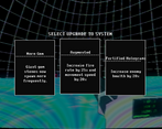
I like the visuals of this, even if it does add some confusion to what's going on. As a first person shooter, it also runs very smoothly. I also liked the choices fore upgrades, though I was confused why there were upgrades to make it harder. Overall, the game has a good start on it.
As for what concerned me, a lack of feedback from taking damage is the first thing I was against. The first two times I died, I didn't even realize why because I didn't think I was getting hit.
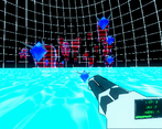
Another thing that I didn't like was how enemies with crystals required you to hit the crystals itself instead of the translucent part. I feel like the whole being should be susceptible, with shooting the gem doing more damage.
I also couldn't figure out what the goal was. Am I supposed to kill the spawners? If so, then the gem vs. translucent thing comes in again. Even if it's a demo, the player needs an idea of what they're supposed to do.
I see promise in this one. I can't wait to see more.
Thanks so much for the feedback!!! :)
Okay not going to lie, I really like the Skull O Matic powerup from Vampire Survivors + added difficulty so I wanted to place something like it into the game lol. My intent was to introduce better upgrades into the pool if the player improves the enemies. I did not clearly show any benefit of collecting enemy upgrade initially. I now am thinking of placing all enemy buffs into a single upgrade path to mimic Skull O'Maniac as increasing individual stats does not make too much sense to collect! At least with increased spawn rate + slight stat boost to feel it's easier to get XP faster at a slight cost early game while the enemies are weaker.
Yep! The feedback of getting hit was a problem. I have already fixed this in a new version of the build which I will share in the future! Also great point about the enemies. I will most likely go about this approach!
As for the goal it was to survive as long as possible, and I did not make that super clear sadly. This was the result of scrapping around 2.5 weeks of work because I made some design decisions that messed with the run and gun nature of the game really badly. The new goal is going to be to survive 10 minutes, and it contains more enemy behaviors + bosses. I have now written a mission objective on the new HUD that explains the goal as well!
I missed the stream due to some last second obligations, but def look forward to the VOD! I wanted also say I appreciate the streams you do for indie developers, it's so valuable to get these and along with helpful feedback! :D
It took me a little bit of time to get used to the gameplay. It feels more like a FPS with roguelite upgrades than a survivors-like. I was a little confused why I died the first couple of times; I think it was because the enemies were translucent, while their gems were opaque, so I thought I was supposed to walk into them to collect the gems, not knowing they were enemies. Later on, I somehow died by enemies that spawned behind me? I'm not sure what happened.
I liked the upgrades, although some of the choices seemed like it would increase the difficulty instead of making me stronger, e.g., making enemies have more hp or spawn more quickly. I'm not sure why I'd choose that over upgrades?
There was also one time when I had 2 upgrades in a row, and I think something odd happened there.. I don't remember what exactly though, maybe the game continued on or something?
Overall, I think distinguishing the enemies from collectibles would be a great way to improve the game!
Thank you for your feedback. I appreciate it! :)
The learning startup time snags people at the moment. I am planning on a tutorial due to this feedback. I am hoping it helps out with getting started.
I feel that. This was the early endless mode as I ran out of time to get other enemy models ready. I was hoping to see if I could capture the feeling with what I had now. I have a timed survival mode for the next update so I am hoping that gets the survivor-like genre a bit more. I definitely feel my game is on the more loose end of the survivor-like genre as some core things from Vampire Survivors I wanted to replace in favor of other mechanics.
I have received the enemy comment a few times now, and am currently redesigning the enemies to make that easier to understand! I will take your collectible comment when designing the enemies :D. I am thinking I will embed to make it obvious they cannot be collected! Also going to add in a mini map and hope that helps with the behind the camera deaths.
That was a bug found! I am in the middle of patching that one up. The upgrade works, it's just that the resource was labeled all wrong.
The enemy upgrade was a concept I was planning around with and I am a fan of the Skull O'Manic powerup lol. I ran out of time, but when collected they added better power ups in the upgrade pool. I will make these more obvious when I design the cards. I am also hoping to add synergies for it as well!
I really like the retro vibes and the idea you have here! It definitely needs a bit of polish but I think you've got a great basis to work on. I did play the 0.4 version initially so this may be fixed but I also got stuck in the intro room like the previous poster did. Adding an in-game menu to that area so you can restart if you get stuck would be a great addition. My biggest feedback with the actual gameplay is that the upgrade enemies being such a little red/mostly transparent can make it very difficult to tell if it's an upgrade you can pick up that is flying towards you or if it is an enemy that still needs to be killed. Also, the game seems to really want to be a run-and-gun shooter which is great. But because of this, I never got to choose an upgrade because I would be shooting when the upgrade menu popped up, immediately selecting something before I had a chance to select them. Freezing the game and locking inputs for a second or two would really help offset this or simply using a keybind like 1-3 to select options instead of the mouse click so that firing doesn't lead to accidental ability selection. Otherwise, I think it's a great project and you definitely nailed the nostalgia.
Thank you for the feedback! :D
I agree with the enemy's feedback 100%. I feel they even blend a bit into the floor. I am in the middle of redesigning the enemies art for V2 at the moment, and I will take that into consideration for the new design.
The upgrade menu definitely needs an improvement. I am adding in an animation for when it appears + disappears, so I am hoping that delay for the animation player to finish should fix that issue! Also I like your idea of mapping the selection to keys as well. I will play around with keyboard input rather than mouse for powerup selection!
Those sound like solid ideas. Depending on the animation, that might be exactly what it needs to prevent the accidental selections.
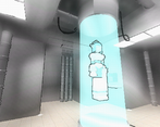
Surely like for retro stylization! Aesthetically It's pretty nice for me, the only things where I would like improvements is controls and character physics. I understand it's about retro, but it does feel a little wooden. Also I have stuck in the wall inside first room when I walk around and inspect the capsule. Overall, this is nice project!
Thanks for playing! :D
I have already definitely got to improving the controller due to the feedback. I have already tweaked the controller parameters and added some sounds + animations to the player already for movement actions! Also a good catch on finding that wall bug. Once again thank you for the feedback!
Nice demo. The controls feel nice and the weapon animation is awesome, especially with that rotating halo that looks super cool. I found it really difficult to survive past the second wave of enemies. Maybe it’s just a skill issue (I suck at FPS games) but it was hard for me to aim properly to the hologram enemies.
It’s a little difficult to understand what’s going on when the enemies and gems are getting closer. Also, it’s not entirely obvious when you get hurt or what is damaging you.
Another thing I would improve is the jump, I don’t know why but I feel like the character would jump much higher in this game. Maybe there is an upgrade that increases the jump height?
Also, what’s up with the upgrades the improve the enemies? That is interesting.
Anyway, I think it has a lot of potential. Visually it looks great. The controls are nice (except for the jump). And the weapon is really cool.
Thank you for the feedback, I really appreciate it!
Yeah I can definitely agree it's hard to tell if the enemies hit you. I wanted to do a slight vignette effect with a screenshake with robot buzzing but lost time. I am working on that right now actually as that was something mentioned before! I will also adjust the difficulty of the waves a tad as well.
Actually yeah there is a better jump powerup! It's somewhere in the pool of upgrades. That being said though I agree the base jump is still not high enough. I will adjust the number for that in the next update and probably adjust how its coded as the way gravity works makes the character fall way too fast.
I am glad you think it's interesting! I was not able to get the art for baby skill trees inside the game, but by upgrading the enemies better power ups would start appearing in the pool that were stronger but come with a catch similar to Binding of Isaac's Devil deal system. I am playing around with it still, but introduced it early to see the reaction. After I polish off and adjust a few powerups I am hoping it work better with the system.
Hello! Just wanted to say that my game is more of aprototype than a full on demomore of super early demo now. I am aiming for a 20MTD / Devil Dagger hybrid FPS kind of game. It is still a bit underbaked but hoping to improve graphics, sound, etc every update + fix bugs.Regardless I would love to get some feedback and suggestions on what I have so far! :)
I made a slight update to the game! I will be adding more, but had to make some adjustments to meet the deadline for another feedback I am part of !
UPDATE v0.4
KNOWN BUGS:
UPDATE v0.5 (HOTPATCH)