Play game
Fata Morgana Demo's itch.io pageResults
Criteria | Rank | Score* | Raw Score |
Sound/Music | #32 | 3.800 | 3.800 |
Overall Fun | #36 | 3.800 | 3.800 |
Controls / UI | #48 | 3.400 | 3.400 |
Art / Graphics | #50 | 3.600 | 3.600 |
Ranked from 5 ratings. Score is adjusted from raw score by the median number of ratings per game in the jam.
Genre #1
Strategy
Turn-based | Card Games | RTS | 4X
Rating #2
Family Friendly
Leave a comment
Log in with itch.io to leave a comment.
Comments
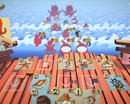
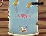
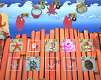
I never played a game like this one before; how should I call it? A deckbuilding tower defence game?
What I liked about this game:
-The gameplay
-The gameplay
-The graphics and the musics were nice too.
What I think would improve this game:
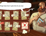
-The dev arts make it easy to confuse cards with each other (especially the axolotls), but I'm sure you are already working on that.
-The fact that there is only like 5 different icons for all the card improvements makes it also very easy to confuse them. (I'm also sure you are already working on that.)
-You can not see the situation of the battle when choosing a new crew between 3 (but for some reason, you can still see the map). A simple "see board" button who hides temporarily the card choice would really help making informed decisions.
-After finishing a stage, you have to manually scroll the map to go to the next trial.
-I don't understand why HP are shown twice.
Random thoughts (neither negative nor positive):
-Rat cards seemed weak compared to other cards, until I realise there are rat cards already in the starting deck... (They still seem less good than axolotls)
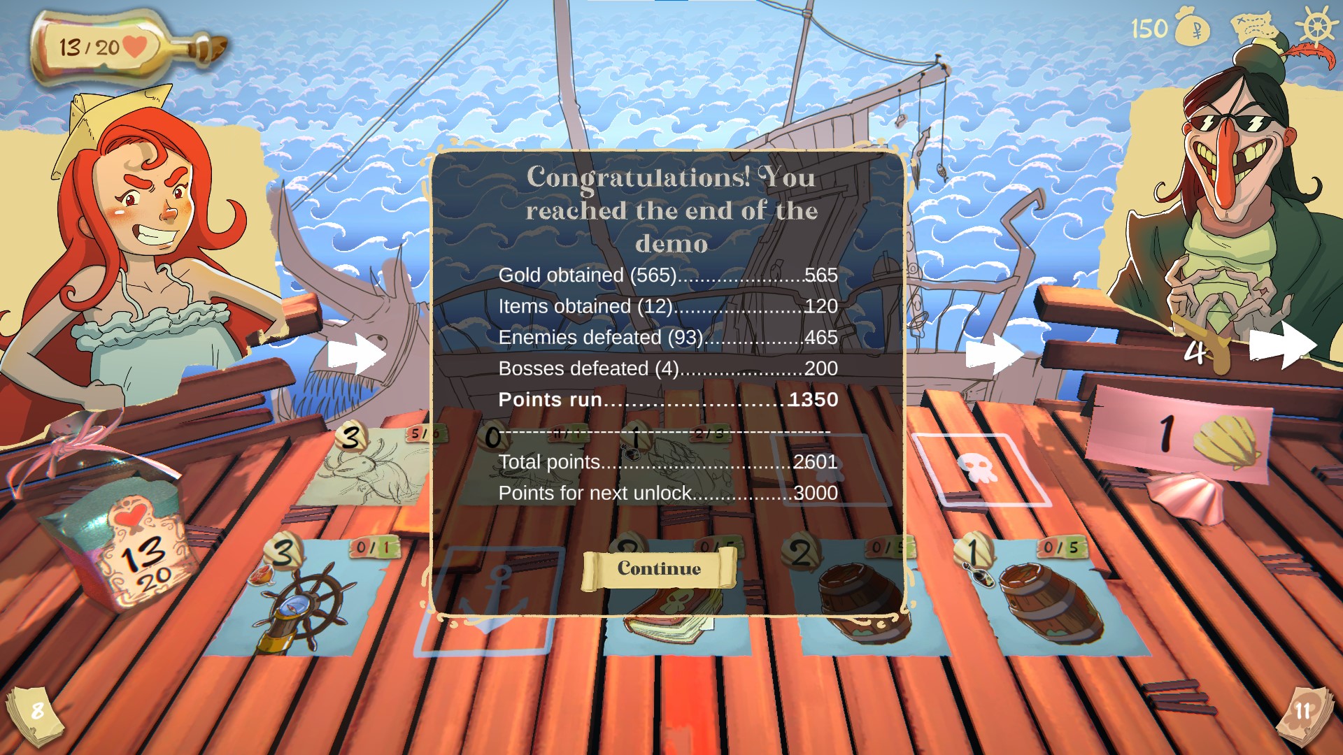
-I thought the game was quite easy at first, until I took too much confidence and let the final boss defeat me.
-I don't know how one can reliably afford the 6+ cards, unless you find a second rudder.
-I was a bit confused at first that you can not drag and drop the card, but I think the current system works probably better for this game.
-Should try a curse 6 run if I have the time before the end of the jam.
-I guess One Piece was a big inspiration for this game's graphics?
-There isn't much variety for ship cards, you plan to keep only the current three?
Hihi! Thank you for playing and your feedback! I' happy to hear you enjoyed our game.
Yes, One Piece was an inspiration for the game visuals :)
We were palnning 3 ship cards per character, that can be modified with items, but many players are asking for more variety so we many add some more.
I'd love to have your thoughts about curses, since we don't have a lot of feedback about them yet. If you get to play a level 6 run let us know how it goes please, even if it is after the run.
(There's a link to our discord server in the game,in case you would like to keep playing it while we develop it)
Thanks <3
Oh I forgot to mention, you can look at the board when choosing a new card, there's an important feature we didn't explain in the tutorial, you can use mousewheel to look ahead and see the whole board.
So I played and won a 6-curses run.
-Curse 1: Doesn't change much, as it is only one shield when there is 20+ enemies in one battle.
-Curse 2: Makes stalling out big threats with cheap creatures way more dangerous.
-Curse 3: Makes shop less interesting to visit. I would say I visited one less shop on average.
-Curse 4: Harder bosses are welcomed.
-Curse 5: Having only one item per crew prevent stacking a bunch of buffs on one powerful creature and makes the game less confusing.
-Curse 6: I didn't let enemies merge very often, so it wasn't at all a big deal.
More random thoughts:
-I tried using the wheel during card choices, it helps but you still don't have a view of the whole battlefield.
More random new bugs:-A auto-save feature would be nice to add at some point. (But I'm sure you are already working on it)
-There should definitively be a score multiplier for cursed runs
-The crab is surprisingly better than I imagined
-The waiter and cheap heal in general as well.
-I have yet to find a card that makes me want to play rats.
-Confused and shielded enemies should lose their confused/shield icon after the effect has expired.
-The game managed to drain 80% of the battery of my laptop in 40 minutes, there may be some optimisation needed.
-Enemies' UI isn't big enough for enemies with 10/10 or more stats
-The stunned animation seem to be missing when an enemy is stunned more than once.
Congratz!
Amazing, thank you sooo much for your feedback, you are so on point! <3
Sen did a nice review for your game, check her VOD
3:38:27 Fata Morgana Demo
Thank you! Can't wait to watch it!
The game was fun, it's got an interesting, puzzle-y kind of vibe. I think my biggest gripes with this were the artstyle, and that the starting cards were kind of bland. In fact, I found most of the cards I started with or found during the waves to be kind of weak and kind of situational and I wish I had more ship card available to me.
Overall a solid effort, althought clearly underdeveloped at this stage, as many cards only feature sketches and the game could have way more bells and whistles. (As expected from a work in progress)
Thanks for playing! I'm glad you enjoyed it, thank you for your feedback