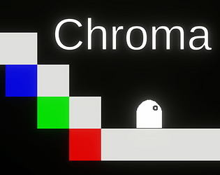
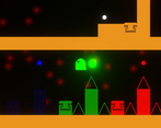
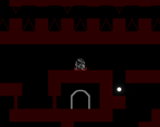
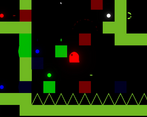
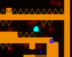
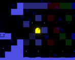
I usually dont like game where you cant see, or the mechanic of reduced visibility. But the way you implemented it with the lights and the colors was very interesting and fun. My biggest critique is that I felt the jump was a little floaty, aside from that well done!
Play game
Chroma's itch.io pageResults
| Criteria | Rank | Score* | Raw Score |
| IDEA | Was this game innovative, or did it use interesting mechanics? | #32 | 4.167 | 4.167 |
| Overall | #88 | 3.450 | 3.450 |
| MOOD | Did this game have atmosphere, or did it make you feel something? | #97 | 3.417 | 3.417 |
| VISUAL | Did this game have nice graphics, art or design? | #109 | 3.583 | 3.583 |
| AUDIO | Did this game have great music or sound design? | #134 | 2.917 | 2.917 |
| FUN | Was this game satisfying to play or did it bring you joy? | #146 | 3.167 | 3.167 |
Ranked from 12 ratings. Score is adjusted from raw score by the median number of ratings per game in the jam.
Let people know how long this project has been going, or share a bit of its history.
Chroma has taken me a few months to complete. It's the first game I've made end to end. Being a one man team, I created all the assets myself with very little experience in game design, sound design, or spritework.
Comments
The color mechanic was really unique and well put together! This was neat!
Nice original mechanics, and really well presented visuals! I was a bit confused about how the color switching works at first, but that's likely my fault. Good work!
I love this game idea ! Really cool to have the different colors light up and reveal different platforms to get through the level. I would definitely use some UI to remind players which key responds to which color. Also, a way to restart would be nice because I got stuck in the darkness with the colors not lighting up at all a few times. Really nice job !
Play my game here if you get a chance :D ! snowin.itch.io/escape-path-beta
Appreciate the feedback. There is actually a way to restart through the pause menu. At any point you can pause and restart the level, or go back to the main menu. I debated about adding in a quick restart, but I was worried that if someone pressed that by accident they would lose a lot of progress. I'm thinking of adding in an indicator to press pause and restart if someone is in the dark for too long though. In general I try to keep the screen free of any HUD elements. I can easily add some more instruction to the page though.
I really like the idea! I start from checking different options in the menu, so I checked the controls before starting, but I kept forgetting which key corresponds to which color. Maybe it would be worth adding color indicators on the in-game UI with? It could show two things:
1. Which key activates which color
2. If you have that color available
The second point feels important for me, as I didn't get it at the beginning why I can't do anything after hitting S. Later I kept forgetting that I can use white. :D
Another sugestion that could make your game more accessible for color-blinded people is to add textures with patterns connected with each color. I think about something like on screenshots of this asset for Unity.
Thanks for checking out my game! I wanted to keep the game free from any unnecessary HUD elements, but I'll add those instructions to the game description at least to make it easily available.
In terms of understanding what colors are available, that's actually built into the game already in a bit of an interesting way. The colors you can use are actually contained within your character's color. As you use colors to see the world around you, those same colors leave your character. So when you start off you're white. Then say you use green. The world around you lights up in green, but you lose that color and turn purple. There's a bit of a lesson around colors to be learned to fully grasp it. This also created a bit of a challenge around making sure you don't run out of colors, because if you use them all up you turn black which makes it difficult to see and navigate around you.
I understand the issue regarding color accessibility. It's something I personally care about, but I struggled to find a way to have this concept be more accommodating. Patterns are a good idea, but they'll only go so far in the game as you'll end up encountering objects in the game too small to place patterns onto. I like where your head is at though, and that's definitely something I'll put more thought into going forward.
I like the idea that you "subtract" a color that is inside of you to light the world and that your current color is a hint what other colors you still have. The issue I had is that that was not what I expected. I thought that my character is more like a color-changing lightbulb. Because of that I was confused that character had different color than the one I used to light the world up.
An idea came to my mind of how you can introduce that mechanic without confusion step by step. You can make the player start with single color and give a hint how to use that color. After that you could spawn a color ball to show the player that colors can be recharged. After second use of the same color you could spawn a ball of another color and show how to use this one. You could repeat it with each color separately, and after that you could spawn balls of two different colors and show how the body color changes when consuming them and after using each color. You could again do that twice for each pair, so that the player can test each combination. After that you can introduce white by giving the player balls of three different colors. And using white would lead to finishing the intro level.
Good point with issue of fitting the pattern on small items. First thing that came to my mind was - do they have to be small? :D If yes, than some solution would be needed for that case. But I know that sometimes it is easy to fall into fixing problems created by some specific solutions (like making some elements small), while changing the solution is the easiest way to not have the problem in the first place. ^^
Good idea, regarding the colors. I was hoping the particle effects could show the color was being expelled from the character, but that's definitely not super clear. Level design is definitely something I'll consider.
I think the size of those objects is important. They're basically bullets that will kill the character. If they're too large they become very difficult to dodge. It's an important element to a lot of the levels, so I don't want to tinker with it too much. That said I could try adding a mode of the game that doesn't use colors at all (all white). It may not be the optimum experience for color-blind players, but it would be a cheap way to at least make the game playable for them.
This game had really cool game mechanics, I assumed wasd did the same as arrow keys but once I discovered wasd keys help to find your way I realized I was missing out on a lot. The neon-light graphic effects were really cool.
Thanks! All the sound effects were made real cheaply through through Audacity. Since I wanted to the effects to match up with the colors, I picked a frequency to represent each color, which gave me three (white is all three together), and made the music using sine waves of those frequencies. The other sounds were just made by mouth, and edited to sound like I wanted. I wanted to keep it simple since the art and mechanics are pretty simple.


Leave a comment
Log in with itch.io to leave a comment.