Play game
Pushing Boundaries's itch.io pageResults
| Criteria | Rank | Score* | Raw Score |
| Theme interpretation | #12 | 3.888 | 4.600 |
| Innovation | #28 | 3.550 | 4.200 |
| Gameplay | #73 | 2.874 | 3.400 |
| Audio | #85 | 2.704 | 3.200 |
| Overall | #101 | 2.704 | 3.200 |
| Graphics | #187 | 1.859 | 2.200 |
Ranked from 5 ratings. Score is adjusted from raw score by the median number of ratings per game in the jam.
GitHub repository URL
https://github.com/GreenCheese333/Pushing-Boundaries.git
Leave a comment
Log in with itch.io to leave a comment.




Comments
I thought the idea and the execution were really well done. While some puzzles were relatively easy to solve, there were a couple that gave me an "aha" moment and those stood out. The graphics could have perhaps done with some work, and the music got a bit grating after a bit, but they got the job done! The jumping felt very "floaty" and imprecise, which made the platforming a bit clumsy. The enemies were also very frustrating to deal with, but perhaps tighter controls would fix that. Overall, a nice game that fitted the theme well.
Hey, thanks for the feedback! I'm glad that you found some of the puzzles interesting, as that was my main objective with the game. You aren't the first to mention the jumping feeling off, so I'll definitely go back and fix that if I ever rework the game. As for the enemies, I had originally hoped to add more variety in enemy type but ran out of time, so I can see why a lot of the enemy placement might be irritating. Again, thanks for the comment!
Interesting idea! I thought there were some really creative puzzle concepts in here, as well as some comical spritework. I would say an issue I had was how cumbersome jumping feels. It made the puzzles harder to solve, in a way I'm not sure was intended.
Overall, nice job!
I'm glad you mentioned that jumping was an issue, because it was hard for me to get a feel for whether or not it fit the game. I had intended for the jumping to require momentum, but the levels I ended up with didn't always work with that mechanic so well. I'm glad you liked the concept of the game though, and I appreciate you taking the time to leave a comment!
Yay we're twinning 😜 (I also made a game utilizing the game window using GameMaker) Your game is still much different than mine and I feel like it was very creative. I just wished there were more elements that interacted with the border so there could be more of a puzzle element to the game. Nevertheless, had a good time playing your game~
Great minds think alike! :)
I like the idea of having interactivity with the resizing mechanic, and I plan to go back and add some new mechanics if I can find the time. Thanks for leaving feedback! Glad you enjoyed it!
The concept is creative. Not the first one I have seen, but I will give five star for innovation.
The gameplay unfortunately gets monotonous really quickly. From beginning to end it's basically the same thing. One of the main problems I see is that how the main mechanics of the game is puzzle-ish with the window resizing mechanics and all, and yet the difficulty of the game relies too heavily on the amount of enemies - that unfortunately doesn't accentuate that core mechanic. I think you should have added for example moving platforms, some block types that moves with the screen resize, or make the enemies more affected by the resizing mechanics one way or another (e.g. add new enemies that are affected).
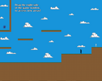
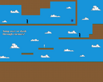
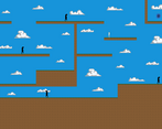
Another big problem is how linear the level design is. In each stage it is so obvious what to do. And then also there is also how plain the level design is... I have hard time describing what I mean exactly but... it is too square-ish perhaps..? Especially when the blocks are dirt and grass, I think the stage design should be a little bit more... curvy perhaps? I realize that with that mechanic making the stage slightly curvy would pose some problems though. Maybe the game would fit better if the setting is instead inside a laboratory or something?
The graphics itself is adequate. It can be better, but I think this is good enough. The SFX and music also fit the game well.
Overall it has got potential. I more or less enjoyed it, but there are certainly rooms to be improved. The criticisms are meant to be constructive, and I hope it helps and doesn't offend you. Good work, and I hope you will make better games in the future :)
Thanks for leaving so much great feedback! I had trouble trying to figure out how to make the game more difficult, but I really like the idea of having platforms or enemies that are affected when the window is resized. I will probably go back and toy with that idea if I can find the time. I also like the idea of a factory setting, and I know what you mean about the levels feeling square. Again, I really appreciate you taking the time to leave a constructive comment!