Play game
The Thing That Brought The End (GameDev.TV Jam 2020)'s itch.io pageResults
| Criteria | Rank | Score* | Raw Score |
| Mood | #56 | 3.563 | 3.563 |
| Visuals | #77 | 3.500 | 3.500 |
| Audio | #81 | 3.188 | 3.188 |
| Overall | #83 | 3.328 | 3.328 |
| Gameplay | #96 | 3.063 | 3.063 |
Ranked from 16 ratings. Score is adjusted from raw score by the median number of ratings per game in the jam.
Engine
Unity
Leave a comment
Log in with itch.io to leave a comment.


Comments
Loved the intro and tense music! The art is just not my particullar taste, but that's ok. Some sfx would have helped bring life to it!
Otherwise, very good job!
Hi!
I was supposed to work with an artist but in the end it didn't worked out so I had to do art myself with my poor skills. Agreed with you about the sfx.
Thanks for your feedback!
Wow, your game really managed to catch the attention with its art style and catching prologue of the story. Both music and visuals are kind of minimalistic, but so effective and intense, I would really glad to have a full-fledged game like that. Regarding some issues: apart from small details like challenging UI, the biggest problem for me was the lack of sounds. I really believe with a proper sound design, the game can become several times better. But overall, really cool, I will save the game for its music ahah
Hi AtymTima, thanks your for your feedback!
I do hear what you said about the UI and the audio. And you're not the only one to point those!
I'm glad you liked the game! It needs to rest a bit but I might consider doing a fully fledge version beacause I had some cool feedbacks.
Thanks for your comments! Cheers!
This was very cool and different! I got an error at the end - connection error- and I couldn't see any deck cards and there was a chain breaking picture.
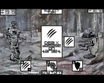
Couple of suggestions- at the first or second screen, you spelled developed wrong with two p's, I feel horrible pointing these out but I make so many spelling errors and can never catch them if no one shows me. The player and the enemy look great, but the background is a bit too blurry. Also the story part and the powers are all very cool but the font is too hard to read (even though it fits the horror theme perfectly)
As EsbenNyboe said, sound effects could be cool- though you are right about no sound effects not fitting the empty feel of the game, so maybe they would sound off. I love the audio btw, so spooky, but it loops a lot, I see you composed it yourself (wow, well done :D ) maybe add a second similar track that interchanges since you have the ability to do so? :)
Hi, thanks for your feedback!
The error at the end is part of the story, but many people thought it was a bug. The creature you unleashed is breaking his connection to the computer and the scientist that control him. That's why it says error. But I do understand that it can be seen as a bug ^^
Thanks for pointing the spelling mistake!
Totally agree with your thoughts about the music loop being too short, the background being blury and the font being not readable. Those are points that I will adress for my next games. Or maybe for this one if I want to improve it later.
Thank your for your in depth comments! Cheers!
This was very cool and different! I got an error at the end - connection error- and I couldn't see any deck cards and there was a chain breaking picture.
Couple of suggestions- at the first or second screen, you spelled developed wrong with two p's, I feel horrible pointing these out but I make so many spelling errors and can never catch them if no one shows me. The player and the enemy look great, but the background is a bit too blurry. Also the story part and the powers are all very cool but the font is too hard to read (even though it fits the horror theme perfectly)
As EsbenNyboe said, sound effects could be cool- though you are right about no sound effects not fitting the empty feel of the game, so maybe they would sound off. I love the audio btw, so spooky, but it loops a lot, I see you composed it yourself (wow, well done :D ) maybe add a second similar track that interchanges since you have the ability to do so? :)
Cool game! I haven't played a lot of games like this, so I can't say much, but I enjoyed the upgrading between fights and the music :) Did you compose the music yourself?
If you develop further on this, it wouldn't hurt getting some more sound effects. Especially for the fighting sequence, but also the UI-clicking between fights. And linking distinguishable sounds to each ability would make them feel that much more real :)
But doing such sound design is also a little time consuming - and maybe my priorities are totally off, since I'm a sound designer, haha XD
anyways, good job making this!
Hi!
I did composed the music myself. In fact a made a music with lots of instruments but it wasn't working well. So I took the track, removed lots of stuffs and made something more minimalist, and then it worked!
I also made some sfx in a short period of time (bfxr 8bit sounds mixed with real sfxs) but didn't included them because they were'nt fitting the "empty / desolation" mood of the game.
But I believe you are right, good and fitting sfx could improve the game.
Thanks for the feedback, cheers!
Cool! Well you managed to make some great music that really adds to the mood :)
This game crept up on me for fun. It took me a while to figure out the UI—some things don't communicate unusable states or which are interactive vs purely indicators that well—but once I got my head around that I had a lot of fun.
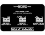
One thing I'm trying to focus on with my own games (and didn't do very well with in this game jam) is giving the player interesting decisions to make on a regular basis. Your game was great for this. Even when the enemy was defeated I had to choose whether to keep fighting or heal and upgrade. Then, I had to choose upgrades, and which new skills to take on and sacrifice. Always keeping me thinking and questioning. Great work!
Loved the unique art, but the UI didn't match it so much. I found the font hard to read and something a little more organic would've fit nicer. For all that it is holy (if you update the UI) don't choose something like Papyrus, Comic Sans, Markerfelt etc. haha
Anyway, great mood, I liked the music too. Was the theme SCP?
Hi!
I'm happy you thought the game had interesting decisions moments because it was one of the thing I was worried about. I tried to get inspiration from Sid Meier's interesting decision GDC talk. To be honest, the game had poor decision making right until the last 2-3 days where I managed to balance the game a bit better.
Absolutely with you about the UI and the font used. Not readable and confusing. And you're not the only one to tell me that.
And the music is just a track I put together quickly with samples from a weird machine called Nightmare Instrument.
Thanks for playing and commenting!
Congrats on the late change then. It really paid off. Sid's talk is great, I try to remember that too.
I googled the nightmare machine and found this intrument called the Apprehension Engine. That thing is amazing and makes some horrifying sounds!
Again, great work, dude. It was a lot of fun.
Yes it was that machine! I grabbed a video on youtube and cutted some slices to make instruments. + other sounds ofc.
Thanks for the comments! Cheers!
Wow I really art! It was super unique and managed to have contrasting elements which still worked together really well! The audio was also really well done. I liked how when you finished a battle, the audio would sort of fade out, as opposed to just shutting off. Overall, nice work, and good job setting the tone!
Glad you liked it! I'm not a visual artist, so usualy my games are made of cubes :) On this project I was supposed to work with an artist but in the end it didn't worked out, so I had to put something together quickly. I'm happy it managed to set a moodi Thanks for playing and commenting!
Wow great game! I got really immersed, and went in for a second playtrough! The link break really gave me an eerie feeling. I really had hopped that there would be more to do in that direction!
The art awsome, if the ability buttons matched the rest of the art i think it would be much nicer! (have them scribles and be worn out like the rest)
I do get that the font you chose ads to the atmosphere but its so hard to read. And read is almost all you do in this game! So having this kind of font for the comic parts might be cool but for the game elements it would be more important to be able to read it easily.
You created a great atmosphere, good job!
Hi!
The funny part is, the texts during battle were originally using the other font and button style ... and I took some of the precious time that I had left to change everything because the robot font "made more sens". Oooh what a silly me...
Thanks for your comment! Cheers!
Interesting RPG game. I really liked the 19th century monster drawings, and the music fits the game really well.
Thanks! I like how you described it as "19th century monster". I was trying to give a horror manga vibe with the style, but I guess it could also be 19th century engraving :) Both works. Thanks for playing and commenting!
Here's a recommend, check out Berserk(if you have the stomach for it).
This was original and fun game! I liked that how in the end I thought I managed to break the game somehow and it just ended up being part of it and created a nice touch on it.
Glad you liked it and finished it!