Play game
Unyielding Frost's itch.io pageResults
| Criteria | Rank | Score* | Raw Score |
| Theme | #1 | 4.571 | 4.571 |
| Aesthetics | #29 | 4.429 | 4.429 |
| Overall | #39 | 4.000 | 4.000 |
| Music | #43 | 3.857 | 3.857 |
| Story | #59 | 3.714 | 3.714 |
| Fun | #167 | 3.571 | 3.571 |
| Sound | #185 | 3.286 | 3.286 |
| Mechanics | #229 | 3.286 | 3.286 |
Ranked from 7 ratings. Score is adjusted from raw score by the median number of ratings per game in the jam.
How many people worked on this game in total?
1
Did you use any existing assets? If so, list them below.
no
Leave a comment
Log in with itch.io to leave a comment.



Comments
Great music! Great gameplay! Great idea and mechanics! What can I say... GJ
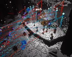
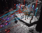
Really great atmosphere and cool system of scavenging and defending. Thank you for the awesome submission!
really great job. The best visually appealing game I have played yet. Also there were two modes of playing which added to the diverse gameplay. the updating using resource is well implemented.
Thank you for playing , I'm really glad you liked it, I tried hard on the models and such, and learned how to do particles by pretty much just messing around with the particle system, so its quite a bit cheesy but i really like how it turned out ^^
Really great idea that looks great... the feel reminds me a lot of Diablo 4... Well done!
It's cause its jank and made by bad developer :P
Nah.. the first few hours of Diablo 4 really build a good atmospheric game... the loneliness, the not understanding whats going on, slowly building power... its really good :)
Was just a joke cause im still a very new developer, but thanks so much for your kind words <3
Ja... still one of the things I'm learning as a new gamedev myself is to lean into my strengths even if they are by "accident", maybe mechanics aren't my stronghold and I should focus on more simple games with better aesthetics ¯\_(ツ)_/¯
I kinda get the ideas. It's nice to be able to venture for something and fight waves of enemies.
While the overall aesthetic is nice. The control is rather unfriendly for players.
It's adding difficulties on top of the NPC side.
Also I don't even know how to control during the waves and kinda lost during venture time.
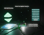
The HUD is too minimal, it didn't show much needed info. So I'm not even sure how the wave defend triggered. Maybe after I talked with the NPC? Well then that's added difficulty if I have no clue what I'm getting into, right?
So maybe provide more clues toward various activities. Draw the clear borders between the venture scene and the wave scene, so the player knows when to venture and when to defend.
yeah.. im sorry it for sure has problems, and i never was able to convey, the wave survival is just basicly a cutscene to see if you survived another night, perhaps if i spent more than 3 real days on it and had ever made a 3d game before heh.. , i do kinda wnat to go back and patch up this game tho so its more friendly and has a couple more features down the road tho.
Sure, keep working on it.
HI! The game is very nice, I really liked the concept of recovering resources and companions to be able to defend your base. The only flaw is that the purpose of the game and what happens is not immediately clear. You have to try a little to understand how to play. But overall it's fun and the graphic style is also nice.
Thank you for playing, and for sure i dropped the bomb on that, i tried to explain it a bit more on the GamePage because of it, but its for sure something that needs work.