Play game
ROCK PAPER SCISSORS OF DEATH (Game Jam)'s itch.io pageResults
| Criteria | Rank | Score* | Raw Score |
| Visuals | #29 | 3.195 | 3.500 |
| Audio | #33 | 2.647 | 2.900 |
| Originality | #48 | 2.647 | 2.900 |
| Overall | #53 | 2.282 | 2.500 |
| Gameplay | #54 | 1.917 | 2.100 |
Ranked from 10 ratings. Score is adjusted from raw score by the median number of ratings per game in the jam.
What was the most challenging part of making your entry?
I think with all jams its about managing your time. It would be sick if we could pop off an obliviion or Skyrim in a day but you gotta reduce scope to fit in the timeline.
What was the most fun part?
Probs just seeing where it goes. All my personal projects are usually FPS games so I just do random stuff for gamejams.
Anything else to add? (important controls, assets used, special mentions, etc)
The UE4 market place for free assets and sources online. Also my mom.
Leave a comment
Log in with itch.io to leave a comment.


Comments
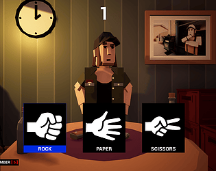
It would have been nice if there was some animation like the image that appears on screen would be used to show what your opponent chose against you. You don't have to animate the character since I know that rigging and animating it is a pain in the butt.
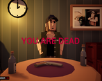
The moment when the enemy dies and ends up flying away, caught me of guard that I started to laugh out loud.
Nice work.
I don't find this choice visual approach necessary since most of the things are static and can be too heavy on some devices, but the scene looks beautiful despite they slows down the framerates and makes UI interaction not so smooth.
Nice work.
This made me think of the 2017 scriptable objects lecture and I thought you were going to have a dynamite class. XD Though, I think the gun suffices as the dynamite class. lol
Fun idea for sure, would have been nice to see a little more animations but the pure text approach worked nicely too :) Nice work
Im russian and I can have gramma errrors graphics very good, gameplay 4, oponent always choose a paper, sound 5, oriinality 5 and game on 4, have a errors what need to fix
UI is snappy and the sound effects are solid, the static screen is a loss, definitely would benefit from some animations.
it looks and feels realy but the text fucks up it would be better if you visualy show what happens instead of writing everything in text
ye defs next time would be good to show it with animations. Would be cool if I made the guy actually like pick up the gun and fire lol.