Play game
Aimless's itch.io pageResults
| Criteria | Rank | Score* | Raw Score |
| Compatibility with idea | #3 | 4.571 | 4.571 |
| Overall | #13 | 3.000 | 3.000 |
Ranked from 7 ratings. Score is adjusted from raw score by the median number of ratings per game in the jam.
Did you included the image of the generated idea in the game's description?
What game engine did you use?
Godot 4
Did you worked solo or in team?
Team of Two
Leave a comment
Log in with itch.io to leave a comment.



Comments
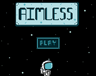
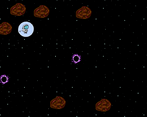
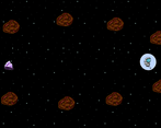
fun game! not sure if it would have went against the spirit of the one button rule but i would have loved to have been able to aim my shots with the mouse in order to go for drive by shots and enable more freedom of movement. i really like the floaty space feel of this game and i think you nailed the gravity. its a cool take on a one button puzzle game which is a pretty hard thing to conceptualize. individually i like the art a lot, especially the little astronaut guy, but i don't think its very cohesive as a whole piece in my opinion. the purple and sci-fi vibes of the black hole and the target crystal match each other but not with the baby blue wholesome astraunaut for example. the background music and sound effects do a lot to add atmosphere, theres one part that sounds like space crickets that really works. overall, i enjoyed playing it and i think you did a great job making a fun game that fit your prompt!
Like in space, if you mess up the throttling maneuveurs, you're screwed :( But in a game, I would suggest to have a possibility to restart or add bounds to the edge of the screen, because I managed to fly out of the visible area many times. Beside this, it's an interesting puzzle game with nicely designed levels. You incorporated the idea of one button steering, so it's also a great foundation for mobile casual puzzle game market. Generally, a nice entry, congratulations!
I found this game insanely hard, i dunno if im just terrible but the amount of force added felt super inconsistent and hard to effectively learn how to reapproach a level after a failure. nailed the concept and love the cute art, I'm just bad at it and got too frustrated :(
Thank you so much for the feedback! I'm sorry you found it so hard, but it's good to know that we might want to consider adding some sort of tutorial screen/option potentially if that might help players. We didn't get a chance to have anyone play test the game before submitting for the jam, so that could also be some of the issue as well. Thanks again for playing our game!
while the art is a bit inconsistent (linear filtering for pixel art is not the best look), the gameplay itself is really solid and i could see a lot of places where this concept could go, it was really enjoyable to play to the point where i beat every level. there was one bug which was that sometimes it seemed as though i would get launched at double the usual speed if i hit the asteroids at certain angles, but i did really enjoy this one despite this, especially with it being a puzzle game that doesn't ever have one correct answer. good game, could've played 10 more levels if they were there!
Thanks so much for the feedback! It's really good to know about the double speed bug and we're so glad the initial concept seems to be fun for people! We were also wondering: What do you mean by linear filtering for pixel art? We’re both still very new to pixel art here, so any explanation for that would be hugely appreciated so we can get better! Thanks again for taking the time to play our first little game!
alright so unless so at least to me the sprites all appear a bit blurry, they don't have the sharp edges that you'd expect with traditional pixel art. i see you used godot which has linear filtering built in. for pixel art you want nearest if you don't want the weird bluriness to show up. you can change this in under each sprites "texture" property, or before starting a project where you don't want the bluriness you could go to the import settings and change the default filtering to nearest (it's set to linear by default, which works better for something which is high-res and has curves for example). ultimately it is a stylistic choice so it's up to you, but i find that most newer developers don't know that their art can appear crisper if they are going for that pixelated style, and it really helps to give your spritework a higher degree of professionalism if that's what you're going for. hope this cleared it up!
Oh, that makes a lot of sense! That's super helpful and so appreciated, thank you again so much!
You guys did a awesome job on working around the restrictions of the theme.
Things I liked
Things that didn't sit well with me
Thanks so much for the feedback! We're so glad it seemed easy to pick up!
We do have "R" as a "reset" button, but we only listed the controls in the description and not actually in the game itself, so that's great to know that was a problem for people. We would have liked to add a controls screen in the game and didn't get a chance to do so, so it's really good to have someone point out that listing the controls should be a priority to add when we work on this project again. Thanks again so much for taking the time to play our game!