The art style, music, and theme all work really well together! The idea is pretty interesting, and could probably be extended. I felt that the "pull universe toward you" background effect was a bit disorienting, and overall the gameplay could use some speeding up / responsiveness. Well done overall!
Play game
WARP!'s itch.io pageResults
| Criteria | Rank | Score* | Raw Score |
| Design | #499 | 2.800 | 2.800 |
Ranked from 10 ratings. Score is adjusted from raw score by the median number of ratings per game in the jam.
Comments
The game have a very nice mood with a good choice of music ! After a while, I get used to the controls and it become fun to try to drive the spaceship. I think the very hard difficulty could stay fun if the rythme of the game was faster. Here, I had to start every turn by finding the shoot upgrade and that takes a long time so it feels like you can not repeat several play while keeping intensity. For that kind of very hard scoring game, I felt like I would like something like Super Hexagon (that have a similar sound design) where you die really fast but where two plays follow each other without interruption. Also, there are some very nice details, like the debris of the asteroids that can still hurt you, the different music for the score screen,...
Thanks for playing, and for taking the time to master the controls !
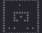
The maze at the start was intended to force the player to learn the main movement mechanic. You're right that it is slow to do, and annoying when replaying. We were crunching to get something which showed all the ideas, and didn't have time to really think about the level design.
I think a better version of the game would maybe have a (skippable or separate) tutorial showing the principles, and then an arcade mode where it just throws everything at you.
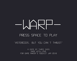
This is actually a pretty good game, good job you all! :) I actually really like how the game looks. Everything is "sharp" (the first word that came to mind), the font is great and the style of the assets is consistent (for example everything has a white border). But yeah, as others have said, the controls could have been better. I personally didn't manage to get used to the controls, thus not playing the game for a very long time. Also, I don't really like how the background moves a bit when you start moving. I would personally have liked maybe a bit of speed blur effect (or something like that), but then again, I don't know myself how to implement such thing and I think it would take some precious time :). This is a very small thing anyways.
Thanks for playing, and taking the time to give great feedback ! Glad you liked the art; I went for a white-on-black style initially, but decided to add some colour to make things more readable.
The controls have been tightened up, and I made the background react much nicer when moving (by which I mean, moving everything around the ship). I don't think it would be fair to upload the improved version while the contest is still going, but I do hope you'll come back and give it another try in a week or two !
Hey a fellow Löve game programmer :)
It is a shame the controls are a bit difficult to get used to. It kind of spoil the experience.
The power 2 and 3 are more interesting than the first one which is the equivalent of the a thrust (at least from the camera perspective). So the early experience doesn't really establish how the lack of thrust impact the asteroid genre.
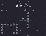
But I like that asteroids collide with each other creating some domino effect which is quite cool. I also like that you tried to use the points in the back to visualize the effect of your power but, especially for the first one, it can be a bit too subtle.
Thanks for playing ! It was our first time using Löve; but it worked out great.
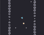
The starfield was important to help convey the powers, but I couldn't get the look for the first power quite right. I have some ideas for tweaks which I want to try out. As for the controls: I have tightened them up more in the mean time, but I think I will wait to upload a new version until the contest is over.
You made the controls really loose. I know that's how the original asteroids was, but in that game you didn't really need to go anywhere in particular. If you want the game to be more fun by requiring less precise movement, I would dampened all movement and rotation so if you stop turning or pulling space, your ship will come to a stop on it's own.
I know it's part of the challenge having the ship conserve momentum, but it's just not very fun that way.
Sorry most of this is just my opinion on game design. The game does look quite nice, looking somewhat like the next generation of the original graphics. And I like the mechanic where you have to pick up the core functions of your ship. It could be an interesting dilemma if I knew what all of them were going into each level and had to choose which was most important to get first.
Anyway, interesting game. Thanks for entering the jam!


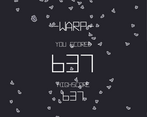
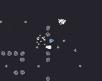
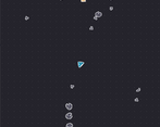
Leave a comment
Log in with itch.io to leave a comment.