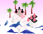
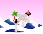
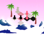
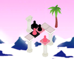
Really like the idea, it's very unique. Less enthused about the tutorial and user interface. It's very confusing what you're even doing at first, but I eventually got it. It doesn't help that the board is isometric and the arrows are straight, and it would be nice if there was some graphical representation of what I was even doing. But if it was more clear what your move actually was, I don't think I would really have any problems with the game.
Play game
Chess but Less's itch.io pageResults
| Criteria | Rank | Score* | Raw Score |
| Originality | #28 | 4.600 | 4.600 |
| Overall | #136 | 4.200 | 4.200 |
| Design | #279 | 3.914 | 3.914 |
| Adherence to the Theme | #532 | 4.086 | 4.086 |
Ranked from 35 ratings. Score is adjusted from raw score by the median number of ratings per game in the jam.
Comments
Hey, thanks for the feedback. As I was in charge of the interfacedesign I humbly accept the feedback. After we released the game I played through it and shared the same feelings you did. It was definitely a miss to go in so hard for the esthetic appeal, rather than functionality. The board being 45* and the buttons not, was just a dumb oversight on our part. But hey, we learn from our mistakes ^^'
Very fun and thought-out game! I really enjoyed the mechanic it had to offer and all i can say is amazing job!
Came for the aesthetics, stayed for the mechanics.
Cool and simple idea, the move designing mechanic has depth and really fun. The button directions were evident for me but I can see that it can be confusing for others.
I'd love to see a more polished version of this in the future.
Cool concept, the arrows being the 45 degrees to the board was confusing, and there were a few bugs like not being able to move in the way I programmed it, and one time I got moved to the next level without completing it.
It's a neat game though, unique concept, and the presentation is great.
You have made a very good puzzle game, and it is something very unique and fun. I didn't like your choice of colors (especially the way the text and background colors look together, as the text isn't readable enough). And it would probably be better if it was a top down game as the buttons are too confusing with this perspective. But the sprites look very good. Good job.


Leave a comment
Log in with itch.io to leave a comment.