Play game
Vortex Evac's itch.io pageResults
| Criteria | Rank | Score* | Raw Score |
| Adherence to the Theme | #506 | 4.114 | 4.114 |
| Overall | #558 | 3.762 | 3.762 |
| Design | #605 | 3.514 | 3.514 |
| Originality | #740 | 3.657 | 3.657 |
Ranked from 35 ratings. Score is adjusted from raw score by the median number of ratings per game in the jam.
Leave a comment
Log in with itch.io to leave a comment.


Comments
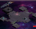
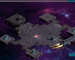
Fun implementation of the projectile mechanic. Winning is very satisfying. A bit hard to see when there are a lot of enemies on the screen and I'm tumbling on the floor.
Please check out my game as well if you have the time :)
https://itch.io/jam/gmtk-2019/rate/462985
I saved the vortex station!!
Honestly, this game is pretty solid in terms of tight mechanics. You made everything fit so well with the shot! The only thing that threw me off every once in a while was the changing recoil (I experienced way less recoil on the upper side of the screen, for some reason that wasn't very clear to me). I would suggest making the player's position more obvious, since I sometimes lost him on screen.
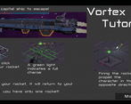
Also, adding a "Controls" section to your description (at the very top) would have saved me some time to figure out how to shoot/charge/move (I hate tutorials, and I refused to play through it haha).
Thanks for the feedback!
Loved the art, but i think the camera is was too zoom out. Also the animations after shooting looks weird, like the character is falling down.
If I were to go back I would absolutely zoom the camera in. The recoil does knock the player over, an attempt at some tongue in cheek humor on our behalf xD
This game is cool, the only annoying thing is that everything looks so tiny, I lose focus sometimes and can't tell where I am. Maybe zooming in a bit when shooting the rocket would have fixed that? BTW the sound the character makes when falling out of the vortex station is funny
Thanks for playing! That sound is a perfect example of "it's not a bug, it's a feature"!
Really cool art style! I had the same problem as everyone else where the camera is a little too far, but other then that, pretty awesome!
Thanks for the feedback!
Really cool execution, maybe the camera is a bit far from the player, but great overall!
Thanks!
I feel like it was a little to far away, had to squint a bit even with full screen. But the idea is great, and the art is really unique and works well. Nice job!
Thank you!
Game looks great! It is often kind of hard to tell what is going on though. I like how the circling of the boss let's you itermittently fire on it even if you don't fully grasp the movement system. All in all a great entry in my book!
Thank you!
I loved the game. Being me, I totally didn't read the tutorial and jumped right in. After a few shots, I figured out that the rocket was coming back and I was being pushed back by recoil. So it wasn't hard for me to pick up how the game should be played. I honestly loved the aspect of being pushed back (if you were going for the what would happen in space sort of physics stuff). I read that other people had issues about seeing the enemies on the screen. I know I didn't have issues since my eyes pick up on small movements but minor color changes might help others? But it might just be the scale size that makes it hard to differentiate but I'm sure you already know that! All in all I think its a great game. Loved the animations, design, and sound of it
Thanks! I'm glad you enjoyed it! :)
I like the idea, however it is very hard to control. Great music and visuals. Good implementation of the "one bullet" mechanic.
Nice work!
Thank you for the feedback!
I loved the game, especially after I figured out how to move around the platform. I only fell off the platform a couple of times. Ha ha. I had fun playing the game! Great job!!
Cool setting/concept. I found myself letting go of the charge before it was fully set up and having to start over, maybe decrements instead of resetting to zero?
Few visual communication issues, I wasn't entirely sure what was hostile and what was friendly on screen.
To me it looks like when the player is flying across the screen they're in a sliding position, so maybe having some sort of combo/reward for shooting/traversing the map before the player stands up would add to the experience, and keep players from playing too safe
Thanks for the feedback! A decrementing charge rather than a reset would be an interesting change. I'm going to have to experiment with that!
Nice idea! A good interpretation of the one bullet idea. My only problem is probably how small everything is, it's very difficult to see the player and the on ground enemies making it difficult to be precise. The game might have benefited from a smaller stage so you could zoom in more, or have it zoomed in and the camera scrolls with the player.
Other than that, it pretty fun. Takes a while to get used to the movement using the rocket, but it makes those last millisecond dodges whilst also simultaneously killing hordes of enemies very satisfying.
Thanks for your feedback, the size is definitely an issue! I'm glad to hear you enjoyed our game!
Really liked this game. I've seen a few 1 bullet interpretations, and I liked this one the best. There's real consequence for shooting too much (falling off the edge), with great reward for shooting far (hitting the boss). Design is really well done as well. Good job!
Thanks for your feedback!
i'm sure the game would be really fun if i could see what i was doing........
I'm sorry You couldn't really see what was happening, our scale is definitely needs some re-working. Did you try playing in fullscreen mode?
yes i did, everything is only a few pixels wide
The concept of this game is really neat. My only problem with it is that it's really hard to hit the enemies. For the normal ones that's mainly due to the rocket and enemies being rather small on the actual screen. When shooting the ship, I was never sure where I need to shoot the bulle so it does that auto lock-on thing when it comes close. And it's also hard to judge whether it'll hit a wall or not. I think most of it comes down to the game being very small though.
Thanks for your feedback! The scale of the game definitely could use some tweaking. I wonder if some sort of lock on feedback would be useful?
Interesting little game well done, sound design was great, great presentation and models too.
Thank you!
It was too small for me but i could manage it and defeat the ship. It was a fun experience. You could really make a cool game out of this.
Stay crunchy.
Thanks for playing our game! I agree the player is far too small, noticed that a little too late! If I were to go back I would have made the character model a little bigger with brighter colors so as to contrast with the level a little more.
Nice little game, but it would be nice if the character were a little more visible so as not to confuse him with the ground ! I think it's great to have included a tutorial in the game :)
Thanks! My biggest regret with this Jam is making the player too small. There is a lot of action happening on screen and a lot of cool animations are very hard to see. If I could go back I would adjust the scale of everything.
Thanks for playing my game!