Play game
Value's itch.io pageResults
| Criteria | Rank | Score* | Raw Score |
| Adherence to the Theme | #580 | 4.045 | 4.045 |
| Overall | #917 | 3.447 | 3.447 |
| Design | #977 | 3.091 | 3.091 |
| Originality | #1184 | 3.205 | 3.205 |
Ranked from 88 ratings. Score is adjusted from raw score by the median number of ratings per game in the jam.
Leave a comment
Log in with itch.io to leave a comment.


Comments
Nice game, It's very polished. It might be just my controller but the controls feels a bit awkward on the controller.
Please consider rating mine:
https://itch.io/jam/gmtk-2019/rate/463337
The core idea is really strong but the way it's executed right now is somewhat lacking.
The hitboxes for both the the player's and the enemies's actions are really small and confusing, combined with the somewhat slippery movement it feels like there's not option but to get hit by the enemy when you go for a melee attack.
The numbers also seem just a little too low. The idea suggests high risk high reward gameplay but there's no way this can actually happen when the player starts with 600 value and an attack for a starting weapon only costs 3.
My suggestion would be to make every action have more impact. Work on the game feel so that the hitboxes are bigger and enemy attacks are more well telegraphed and make it so everyone deals more damage and the player's attacks cost more. If the enemies have good and interesting drops, the player is driven to make difficult decisions about whether or not a battle is worth it and the game becomes way more interesting.
Overall, great job on the game, it has a lot of potential if you keep working on it after the jam is over. Good luck!
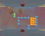
A very captivating game indeed. Took me a while to realize the thingies with the light bulbs are chests :D There's amazing quantity of different items and monsters, and it is ruthlessly balanced, as any roguelike should be - I've never managed to do any damage to the large lovecraftian monster that seemed to be the boss. Still enjoyed the game a lot. Oh, and kudos for supporting xbox controller :)
If you have a chance, check out my take on the roguelike genre: https://itch.io/jam/gmtk-2019/rate/460262
Quite fun! reminds me of our game. Beautiful artstyle, fun to play, perhaps the melee isn't quite as potent as I would expect for the risk-revenue that comes to get close to the enemy. Also, check our game, which has the same premise (roguelike with one value ) Its Rogue One https://itch.io/jam/gmtk-2019/rate/461305
As cool as this game as a whole could be I don't like how it works right now.
Overall just a lot of issues with the game even though it could be cool.
Impressive scope for a jam, and though some parts are clearly unfinished (bullets cough cough) the game is still a tonne of fun to play! Great work guys, and well done for managing such a large team for a jam :)
Awesome game, and great idea! In one boss room I found that I could walk through the wall in the middle of the wall if there was no door. Also on 4k resolution, the exit game screen was buggy. Overall, very impressive!
Cool Rogue like game. You've managed to create a randomly generated game with multiple enemies and different types each with their own effects. This is a massive project for a 48 hour jam. Well done!
Our game isn't as large of scale as this game but if you have a chance could you give our game a try: https://crypticsilver.itch.io/happy-accident
I really enjoyed this game! Having one value for health/currency/damage really adds another layer of strategy while playing.
My favourite way to play was to one keep one weapon at the beginning and sell the other one, and then sell the non-special weapons I find through the game.
In one of the playthroughs I accidentally spent too much money on the lottery and died :D
Great game good job guys
------
Hey, we made a GMTK game too. Check it out!
Nice idea, but the game certainly needs more polish. The weapons don't feel that impactful and using the melee weapons is almost suicide, because it puts you really close to the enemies. Some kind of dodge button would've also been neat. But I can understand that this has been created within few days, so for that it has some things going for it. The artstyle is quite nice looking and the game is packed with references to movies and games, which is always a plus.
Nice attempt and if the developer polishes it after the jam even more, it could be great fun!
Mixing life with money was very trick. Many times I died because I bought something more than my value. I was struggling very hard with melee weapons. I was almost dropping the game but I found my best gun, Rapid Pistol. I demolish every enemy with her. I dont know what each shield do but I only defeated the final boss with a shield that don't consume Value. The map's randomization is very cool. I defeat 3 times this game and each mapa was great. Sometimes, with many enemies my PC goes so low FPS that I coundn't even move. In general, good job!
The idea is nice and the art looks good but the game needs some polishing and tuning. The melee weapon are hard to use since it puts the player near the enemies and I can't dodge quickly after attacking. The ranged weapon are better but the bullet size is so small and sometimes hard to see. The visual feedback for damage is sometimes hard to notice. A health bar for the boss would be very appreciated. Other than that, the game is really fun and the procedural generation increases the replay value a lot. Nicely done.
Well done. One bug: some of the small orb enemies would get caught on terrain, including lava. I had to walk through the lava to find them.
Thanks for the report. We are having trouble with the unity sprite sorting in the build version of the game. I think this might be a bug in unity since it looks fine in the editor. I hope you still where able to have fun with it though. Thanks for playing!
I really liked the concept and the art was amazing. The music also felt really good to listen to. I think that the best strategy though was to always use guns because melee got you hurt and did so little damage. I think enemies should not be able to do touch damage for a little bit after getting hit. The final boss was to easy to find by just skipping rooms and was too easy. I also couldn't figure out what shop keepers gave you. Overall though the game was really amazing.
Thank you. That is good to hear. I think we are going to continue on this game at least a little to iron out some of these issues. We just ran out of time. We started work on the boss on Sunday. You know how it goes. Thanks again for playing and complimenting the art. I will pass it along.
I don't think it's really adherent to the theme, but it's still fun to play and for only 2 days it looks like a lot of work
Thank you so much for playing it and glad you had fun playing it! It was a lot of work and we really enjoyed making it. We where hoping representing health, currency, stamina, and ammo as only one number would be fit the theme perfectly, but maybe we didn't go far enough with it.
I think it fits the theme alright, but simple things like bigger juicier bullets would make it a lot more fun imo.
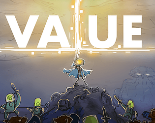
Interesting idea, not very original but well done, especially the cover, which caught me as soon as I saw it.
The menu is very nice and above all working, which I really appreciated.
Pretty smart enemies and a decent level design.
For a Game Jam it's a great result, congratulations.
Thank you so much for playing it! We where hoping representing health, currency, stamina, and ammo as one number would be pretty original. Maybe we didn't go far enough with it.
Love the concept: having just a parameter adds a level of complexity in resource management.
Gameplay-wise I'm not really satisfied: I couldn't understand when I could shoot, since there are many weapon with different fire rates I'd prefer having a visual feedback when the shot is ready.
With some adjustments it could be a great game. Keep working hard!
Thanks for the feedback. Did you also try out the melee attack? It has better feedback. It would be nice to have a cool down bar to show you when your gun is ready especially for some of the weapons that have a 3 second cool down.
A cool down bar would be extremely useful. Since I didn't understand shooting I began using just melee attacks. It is good, it's visually nice and has good feedback.
Great concept, but I feel like it wasn't playtested enough.
When shooting when your character is next to a wall the bullet just dissappears.
Biggest problem probably is that when you pick up a bunch of credits at the same time the sounds stack and it can get extremely loud to the point it hurt my ears a bit.
Bullets need a proper texture and in my opinion should be bigger but slower. Also more impact when shooting/killing enemies would greatly help.
Mainly needs more polish and bugfixing, but could be a great game!
Yeah, we just ran out of time. We are planning on adding these things later though. We even have art for the bullets. The bullets actually are different speeds depending on what weapon you pick up. I guess that was not obvious. Thanks for playing!
Cool little concept, fun art style. Suggestions: bigger bullets, more bullets and screen shake!
We agree! It’s something we are thinking about doing if we work on it some more!
Would be good but it's so odd how some things are well done and some are just awful like the projectiles (they are so small it's so hard to see them)
I get that. We just ran out of time. We even had the art ready for better bullets.
Yeah i suspected that, maybe too ambitious for a jam but you should try to expand it into an actual full-blown game, it might become intereasting