Play game
dreadshot's itch.io pageResults
| Criteria | Rank | Score* | Raw Score |
| Presentation | #1164 | 3.465 | 3.929 |
| Fun | #2602 | 2.583 | 2.929 |
| Overall | #2757 | 2.646 | 3.000 |
| Originality | #4993 | 1.827 | 2.071 |
Ranked from 14 ratings. Score is adjusted from raw score by the median number of ratings per game in the jam.
How does your game fit the theme?
The Graphics
Did your team create the art for this game during the 48 hour time slot?
Yes
We created all art during the game jam
Did your team create the audio for this game during the 48 hour time slot?
Yes
We created all audio during the game jam
Leave a comment
Log in with itch.io to leave a comment.



Comments
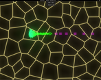
It is hard to see where the enmy shapes are and where you are shooting. I am unsure if my red-green colorblindness makes it even harder for me, but the visuals are very distracting from the gameplay. However I really like the effects, it is just a bit too much. Other than that it plays nicely.
Very good job on the art and sound! I just think it's a little hard to tell what's going on because of all the visuals. I still had a lot of fun playing!
Very impressive background graphics so good job on that. I think overall it's a good game for the timeframe.
I saw this on the stream, but I now got my hands on it too. As I mentioned on the stream, I'm really impressed by the technical aspect of the background and other parts of the audiovisuals, and it seems you were mostly trying to challenge yourselves in this area when doing the game.
The main problem I have is that the visuals and audio distract from the gameplay instead of reinforcing it.
For example, it's really hard to tell that you've been hit, to the point that the first gameover came as a surprise; visually the hue of the spaceship changes—which is a nice touch!—but this alone is hard to notice with everything else going on, and the particles look a lot like the particles for defeating enemies; in terms of audio I think it's the same sound as for hitting enemies—which is really juicy and nice—possibly at a different volume?
Some other thoughts on the audiovisuals;
Once again, I'd like to say I'm really impressed with the technical aspects of all of this, it's amazing given the short amount of time there was for this jam, and it I remember correctly there were two of you? I think it's actually harder to cooperate than to do things on your own, especially given the short amount of time; there's great teamwork, it didn't feel like the game had conflicted visions.
In terms of gameplay, I like the ramp up in enemies, it does make it feel more chaotic as time goes by. It's fairly standard for a twin-stick shooter, but there's nothing wrong with going with tried and tested formulas if your focus is a different aspect of the game.
Great work!
Thanks for the very detailed comment!
And i agree with you that the player getting hit is indeed not noticeable enough, although i only really thought of this after the jam was done ;p, so i did not have time to fix it. because currently it only plays a sound, and makes the screen shake a bit (but that's almost unnoticeable according to the people I've talked to so far).
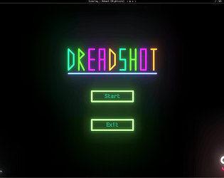
as for the warning, I've already created a new version of the game that has a warning on the menu, as well as two new buttons to change the bloom and remove the background, the explanation text on the menu also doesn't have bloom on it so its much more readable than it is currently. but sadly due to the way the jam works i can't upload these versions to itch yet, but these changes are available on the git repository.
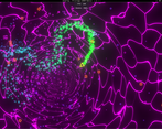
Also the backgrounds moving speed (not the colour changing speed) is somewhat tied to the music of the game, as the weird... wormhole type thing opens/closes with the beat of the music, but i agree that changing the speed that the colour changes might be a good idea if i make any more changes to the game after the jam. same for the idea of making it react to the players movement/position. i actually tried to create some 3D fractal art at one point during development but this seemed like even more distracting than what we currently have ;p.
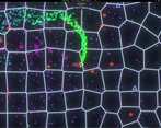
Yeah, I think that's unfortunate of how the jam works. As for the crazy visuals... there's a lot you can do with color theory; for example if the background is very chaotic but all very dark, or all with very low saturation, or all the same hue, or "blurred", and so on, you can make the foreground stand out from the background. Like if the voronoi background had colors ranging from 0% to 20% luminosity, and the foreground was mostly 80%-100% luminosity, it doesn't matter how chaotic the background is, it still has nice contrast with the foreground. The main problem was the intensity of the contrast within the background itself.
Now that you mention it, I think noticed during the stream there was a sync between the music and the background, which is a really cool touch. I thought it was more tempo-based sync than audio sync though. I think by the speed of the changes in background I meant more like the magnitude of the changes, like you're going form 0-100, when going from 0-1 would still be a noticeable and nice touch.
things get very chaotic :) good job !
It's a fun game, but the background movement really hurt my eyes, so I'm not going to rate it, because I don't think I got the full expierience
Hey, thanks for leaving a comment.
yea the background + the bloom can be somewhat of an issue for some, might upload a less bloom and static background version.
The seizure risk was worth it. The atmosphere is really well done and the music suited so well. An occassional camera shake would go along way, especially since i was distracted with the background and firing aimlessly :)
you might not notice, but when you get hit the camera does shake ;p, but i guess its not as much as it could be yea.
Thanks for the feedback!
! SEIZURE WARNING CONTAINS FLASHING IMAGES !
noticed that this page does not include any of the info that is on the game page so thought i would mention this here!
Also your health is shown by the colour of your ship Green = high, Yellow / Orange = medium, Red = low.