Play game
MeltdownPanic's itch.io pageResults
| Criteria | Rank | Score* | Raw Score |
| Presentation | #4053 | 2.200 | 3.111 |
| Originality | #4168 | 2.278 | 3.222 |
| Fun | #5149 | 1.493 | 2.111 |
| Overall | #5149 | 1.571 | 2.222 |
Ranked from 9 ratings. Score is adjusted from raw score by the median number of ratings per game in the jam.
How does your game fit the theme?
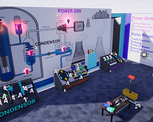
Goal is to manage a complex nuclear power plant with the input parameters changing at random intervals
Did your team create the art for this game during the 48 hour time slot?
Yes
We created all art during the game jam
Did your team create the audio for this game during the 48 hour time slot?
No
We used pre-existing audio
Leave a comment
Log in with itch.io to leave a comment.


Comments
Couldn't figure out controls
Controls definitely need to be more intuitive. I have a "manual" of sorts that describes the controls and goal of the game, if you want to give the game another shot. Manual can be found at this imgur link https://imgur.com/a/mu5mf44
I liked that you built this in Unreal, so good effort for that. I found the UI (buttons on the panels) weird and completely non-functional, so a tutorial would make a great addition into the game. I think the FoV is a weird choice, and the lighting is a bit buggy and weird, interesting choice of level design (shouldn't it be a room?). Also, I fell through the map by running into the panel on the very left side. Anyway, nice job for submitting before the deadline!
I agree that the UI isn't great. Thats one of the things I wish I had put more time into. Its not very intuitive that you have to mouse over a button or switch on the panel and then use a different number key depending on the console. It should really just be a mouse click and there should be a visual indication that something is interactable. Going to take a second swing at this project and improve that, as well as fix the FOV and the lighting
That's nice to hear! Good luck.
Was able to get the power going for 18 seconds, first second happened right at round change though. Would have loved to have the instructions on hand, like when I hold Tab they show up on the screen. But I do like the idea, nice job!
Thanks pit1s! Tab to throw the instructions/manual on screen would definitely be a dope feature. I'll add that onto the to do list when I take a second swing at this
Seems like a good game but I really can't figure it out. Controls are strange at the very least and there's just a lot of info thrown at you at once!! Maybe have multiple levels that start out simple and get more challenging. Other than that, I think you're onto something with this!
I realized it was a bit too overwhelming at the 11th hour when I was testing it out. If I took a second swing at this I would definitely ramp up the difficulty over a few stages and make the controls less wonky. Mouse click instead of the number keys would definitely make the controls more intuitive
I really like the visual style. It made me really curious as to what sciency stuff might happen!
Unfortunately the controls and objective were unclear so I wasn't able to interact with anything.
Hey Sam. I created an imgur link with a "manual" of sorts for controls and objective overview (https://imgur.com/a/mu5mf44), Thanks for taking the time to play my game! Hopefully the manual clears things up