Play game
King_Pong's itch.io pageResults
| Criteria | Rank | Score* | Raw Score |
| Enjoyment | #1372 | 3.396 | 3.396 |
| Overall | #2861 | 3.069 | 3.069 |
| Style | #3274 | 2.979 | 2.979 |
| Creativity | #3982 | 2.833 | 2.833 |
Ranked from 48 ratings. Score is adjusted from raw score by the median number of ratings per game in the jam.
How does your game fit the theme?
Plays an important role in the rules of the game. 7/10
Development Time
96 hours
(Optional) Please credit all assets you've used
kenney_input-prompts : https://kenney.nl/assets/input-prompts
kenney_shape-characters : https://kenney.nl/assets/shape-characters
perfect-dark-brk (font): https://www.dafont.com/perfect-dark.font
bfxr (sound_effect)
ping_pong tutorial (youtube OFC)
Leave a comment
Log in with itch.io to leave a comment.




Comments
Looks great, good sfx, and that charging glitch should just be a feature cause thats awesome.
Decently thought through idea, cannot win even once ^^ in the endgame its so impossible, the ai ain't stupid either
Thank you!
For the ai I just made him slow if your difficult are easy and vice versa
And I can add achievements in the future if you beat insane difficulty
Nice idea of tug of difficulty war. Neon-like art style also looks pretty nice.
Was a hard one, but i won!
Thank you!
wooooooow 2 members working on 1 porject, nice!!
Nice idea of tug of difficulty war. Neon-like art style also looks pretty nice.
Was a hard one, but i won!
Fun game, but looks to me that using the glitch is a must if I want to win, I enjoyed anyway.
probably i can fix it by making the wall smaller with area behind it if you understand godot
just to make strategy
For example... minecraft the bridge
I really like the idea, got a glitch where the ball got stuck under the bar but overall very fun.
Nice and fun game!
Interesting idea with changing the size of the one who is ahead in points. You can also play together, great!
Thank you
Also online mode is good idea but i didn't learn it
really cool take on pong, and great execution! i will say that the title screen still being visible during the game makes it a little hard to focus on the game, but its overall well done!
I am mad, for I am bad. This game is everything wrong with modern development. Mario Kart (Miyamoto-san's wicked blight on racing games) and it's introduction of rubber band mechanics has atrophied the modern race game enthusiast, and such comeback mechanics are a plague spreading across the globe. This brings us to me... someone with a medically diagnosed skill issue, unable to win, too stubborn to lose. For a score of days and nights, I wrested with the AI (on Normal) until I at last triumphed. I am tired. I crave rest, and so rest I shall, and forget this wretched game.
JK, this was super slick, showed a ton of character, and provided a deceptively simple twist on Pong that offered a lot of fun and frustration(the good kind) the title alone made me click when seeing it in another comment section. I had a blast!
Thank you and that scared me like my first jam
also i saw something bad in my screenshot
"submission" word, you know what that means
Oh, you mean commenting plays an important role in encouraging others and to invite more people to your game? it's perfect thing
I love your title screen, more games need to do this… show some character some of what the game actually is (specially if arcade-y like yours) on the title screen. high marks for that one!
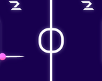
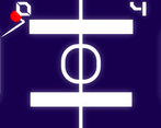
the gameplay is quite simple but well done, the grow/shrink pads makes sense with the theme, the score being a tug of war instead of flat points is also interesting.
as points of improvement:
overall good job, hope you had a good time making it