Play game
Size Up City's itch.io pageResults
| Criteria | Rank | Score* | Raw Score |
| Enjoyment | #6191 | 1.818 | 2.571 |
| Creativity | #6203 | 2.020 | 2.857 |
| Overall | #6576 | 1.785 | 2.524 |
| Style | #6960 | 1.515 | 2.143 |
Ranked from 7 ratings. Score is adjusted from raw score by the median number of ratings per game in the jam.
How does your game fit the theme?
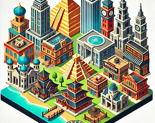
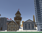
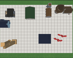
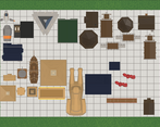
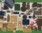
In this game you are scaling buildings up and down and placing them on the game board to build a city. You have to strategically size up and down buildings to try and maximize your how many points you earn. It fits the theme because you are changing buildings sizes and dimensions while placing the pieces in your city.
Development Time
96 hours
(Optional) Please credit all assets you've used
Artwork: Low Poly Ultimate Pack by Polyperfect
Sounds/music: Pro Sound Collection by Gamemaster Audio
GUI: GUI - Mono Round by Layer Labs
Leave a comment
Log in with itch.io to leave a comment.


Comments
Interesting take on the theme. Its a fun little point chasing puzzler game. I didn't feel much need to change sizes until near the end when I was running out of space and had to start shrinking things. Never once felt the need to make things bigger since that would just eat limited space.
Some small suggestions in case you ever work on it some more. It would be nice to rotate pieces. A bit of camera control would be nice, its a shame to build this city but not be able to clearly view it from all angles after finishing. The ability to check a piece's tags after placing it would be nice, either by hovering the mouse over it or by clicking it. Finally the grid felt kind of redundant as there's no grid snapping.
Otherwise a nice little game.
Thanks for the feedback! I do plan on working on it a bit more to polish it up. I plan on adding a camera that rotates once you've finished to be able to view your city from different angles at the end. The checking building's categories is a very good suggestion and I will try to find a good convenient way to do this. I also plan on adjusting the UI a bit to maybe try to make it easier / add more functionality. And thanks for the grid suggestion, I didn't think of it but it does distract you a bit since there is no grid snapping. I first wanted it to look more like a game board but didn't really accomplish this well haha.
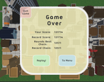
Suprisingly fun game! I managed a score of 137218. It kept giving me medieval churches.
Thanks! I think you've managed to beat my high score. In all of my tests I think in the 120,000s was the highest I could get.
I saw the video of game but idk why the screen is a little too zoomed when I played the game so I couldn't play the game
do you have a solution for that ?
Interesting, I haven't seen that issue before and don't have a solution for it. The only thing I can think if is that maybe the game window was small which changed the camera but it should keep the same aspect ratio.
Nice game!
Thanks, I appreciate it!
You've used cool 3d assets, it's sad that they are only visible from the top as they are hard to distinguish from one another. Maybe you could add a way to rotate the camera?
Hi vanyle, thanks for playing my game! I agree that it would be nice to see the buildings from a different angle/perspective. I tried to do this by allowing you to toggle from an orthographic camera to a perspective one but I agree that a lower angled camera that can rotate would be really cool to add. Thanks for the feedback!