Play game
Anima Crescente's itch.io pageResults
| Criteria | Rank | Score* | Raw Score |
| Style | #1863 | 3.496 | 4.625 |
| Overall | #3348 | 2.929 | 3.875 |
| Enjoyment | #3989 | 2.551 | 3.375 |
| Creativity | #4254 | 2.740 | 3.625 |
Ranked from 8 ratings. Score is adjusted from raw score by the median number of ratings per game in the jam.
How does your game fit the theme?
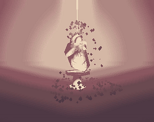
the game is centered around growing your soul, upgrading your character to battle a giant boss
Development Time
96 hours
(Optional) Please credit all assets you've used
NotJamBlkltr13 font by Not Jam @ itch.io
Various palettes from Lospec, authors on credits
CC0 Freesound SFX and drone
Leave a comment
Log in with itch.io to leave a comment.


Comments
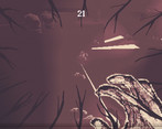
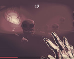
Art style and audio is pretty interesting, and the overall atmosphere is very cool. There are some problems with gameplay and UI. Firing is a bit random, instead of using a tiny square use a circle to define the overall direction of the shots, maybe also by using some esoteric symbols that can also contribute to the style of the game. The UI is difficult to read, while I'd use the stylish fonts for atmosphere, for important text I'd use a more readable font, also maybe some sound effects could help with UI interaction, those effect can create atmosphere but also are useful to give feedback to the player. I really enjoyed the art and concept, some flaws made the experience difficult to understand, but I really enjoyed it. Cool game for sure, to me it feels a bit like of a 3D version of Blasphemous.
Grate game, gould be pretty hilarious when you pick double speed multiple times. Art style is peak! Ui could be confusing, at first i tried to upgrade the stats by clicking on the stat name but not on a number below.
"Press R to stab yourself" is the best)
I really liked the sound of that as soon as I tought about it B)
Your game is really cool!! Im most fond of your grafics specifically. I was not sure what to do but I kicked around and it was fun, so good job!!
Glad you had fun! I’ll definetly have to work on clerar instructions tho! ^^U
Wow, really cool art design, good job!
Thank you! It was something I tried to focus on!
It surely has an impressive art direction. The shooting itself is also quite okay. The font though is horrible and very hard to read and it is unclear at the start what to do. Also the upgrade menu is pretty unintuitive to use, I didnt really understand how to buy upgrades besides pressing enter and sometimes it works and sometimes it doesnt.
But the option menu and artstyle are really good!
Time constrains and life got in the way so I couldn’t really design any more weapons, but I laid the ground work to do so more easily in the future.
UI design was one of the last aspects I put attention to so it really shows :( any suggestion for how to convey things better?
Some upgrades apply effects without clicking on the stas tho!
Thank you very much!
My main issue was understanding the shop menu. I didnt get how to buy upgrades at all. I tried clicking on the individual upgrades trying to unlock them, since I it seemed like my coin count would be sufficient. But nothing happened when I click on them. At some time I figured out I can buy ugprades with pressing Enter, but that was confusing since I dont even know what upgrades have been bought.
The hard to read font text also made it more difficult than it had to be. I tried to open the shop with F all the time since it looked like an F key, but it was E instead :D
Thanks for the feedback! I definetly need to make it clearer what upgrade is selected. And I also did’nt even know Enter could be used! I’m still new to Godot UI nodes so it’s kind of weird for me.
I’ve been able to click on all upgrades and see the effect, but maybe because I grew used to it, will look into the matter, thank you very much!
And yes font is a problem, I was going to include a font switch option but oh well, time ^^U