Play game
Scaled Survivors's itch.io pageResults
| Criteria | Rank | Score* | Raw Score |
| Enjoyment | #2165 | 3.119 | 3.119 |
| Style | #2766 | 3.143 | 3.143 |
| Overall | #3495 | 2.881 | 2.881 |
| Creativity | #5356 | 2.381 | 2.381 |
Ranked from 42 ratings. Score is adjusted from raw score by the median number of ratings per game in the jam.
How does your game fit the theme?
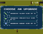
Upgrades scale attack size or dodge distance
Development Time
96 hours
(Optional) Please credit all assets you've used
see description for full credits
Leave a comment
Log in with itch.io to leave a comment.


Comments
Pretty hard yet very fun game!
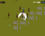
A fun little survivorlike, I think I managed to become immortal just with projectile size haha, not that is feels bad in a survivor game to be an unstoppable wrecking ball
A cool survivors style game. Did the game over screen have a replay button? That would be useful... perhaps I just missed it. Great work though!
My man was going around slaying everything in there path it feels amazing to be an unstoppable force to be wrecken with.
Cool submission. It's pretty funny to become hilariously overpowered. It would be really neat if there was some trade off for getting a larger slash attack, more wind up or cool down perhaps. It would be neat if there were more upgrades, even something like scaling up the size of the enemies so they move slower, have more health, and give more exp, for example. I think you could really take this idea up to 11 and it could be really fun.
It's a bit basic, but has a nice look to it, the enemies and character are fun and the UI is also pretty. It'd need some more gameplay options and challenge imo.
I was sad when enemies stopped spawning. I wanted to get projectiles so big they covered the entire screen! Fun game that made me want to keep playing. A pause would have been nice but it looks like tabbing out does pause it. Since the attack/dodge on was mouse button I was expecting the sword swing/dodge direction to be based on mouse pointer location and not the last player movement direction. UI was slick looking. It wasn't immediately obvious that you needed to click on icons and not the text since they are similarly circled. Overall everything worked really well together, good hit boxes too. Good job doing this in the jam time!