Play game
MageCat's itch.io pageResults
| Criteria | Rank | Score* | Raw Score |
| Presentation | #3274 | 2.581 | 2.581 |
| Enjoyment | #3611 | 2.258 | 2.258 |
| Overall | #3804 | 2.355 | 2.355 |
| Creativity | #4234 | 2.226 | 2.226 |
Ranked from 31 ratings. Score is adjusted from raw score by the median number of ratings per game in the jam.
How does your game fit the theme?
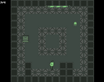
the player can roll a dice to change the way objects are in the room
Did your team create the vast majority of the art during the 48 hours?
Yes
We created the vast majority of the art during the game jam
Did your team create the vast majority of the music during the 48 hours?
Yes
We created the vast majority of the music during the game jam
Leave a comment
Log in with itch.io to leave a comment.


Comments
Wow It`s realy good stuff!!! Of course there are some flaws, but the game is suitable, and if it is finished, it will be a cool TimeKiller for mobile devices=)
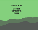
There's no option to actually start, it's just normal text.
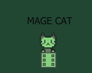
Cute character, nice color palette and charming music, but I wish there was a bit more gameplay
I like the idea of doing a Gameboy aesthetic, I'm not sure you pulled it off though. For your sprites - in Unity, when you're importing sprites, there's a line that says "Filter Mode" - for that dropdown, you should pick "Point (No Filter)" instead of "Bilinear".
Rotating the room with spacebar is an interesting mechanic, I'm not sure what the purpose of it is though. It doesn't seem to change the gameplay at all.
I think the music was really cute, and I love the character design!
A little strange that the menu UI is not centered and the pixel art has interpolation but in the screenshots its crisp.
Music and character are cute :)
the screenshots are of the windows build at the time I was not aware of why they were blurry for web but it turns out I just needed to change a setting in game maker HTML graphics for them not to be.
Thanks for the feedback
Very short with uninteresting level design. Has lots of potential though, with good art and music. I was able to beat the whole thing without using the dice power at all; making levels dependent on that mechanic would make it a lot more interesting.
The game is really creative and playable.
I like that you can push the little block around. It has great background music. I wish it had better sound effects though.
I really dislike the control scheme. The start menu needs the arrow keys, but gameplay uses WASD. And I am a bit unsure what the space bar with the dice rolling really does. I think it just changes orientation? That doesn't really introduce a new level of challenge.
However, I think you did a great job with the limited time you had!
A little short, but the graphics are very cute. good job
How do you start the game? I've pressed every button
Edit: Got it!
I think you use the arrow keys to move between options and enter to select
you use the arrow keys and enter to navigate the menus
sorry about that i forgot to put the menu controls on the itch page discrption