I call this “skill issue”
RedTeapot
Creator of
Recent community posts
Thanks for playing! Sorry for the jank, I guess now I know resizing colliders is not a good idea. The reason for growing gems and the player was to make an incentive to keep adding boxes to the boat (or otherwise it sinks because of weight). In hindsight, yeah, it didn’t work that well.
The seagulls can destroy boxes when they dive by the way. Won’t happen if you kill them quick enough though.
I agree about the controller support but I don’t have one, and more importantly I don’t really know of a good way to implement the pick up mechanic with the controller. Perhaps determining the angle and distance based on the joystick input? Feels like this would be very imprecise and require decent snapping to not be a rage game
I think movement and shooting is quite nice, and overall with some tweaks I can see this becoming a fun game.
As for the enemy pathfinding, perhaps context-aware steering would help - basically, that’s an easier way to have enemies avoid obstacles and keep distance from each other. Although if you want complex level layouts, you’ll need actual pathfinding. When I was fiddling with it, it was not easy.
As for the art, perhaps picking a decent palette on Lospec could work? I think colors go a long way.
Regarding gameplay, I think enemy hitboxes for projectiles could be bigger as that IMO would make the game a bit more fair.
Overall, nice job!
Thank you for reporting this, should be fixed now.
Here’s the invite link: https://discord.gg/HEvwtWy3Bq
A cool juicy shooter with simplistic but stylish graphics, and I liked the music!
What was bugging me a bit were the nice but slow restart animations. I’ve lost quite a few times, and I would have preferred to get back into action quickly.
Clearing the stage after taking damage is an interesting move, but resetting the player’s position felt somewhat distracting for me.
Also, I was missing the enemies quite often. Maybe increasing their hitboxes for bullets would help, or decreasing the spread, or at least increasing the rate of fire. Otherwise, I was spending quite a long time running around and waiting to recharge merely to miss again.
Not related to the game itself, but I think picking a more interesting name and having a more elaborate thumbnail would make more people notice the game. I think a simple GIF showing a bit of gameplay would go quite a long way since you have plenty of action in the game.
But overall, great job!
Ants are everywhere, and I like it. It’s a fun factory-ish (I guess) game, even had some room to optimize the routes for maximum APM (ants per minute).
Looks like the font is missing some characters, such as capital letters, so I had to lick the nest.
Also, maybe being able to set routes that don’t require returning to the nest would be nice for throughput, but not sure if it contradicts your design goals.
Great job!
Nice background music, albeit I’d prefer longer loops.
As for the mechanics, I think some coyote time and maybe jump buffering would help. And maybe zoom out the camera a little bit because sometimes I couldn’t see where I’m going.
And I’d suggest replacing the dead sprite with something else because that looks a bit off.
Overall, good job!
A nice little game, it’s a shame the balance is on the hard side. I loved the intro cutscene. Not a single word but conveys the story.
As for the feedback, I think some more juice wouldn’t hurt. For example, making the sword swing faster, adding damage flash to the slimes, maybe some particles and a hit stop too.
Nicely done!
I liked the atmosphere and puzzle design, especially lasers going into the boxes the internals of which you can rearrange. And having multiple entrances/exits - that was kind of a “oh, I get it” moment for me, took a while to realise that.
Good to have the undo mechanic, it turned out I needed that.
In general, I would like a bit more polish (like, animations, maybe some particles and so on) and faster character movement.
Nicely done!
I was thinking about increasing the size in discrete steps with an animation of some sorts and so on. Probably would still have a bunch of physics bugs though.
Now I think your idea is very interesting. Gems are also used as health so that might result in some interesting interactions. Like, if you lose a gem, you don’t need as many crates attached to the boat so you can throw them at enemies. I would need to figure out a way to spawn new gems but otherwise this seems like a direction worth exploring if we decide to work on the game after the jam.
Thank you for the comments!
I wish this game was longer, and I think it’s a good sign!
I have a couple of notes though:
-
I don’t think I need to read the doalogue again after losing. I liked that there was an option to speed it up and skip but I’d prefer if it didn’t appear at all.
-
It wasn’t really conveinent to have to look at the tiles and the timeline. Perhaps the tiles could flash in sync with the beat? Not sure if it would solve the problem completely but probably it would help a bit.
These nitpicks aside, great job!
Nice take on the theme, and the writing is funny.
However, the tutorial was too fast for me. Perhaps pausing at certain stages and waiting for a click or a button press would work better.
Somewhat related to that, I think the amount of item the client wants should probably be always shown unless forgetting it was part of the design. Otherwise, I would cut a wrong amount, receive some complaints in my face, have to cut again but then I don’t see how much.
Regarding the cutting mechanic itself, it would be convenient to be able to cut a piece multiple times if, for example, it’s still too big after the first attempt.
Good job!
P.S. Why is the window so tiny?
Quite a fun and polished entry!
Gameplay-wise, I think, having a currency system or something that prevents me from spamming all the guns would make it more strategic.
Also, since you have a variety of weapons with different abilities, having in-game descriptions would be nice because when I started playing, I had already forgotten everything. And maybe the enemies could have different weaknesses but that’s probably outside of the scope of the jam.
I liked that the enemies got smaller so you have to place towers of all sizes.
Nicely done!
It’s overall a great entry. Looks good, sounds good, has a nice introduction and everything.
I was having some issues with wall jumps (I was slipping down when I felt like I shouldn’t have), but in general the gameplay is smooth. Quite good level design too.
Amazing job, it’s a shame this entry has too few ratings. It deserves more recognition
Resizing the character seems to be quite a common theme for this jam, but having a sheet of paper that folds is a nice twist on it.
My main complaint is the collisions or something - when climbing up the pipe, I could not get out of it. Pressing space didn’t help, nor did making the character smaller. Don’t know if there is a correct way to do it.
Nice premise and visuals though, good job!
Movement took a while to get used to, but otherwise very fun and polished entry.
I think my only complaint is that sometimes the orb reset when it shouldn’t have (I touched a wall, perhaps the ground detector was triggered), and sometimes I was getting stuck on the castle towers when I almost fell down.
Nothing more to say, great job!
How can such a small paddle yeet such a giant saw blade?
Somewhat hard for me but really fun and juicy, as usual.
My only complaint is that I think the direction of the saw after you hit it should depend on your relative position, not on the movement keys you’re pressing at the moment. Or, if you add mouse controls, on the cursor position.
Sick game!
That intro text, lol.
Quite a cute game with good graphics and audio, it’s a shame that you ran out of time to add the planned mechanics.
I don’t know if this was planned or not, but I think adding some hints about what can be crafted with what would help. I managed to craft the hideaway but couldn’t figure out how to craft the rest of the items.
As for a bit of an improvement for visuals, a y-sort would be nice since the view is isometric to make the items properly appear before each other.
Good job!
It’s an interesting concept, and quite fun to play as well.
My main complaint is the bugs. Not sure if it’s browser-related or not but the tutorials were partially out of screen (which got somewhat fixes by lowering the page scale and reloading the game), and dragging the camera was kinda weird. I lost because of that - it took me too long to find where the computers are.
I’d also suggest increasing the hitboxes for computers and links - these were on the smaller side making it harder to click, especially since this is a thing you want to do quickly.
As for the gameplay, I didn’t feel a need to switch the flow on half-duplex links. Maybe you could add an indicator near the computers that would slowly fill up if they don’t send data for a while? That would allow me to see when it’s time to switch these.
Good job on your entry, I think with a bit of polish and bug fixing it’ll be a great little game!
I liked finding the “extensions” to the locations (such as deep forest), it helped spice things up.
I think most battles could be simply bypassed by clicking “explore” repeatedly, this way I was able to find 4 scales. Didn’t work in the underworld though, not sure if the chance is simply lower or you actually need to fight somebody.
I didn’t get the point of the city. There was a bit of dialogue but besides someone telling me I need 5 scales it wasn’t really useful to be honest. Given that apparently you can win by getting rich (at least that’s what the button in the dragon menu implies), perhaps someone in the city could hint at that?
Overall, nice job!
A nice little game, and a cute little cut scene!
Would be nice to have some music and sounds though, as it would help sell the setting and improve immersion.
My main complaint is about the randomness, though. It’s generally a complicated topic (I’ve made a couple of randomized jam entries so I had to learn it the hard way), so it’s understandable. Not sure if you already know this, so I’ll list my ideas about how it could be improved:
- Don’t spawn pedestrians right near the exit. I guess it’s fine if they walk past it after a while, but I shouldn’t be immediately stomped after getting out of the burrow.
- Maybe guarantee that an item is spawned each time you go out. Looks like items will spawn after a while anyway but I’m not sure waiting for them is a good idea.
- You can increase the difficulty each time the player obtains an item. For example, the first venture might have just a couple of pedestrians, the second will have the ice cream, the third will add mousetraps and so on.
Sorry for the wall of text, just trying to be helpful. Looks like this is your first game (at least according to the Itch profile), so great job on this one and good luck on your future works!
I think it’s an interesting idea, and the presentation is very nice (if anything, some particles could perhaps add a bit of juice).
However, I think it needs more constraints. For example, I didn’t use any blocks besides 1x1 and didn’t even have to use the web for movement - jumping is just enough to complete the level when you place the blocks strategically (and by that I mean 2 up, 1 or 2 to the side in a staircase pattern). Perhaps having some blocks that can’t be walked on but can be attached to using the web could help with that, as well as some permanent walls or classic spikes.
There were some, uh, bugs when you place two blocks close to each other (I was attaching to the wrong block), but overall I think the character controller is quite nice and fluid.
I liked the idea of having multiple build zones so that you can’t simply disassemble the level behind you.
Overall, I see that it was quite a lot of work to implement everything, so great job!
Thank you for such a detailed comment!
In fact, the boxes don’t shrink in water (they don’t shrink at all). Instead, you and the gems are slowly getting bigger, and the newly-spawned boxes are bigger as well. Now I know it’s not obvious at all, I think the size should change in steps which would be indicated by an animation.
Regarding the physics - yes, it’s indeed janky. Buoyancy turned out quite easy to implement but I really struggled with the character controller - the dynamic one was too floaty so I ditched it, and the kinematic one interacts weirdly with rigid bodies. Also, increasing the player’s size (along with the collider) does not help.
The ship is not supposed to suddenly sink, this was just another physics issue. This happened to us as well during development but I couldn’t debug and fix it in time.
Looks like this jam has plenty of character size changing games but yours does put a unique spin on it, as usual. Well-deserved fives all around.
I guess the only issue was that I kept breaking this level:
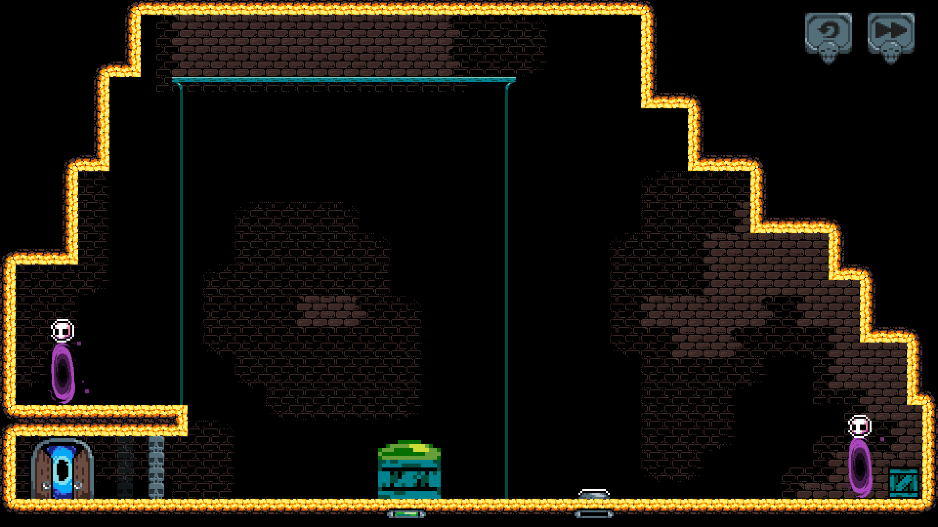
First my character poofed out of existence, then I got the box stuck on the wrong end of the portal. Perhaps a bit more space around the portals would help?
Also, jumping while holding down is not the most convenient control scheme.
These minor issues aside, congrats with another banger!


