This was great! I really like the style, clever puzzles, and interesting mechanics that are intuitive. I only wished for a button to quickly restart a level instead of having to go into the menu. Otherwise really solid all around. With a bit of polish this would be a gem.
Play game
Slime Matters's itch.io pageResults
| Criteria | Rank | Score* | Raw Score |
| Game Mechanics | #5 | 3.923 | 3.923 |
| Design | #6 | 4.308 | 4.308 |
| Overall | #6 | 4.026 | 4.026 |
| Interpretation of the Theme | #7 | 3.846 | 3.846 |
Ranked from 13 ratings. Score is adjusted from raw score by the median number of ratings per game in the jam.
Comments
Saw @OgelGames recommend this, great recommendation! One of my top picks now also
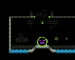
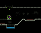
Really cool game! Lovely visuals, music and interpretation of the theme. Wish I was able to restart the level without quitting full screen with ESC because I kept locking myself. Those platforms that were comprised of a gray grid were hard to see at times, they seemed like background details, so I wish they were visually clearer. There are some very clever puzzles in this game, I hope you expand it more!
Thanks for the feedback, you’ve raised some really good points. I sadly didn’t have time to test the web-version as much as I’d have liked to, so I didn’t even notice that the escape menu would kick you out of full-screen mode! As for the slime-permeable platforms I was kind of aware that they might be a bit harder to spot but I wanted to keep the color palette small, and told myself I could get away with it. In hindsight I think that my judgement of their visibility was kinda biased because since I placed them, I already knew where they are and so they stood out to me more. So next time when I have to decide between a more concise color palette and visual clarity I’ll go with the latter.
I know how that feels, same thing happened to our game, we get too used to how things work/look. I don't think keeping the color palette concise would contradict having visual clarity, if you use a different value of the same color I think it already fixes the problem without standing out too much. Grays and browns are usually very safe to use no matter the palette. In your specific case, a low saturation blue could have worked as well I believe. The colors overall were very good, but perhaps playing more with different saturation of the same color could have enhanced the visual experience. Just decided to mentions this here because I'm a full time artist so I have no idea how familiar with color theory and the like the people who also code are.
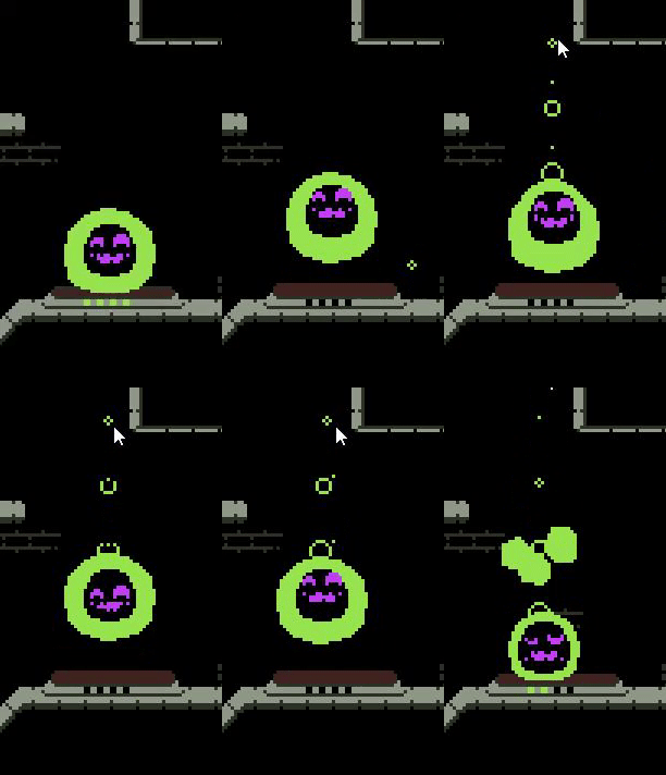
Thanks for the nice words! The slimes use harmonic springs and raycasts from the center of the slime to determine the shape. I basically have simulated springs that drive the desired radius of the slime and then I raycast from the center to that point to prevent any overlap with the environment. The source code is available on my github if you wanna have a look https://github.com/Umbrason/GodotJam-SizeMatters/blob/main/Shared/Slime/Rendering/SlimeRenderer2D.gd


Leave a comment
Log in with itch.io to leave a comment.