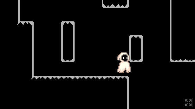
Play mod
game jame's itch.io pageResults
| Criteria | Rank | Score* | Raw Score |
| Fun | #102 | 1.636 | 1.889 |
| Controls | #107 | 1.732 | 2.000 |
| Graphics | #109 | 2.021 | 2.333 |
| Originality | #112 | 1.636 | 1.889 |
| Audio | #113 | 0.866 | 1.000 |
| Overall | #113 | 1.512 | 1.746 |
| Accessibility | #114 | 1.347 | 1.556 |
| Theme | #114 | 1.347 | 1.556 |
Ranked from 9 ratings. Score is adjusted from raw score by the median number of ratings per game in the jam.
Godot Version
Godot4
Wildcards Used
N/A
Game Description
its my first game on godot but in total its my second game its hard but i completed it so you can too
How does your game tie into the theme?
because the image said it
Source(s)
What is that is it this: https://kerya044.itch.io/game-jame
Discord Username(s)
N/A
Participation Level (GWJ Only)
0 its my first game jam and first game on godot
Leave a comment
Log in with itch.io to leave a comment.


Comments
Grats on the first game jam. The platformer was really solid, art style was consistent. Definitely could use a checkpoint system, and the level design should try an lead the player in a certain direction. I had to stop because I didn’t know where to go from there. Could definitely also use some music/sfx. Great job so far.
This is a very basic platformer.
There's really not enough here to critique, but what does exist is competently done.
Come back in January, and shoot higher.
I'm glad you were able to submit! I think maybe reducing your base resolution would have been helpful, or as Noskire has mentioned below, perhaps zooming out a little bit (would effectively be the same thing). It would allow the camera to sit a little further away from the player so more of the screen can be seen. At the same time, the drag margin on the camera is massive, to the point if you get anywhere near an edge, you'd normally want the camera to start moving so you can kind of see where you're going, but it had remained still. I recommend for a first full game to just reduce your drag margin, or turn drag off entirely.
That said, I'm really glad you were able to submit! Very impressed you were able to, since this is your first in Godot and only second overall. I think you have some real skill, given that, functionally, it was a good way to the point of being a decent platformer! Keep it up!
I think the camera should be a little far away, so we can see better where/when to jump.

Also, I got stuck in this part. :/
It's very challenging, but I can see the concept. Perhaps you should add some checkpoints and help the player become more comfortable with the jump mechanism before the level becomes difficult. Congrats for your first jam.
Camera movement needs some work in the vertical directions. It falls too slow with the player so I cannot see what is below. I'll die (from spikes) and I won't know.
You got the Celeste-type platform feeling down though. Good job.