Oh, I might look into implementing that. Weirdly enough, game was inspired by a Bluey episode. Thank you playing and the kind praise.
Vase
Creator of
Recent community posts
It wasn’t initially intuitive to launch the fish. It took me like 20 tries before I realized I was shooting backward. I eventually soft-locked myself by launching into outer space. Was really fun in the meantime though. I actually really liked the fact that I could skip checkpoints, seemed like an extra layer of puzzle on top. Interesting art direction as well.
Oh man, I love that we had similar game concepts. Funny enough, half-way through our project, we wished we had done it in 3D. I would love to know how you guys handled the shadows, from what I can tell it looks like they were handled with simple shapes rather than the actual shadows being cast.
The level design was really well done, short and sweet puzzles. Pacing was also well done. Art and music felt very cohesive. Felt like Hotel Transylvania might have been an inspiration. Scene transitions were handled well. I feel like the only thing that could’ve used more work were the UX elements like the ‘health’, menu and end credits.
Great work everyone!
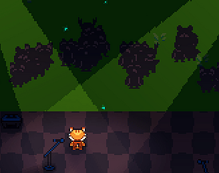
Thanks for trying and thanks for the feedback. I do feel like we didn’t do a great job at explaining the mechanics, but the audience has suggestions that get completed when you activate certain button/equipment and currently there are only 3 audience suggestions implemented.
- red button for lightshow/pyrotechnics
- blue square for the synth on the left. Need to push button then manually rotate past the 50% mark.
- blue dial for the riser/drop on the right, need to push the bar to the end then hit the drop button.
That was a lovely experience, I also appreciate the nod to Christmas with the music selection. I want to second the keyboard controls feedback, it felt very unintuitive at first but could eventually see myself getting used to them. I would’ve loved to have seen more work done on the visual side of things. I love what you did with the mouse controls as well. Great job.
Grats on the first game jam. The platformer was really solid, art style was consistent. Definitely could use a checkpoint system, and the level design should try an lead the player in a certain direction. I had to stop because I didn’t know where to go from there. Could definitely also use some music/sfx. Great job so far.
I enjoy the fact that you mentioned the edge cling mechanic. That was largely emergent gameplay because of a change in the collision model for the player. I liked it so I kept it in last minute but we didn’t have enough time to update the art. Glad to hear the appreciation for the level design and the music.
Loved the game. Loved the art and the gameplay feel, the game loop is good. Attacks feel impactful. Sound design goes well, could use some music. The game feels polished in general. Great job.
Some things small things I have feedback about. Food depleting in camp sucks. cold meter going. It was hard to start playing with so little food at the start.
This is top tier quality for a game produced in a week. It introduced several levels of game design throughout the playthrough. Art design was amazing throughout, it definitely seemed heavily inspired by hyperlight. Sound/Music design was on point. Gameplay was very solid.
My only gripe is that sneak attack seemed a lot more like a detriment than a helpful solution.
Great work, keep it up.
I survived for 2mins. I like the concept, but it felt pretty frustrating that the game didn’t pause when the shop was opened. Because of that I basically never knew what any of the upgrades did and solely smashed the cheapest one. I also never knew when I took damage.
Overall, I liked it but did feel like there could be a few improvements. Good job
Sprite art looks amazing and the game concept sounds fun. I personally found the difficulty pretty steep. It felt like the water was costing way too much, and the snow lasted pretty long with no indication it was over. I managed to build one plant before the tree timer went out. I didn’t manage to water the big tree a single time.
I would have loved to see the timers relaxed quite a bit.
This was an extremely fun experience. Visuals are great, concept is simple and executed real well. Unfortunate that there wasn’t audio.
Things that I think could be improved: Overall readability and first impression was difficult, I had no clue what I was supposed to be doing. Figuring it out is part of the charm but maybe the layout could’ve changed to have the first challenge on the left progressing to final challenge on the right with progress on top. The only other thing was getting that left slider into place was painfully slow with the current single .oo1 slider.
Love the entire experience, great job.
*Experience taken from browser version
I Survived.. relaxing mode. Had fun, thanks for the content. Simple enough controls and game mechanics. Enjoyed the lighting thing that was done at the end.
The things I think could be improved upon. Sfx volume was a bit loud with no way to adjust it. Art could be improved, readability of the UX could use some slight improvements. All in All, good job!
That was a great short experience, especially the wolf. Didn’t understand the lantern mechanic at first (didn’t see controls until second campfire), ended up skipping first campfire and going to the second one without a lantern on.
Visual Lighting setup was fantastic, would to see how the campfire was made. Overall great audio selections. Great pacing.
Things I think could’ve been improved. There’s a few sticky collision issues with the trees and there were some ordering issues between the player and the trees
Great job everyone.


