Indie game storeFree gamesFun gamesHorror games
Game developmentAssetsComics
SalesBundles
Jobs
TagsGame Engines
A jam submission

ANTISOCIALView game page

Don't Get Distracted in Making Becoming the Number 1 BLUTUBER!
Submitted by Intensechili2 β€” 17 hours, 29 minutes before the deadline
Add to collection

Play game

ANTISOCIAL's itch.io page

Results

CriteriaRankScore*Raw Score
Audio/Sound Design#282.7193.100
Theme#302.7193.100
Overall#332.5612.920
Innovation#342.4562.800
Gameplay/Fun#342.3682.700
Art Style/Visuals#392.5432.900

Ranked from 10 ratings. Score is adjusted from raw score by the median number of ratings per game in the jam.

Game Engine / Tools
UNITY, PIXILART, BOSCACEOIL, JSFXR

How does your game fit the theme?
You have to help the main character stay isolated and focused to his goal of becoming a live streamer.

Self-made stuff

Graphics / Art (e.g. models or textures)
Audio (e.g. music or sound effects)
Assets (e.g. free or owned)

Leave a comment

Log in with itch.io to leave a comment.

Comments

Submitted

Like the idea gameplay wise, but took me a while to figure out how to even fling them. A lot of it’s really unclear what’s happening, and I found the basic SFXR style sound effects a little brash and annoying. But I like the gameplay idea, I liked that i got a dragon. Really think this has potential!

HostSubmitted (2 edits)

Click click click πŸ˜†

GAMEPLAY
Frantic clicker game where trying to last as long as possible was enjoyable. Throwing enemies was fun, though grabbing them with the mouse was occasionally challenging.
The game became quite difficult over time, making it hard to sustain. I did not get further anymore after a while.

ART STYLE / VISUALS
Nice self-made pixel art style that complemented the game's aesthetic.

AUDIO / SOUND DESIGN
The music matched the pixel art style well, enhancing the game's overall atmosphere.

INNOVATION
The game wasn't particularly innovative but provided an engaging experience.

THEME
The theme was touched upon.

Good entry for the jam. Nice job!

Submitted

The game looks very nice, its just difficult to understand what's going on at first

Submitted

That was fun! The visuals and sound effects are very nice. It's starts very easy, but after a few seconds, there is a huge difficulty spike, and I couldn't get much further. Maybe it would be nice to increase the size of the area you can click to grab an enemy to make it easier and more satisfyingπŸ€”. But overall, it's a nice game. Well done!

Submitted (1 edit)

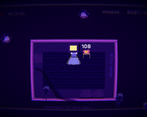
Fun concept and cool visual effects, but flicking away enemies so they actually disappear felt pretty inconsistent, and I had no idea what the things I bought in the shop did. After game over, I could also still hear the enemies colliding with the character and could still click the character to get more viewers. It also got insanely difficult with a huge swarm of enemies spawning in at the same time after around 13000 viewers or so, and like someone else said, the title cards were pretty hard to read. Overall pretty fun game though!

Submitted

This was super fun. I loved the music and the general audio and art design. I think the game itself is a tiny bit too difficult, I've rarely been able to actually pick the enemies and flick them despite being right on their bodies with the cursor, which only became a problem a half minute into the game when hundreds of monsters spawned and came my way lol. Still a pretty fun little game with lots of potential!

Nice vibes. Sadly I only have a trackpad so I found it a bit too hard, but I loved the cute intro.

Submitted

A nice little clicker game that ran well for me. The frantic gameplay was quite fun, I didn't expect to be playing many games with such a fast-paced take on the theme in this jam πŸ˜‚ definitely more my sort of thing.

I would have loved to see the "fling" use physics, so the distractions slid a little after you let go. It wasn't particularly satisfying to flick them away unfortunately.

I also thought there was a pretty massive difficulty spike after a minute or so, which I couldn't really get over, sorry! I don't know if there was some technique I was missing, but I just could not seem to flick them away quickly enough.

This would work really well on mobile I think πŸ€” the art style is interesting, but the title cards at the beginning were basically unreadable sorry! I think you need to pay a bit more attention to how words appear on the background you're using πŸ™‚