Play game
Lucent (Project Greenlight)'s itch.io pageResults
| Criteria | Rank | Score* | Raw Score |
| Aesthetic (Art & Audio) | #7 | 3.800 | 3.800 |
| Likely to Release | #15 | 3.600 | 3.600 |
| Overall | #15 | 3.350 | 3.350 |
| Interesting Gameplay / Fun | #18 | 3.000 | 3.000 |
| Bug Free | #24 | 3.000 | 3.000 |
Ranked from 5 ratings. Score is adjusted from raw score by the median number of ratings per game in the jam.
Leave a comment
Log in with itch.io to leave a comment.




Comments
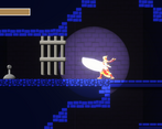
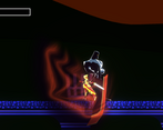
Running around the map was good fun, and I liked how the sword slash was bright. The wall jumping or the visuals for it seems off.
Also, I was running in to slash and then running out to kite the enemies. Kind of like dancing barely outside their range and pressing A and D repeatedly. The camera movement for this is kind of dizzying, but this is probably just because of how I was playing.
Favorite part was timing dashes to avoid enemy attacks. Congrats on the huge map!
Thanks for playing! Unfortunately dancing around the enemies is pretty much the optimal strategy at the moment. And I agree that the camera needs some work, it makes me dizzy too, but I'm not sure how to tackle that problem just yet. That's a future project's goal haha.
Hopefully for the polished version I'll have some more variety in for the player attacks so you can do more than just slash and dodge.
>What was the most frustrating moment or aspect?
The big enemies have seemingly no reaction at all to any of my hits.
>What was your favorite moment or aspect?
Discovering wall-climbing was in the game, and that I could skip enemy encounters using it, was cool.
>Was there anything you wanted to do, but couldn't?
I wanted more variety in my attacks.
>If you could change, add, or remove any 1 thing, what would it be?
The basic enemies can only possibly be a threat when they spawn behind you. If I wanted to keep the mobs of enemies, I'd have them spawn more often, make them damage on contact, and make them easier to kill so they're more of a threat but potentially less tedious. Idk if that's the solution here, but they need something.Excellent, great feedback, very spot on, thanks! In response
- hit feedback is coming
- stretch goal for Sunday is to get a 3-hit combo in
- the enemy spawner was just a temporary solution for submission, I'm working on making the grunts more of a threat as I type this and also adding a new enemy type to help support them.
Holy moly, that is a map if I've ever seen one! My jaw was on the floor after continuously going through rooms and thinking "yep, that's the end of the map" only to be greeted by MORE map. Very impressive.
Like Roldy said, the map menu is really nice. I have no idea if the "I'm stuck!" button that boots you out to the desktop is the final, intended purpose (I was expecting it to be some sort of hint feature), but I was laughing hysterically at it anyways.
As in the prototype, there seem to be some quirks of the player SM and the world that results in weird things like grabbing onto the side of ledges in thin air, etc. I also would highly recommend disabling autoclimbing on walls once you are in complete freefall, as it's disorienting when I am falling down to get to a lower area and I climb on a ledge without meaning to do so.
Very annoyingly, I got a wrong-warp glitch where I went through a door and I ended up in a completely different area, and the camera got desync'd into another area too when I tried to go back, forcing me to reset.
For combat, I think that the player being given some extra attacks that conserve momentum would benefit the flow greatly, esp. a dash attack or slide attack.
Awesome, thanks for the feedback! I'm glad you think the map is big, it feels pretty small to me, but maybe that's cause I know how big the world map as designed is).
Good catch on the I'm Stuck button, it's supposed to send you back to the last checkpoint but I didn't have that feature working yet, I should go fix it now.
That's a good suggestion for the ledge grab during free fall. But I also wouldn't want people to miss a ledge grab either - maybe if they're holding down while falling they can disable the ledge grab option, how does that sound?
As for the wrong warp glitch, I'll make a note to hunt that down.
Stretch goal for polish version is to get a 3-string combo attack in, we'll see how that goes and to smooth out the movement when attacking (like transition out of the attack animation at a certain frame if the player is trying to dash or jump rather than watching the whole thing). Adding buffer inputs to a lot of movement mechanics is also on my want to do list.
Thanks for the feedback, here's hoping I can fix most of it.
I like the exploration. And the map menu is cool. Character design looks good.
Wall jump/climb animation is a bit wonky.
Looks like alot of the game structure is in place which is impressive for three weeks. Plenty of potential but I would think this is a game with a very large scope.
Played on Windows. Didn't notice any bugs and seemed to run well.
Thanks for the feedback! I'm glad you like the exploration, it's pretty crucial. Unfortunately I didn't get to put in all the areas I wanted to, but so it goes.
Unfortunately probably not going to be able to fix much of that wonkiness in the time remaining (especially changing animations), but I'll do a quick pass to see what I can smooth out in terms of implementation/state triggers.