Play game
Stuck In The Liminal's itch.io pageResults
Criteria | Rank | Score* | Raw Score |
Music | #1 | 4.050 | 4.050 |
Gameplay | #5 | 3.350 | 3.350 |
Overall | #5 | 3.550 | 3.550 |
Comedy | #8 | 3.050 | 3.050 |
Story | #8 | 3.200 | 3.200 |
Graphics | #9 | 3.300 | 3.300 |
Ranked from 20 ratings. Score is adjusted from raw score by the median number of ratings per game in the jam.
Leave a comment
Log in with itch.io to leave a comment.
Comments
I liked this one overall, though I do have some complaints.
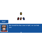
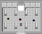
First, the good stuff. The sprites are solid Game Boy-styled images, each with distinct appearances despite the harsh color and pixel limits. The songs are absolute joys to listen to - not surprising given who's making them, but worth pointing out anyway. 😉 The maps are always just 1 screen - it's really easy to see where to go and it's virtually impossible to get lost. The puzzles weren't too hard to figure out but still made me think a little. The color switching mechanic is an ambitious twist on your standard rock-paper-scissors elemental mechanic, and even has interactions with the battle environment. Frequent save prompts, while not the most exciting feature, are still appreciated - I was able to play through the whole thing in one go, but having those saves at key points would definitely have been appreciated if I had lost at some point. The cutscenes were good too, with a fair bit of movement and fun banter between the characters. Those characters also had very distinct, consistent voices, something I haven't seen in many of the entries here.
Next up, the bad stuff. Trying to interact with the shards on the map was pretty buggy, exacerbated by the camouflage mechanic. I'm not exactly sure why it would happen, but there were moments where I would see the shards even if I wasn't camouflaged (the instance I specifically remember was in the room where we meet Alex), and even after toggling the camouflage it still wouldn't always register that I was standing on top of the shard spamming the interact button. Triggering the swim mechanic results in seeing an image of Alex standing on the floor and another of him swimming until the transition was complete - just a weird visual issue. I'm not sure how I feel about the team mechanics: having the characters switch positions automatically when you interact with their corresponding object is certainly preferable to having to dig into the menu and manually switch characters around to get the desired positioning, but then I have to question why the characters need to switch positions at all. Not sure what the answer is here, and maybe I'm just thinking too hard about it.
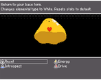
Gonna make a whole new paragraph for the element system because it's such a big deal. I think it needs some tuning, and some issues may have been due to the compressed nature of the game and constraints of the jam version. I think it would benefit to have some UI element similar to the one in RATD to help users remember the relationship between the elements. It could be something that can be toggled if not everyone likes it, but even with 3 elements I was having trouble remembering what the weakness/resistance relationships were. Another thing about the MC specifically: the only Blue skill available at the start is one that requires the enemy to attack the character - not great if the enemies fail to attack that particular character or don't use a damage-dealing skill. It also seemed like sometimes the weaknesses didn't work properly or didn't do as much damage as I would have expected. Maybe that was me failing to remember the relationships properly, but it could also be due to the skills not getting enough of a boost from the weaknesses. I found the combo enemies confusing too: they have an outer color, which I would think would be the part that would take priority since that's what the skill is hitting, but is it actually the inner part that determines the weakness/resistance? It wasn't clear when I was playing. Another thing that's kind of an issue is the allies that are locked to a single element. While nobody seemed to be completely up a creek due to a poor match, it did concern me that I couldn't do anything to shield them from unfavorable matchups or use White damage-dealing skills to get around resistant enemies. Some of this may be muted by having more variety of elements, thus allowing for more neutral matchups, but unless you're going to be able to swap characters mid-quest at will there will always be scenarios like this. I liked that there are bonuses for matching a color with the battle environment, but I didn't find it to be helpful, and if I had to switch away from the color due to type matching it made the bonus meaningless.
So the elemental system needs some work, and I think some of the issues are just due to the constraints of the jam. I know that's a big wall of text, mostly of complaints, but I did actually have fun playing this game and I'm looking forward to seeing how this concept develops.
Don't worry about walls of text, I always appreciate what you have to say. I appreciate the compliments on the pros, but the cons are where we can learn most from.
> I'm not exactly sure why it would happen, but there were moments where I would see the shards even if I wasn't camouflaged (the instance I specifically remember was in the room where we meet Alex), and even after toggling the camouflage it still wouldn't always register that I was standing on top of the shard spamming the interact button.
I believe this is a glitch that stems from attempting to camouflage or change party members while swimming. I watched the guy who drew our title art accidentally trigger than and he ended up having to reset the game. If I roll out a post-jam version I'll definitely try to fix this.
> Triggering the swim mechanic results in seeing an image of Alex standing on the floor and another of him swimming until the transition was complete - just a weird visual issue.
Unfortunate side effect of how I implemented it. Alex swimming is actually a boat which starts invisible and changes sprites when you access it. Unfortunately the boat sprite appears before you start to get in which is what causes the visual glitch. I did try to fix this but I literally had the guy who made Axial help me through it and even he had this same issue.
> I'm not sure how I feel about the team mechanics: having the characters switch positions automatically when you interact with their corresponding object is certainly preferable to having to dig into the menu and manually switch characters around to get the desired positioning, but then I have to question why the characters need to switch positions at all.
I originally had it so you had to manually switch party members to access different overworld abilities and then introduced automatic switching on the last day after enough complaints. The one party member on the field at a time thing was experimental, and I'm thinking I may just have every party member on the field in the game SITL is prototyping.
> I think it needs some tuning, and some issues may have been due to the compressed nature of the game and constraints of the jam version.
I agree. Less colors means more dramatic changes. In my original idea with six colors, buffing one stat and nerfing another would not be as big of a deal. Factoring in both elements and stat changes makes it a royal pain in the ass to balance, and I've been giving a lot of thought as to what to prioritize. Most players have been valuing elemental types over stat changes so I may try to emphasize that going forward.
> I think it would benefit to have some UI element similar to the one in RATD to help users remember the relationship between the elements. It could be something that can be toggled if not everyone likes it, but even with 3 elements I was having trouble remembering what the weakness/resistance relationships were.
I didn't realize I should've done this until watching Human play RATD. I even played RATD myself during jam time and didn't think to do something similar in SITL. Still kicking myself for that, but as I introduce more colors in the actual game (and even do a post-jam version of SITL) I'll be sure to implement some UI stuff to make the experience a bit easier.
> Another thing about the MC specifically: the only Blue skill available at the start is one that requires the enemy to attack the character - not great if the enemies fail to attack that particular character or don't use a damage-dealing skill.
I was such an idiot for not realizing this. Blue was based off some of my buddies' suggestions to have colors be hyper-specialized including having blue being unable to attack at all. Even then though, I really should've pulled a hail Mary and threw in a standard blue attack. Between Reid only having Counter as blue and Alex having very low attack, blue is kinda worthless in SITL.
> It also seemed like sometimes the weaknesses didn't work properly or didn't do as much damage as I would have expected. Maybe that was me failing to remember the relationships properly, but it could also be due to the skills not getting enough of a boost from the weaknesses.
This could have also been stat buffs and nerfs on top of everything you mentioned. Like I said, pain in the ass to balance.
> I found the combo enemies confusing too: they have an outer color, which I would think would be the part that would take priority since that's what the skill is hitting, but is it actually the inner part that determines the weakness/resistance? It wasn't clear when I was playing.
Each Guardian's weakness matches their current color. For instance, the Yellow Guardian starts blue making it weak to yellow attacks but then turns yellow making it weak to red. I can see why that could be confusing with the names not matching the initial color.
> While nobody seemed to be completely up a creek due to a poor match, it did concern me that I couldn't do anything to shield them from unfavorable matchups or use White damage-dealing skills to get around resistant enemies.
This was another thing I realized long after submitting that pissed me off. I've literally planned to have party members learn differently colored skills as they level up yet we forgot to do it here.
> I liked that there are bonuses for matching a color with the battle environment, but I didn't find it to be helpful, and if I had to switch away from the color due to type matching it made the bonus meaningless.
This I feel is going to be an extremely minor thing compared to the core battle system. I almost see it as a Pokemon ability; helpful in some cases but not paramount to combat.
Thanks again for the detailed feedback. As I've probably mentioned a thousand times, this game's purpose was to prototype all the features we devised and expose their strengths and weaknesses at the current moment. Between this wall of text and all the other feedback I've gotten so far, we could be on a really good track to start streamlining this battle system.
You're welcome, and I'm glad to help!
One more remark on the elemental switching: I think the stat boost and weakness things are an either-or proposition. Either the element determines weakness/resistance OR it can influence stats, but not both. Us veterans of RPS elemental systems are familiar with how they work and they effectively become a matching game, and if that's the gameplay you want definitely go for that; but what about one that focuses on just the stat changes? Maybe that would result in a more interesting gameplay loop? I don't know, maybe I'll try that some jam if you don't (or maybe I will anyway 😛 it's not like anybody has a monopoly on these mechanics).
Apologies for the late reply, but lately the team and I have considered being able to change the color of both yourself and your weapon. Changing your color changes elemental type and a few basic moves, while changing the color of your weapon changes your stats and gives you additional moves that play into the stat buffs you gain. For instance, if you want to be blue but deal high damage, switch your weapon to red and your color to blue and use the blue moves that come with changing your color. Have yet to actually try this but I'm liking the sound of it.
For your game DJ, I will sat at the title screen for as long as I needed to hear a couple loops of the soundtrack. I was not disappointed! Gameplay was so tight from beginning to end, and the writing was on point too. Alex was hilarious. Man, you somehow discovered another flavor of himbo, and I love it.
The game was well paced, combat went quickly and was satisfying, and puzzles were fun, if not a bit easy. Noticed a few little glitches in the character switching when they used their skills. Must have been such a pain to event those. Still, they worked!
For combat, I think some ui prompts would have helped, though only three elements made it way easier. The hearts being damaged by the same color, whereas the other enemies are damaged by their weakness color is a bit of a contradiction in messaging I found confusing. I also didn't like switching colors, so I dashed through combat in a red rage. Need to see the alternate endings (if there are some). Really impressive work once again DJ!
Thanks for the feedback and many many more for hosting Harold Jam for so long. I'm still shocked at how much everyone likes Alex. Writing him made me want to die at first, but at the end of the day he became a multi-layered character I'm actually proud of in retrospect.
What glitches did you notice when switching characters? Eventing the character switches wasn't too bad, but that was a last day change so something may have slipped by me. The Cores were a risky move and I almost did change their weakness to the same as every other enemy. However, I ultimately decided to keep their weakness and have a descriptive message introducing them hoping it would work well enough. I feel like for a full-length game that will be based around seven elemental colors, enemies need different weaknesses than the usual RPS matchups to keep gameplay fresh. One way to make this easier would be to do what Octopath Traveler does and show enemy weaknesses when you hit them with the attack they're weak to. UI prompts should've been a given and I still can't believe I didn't steal what Sawyer did in Rage Against The Dying with the matchup chart in battle.
Big question; what exactly did you not like about switching colors? This isn't a mechanic I can just yoink out of the game I'm prototyping; it's pretty much the heart of the game itself. With that said, it has plenty of room to grow so I'm eager to hear what you can suggest. I can gather that there's a definite lack of balance between each color, given some said blue feels pretty much worthless and you can pretty much sweep the game by turning red and spamming white attacks. (Kicking myself for not having Souls be immune to white attacks now. D'oh!) Because of this, switching colors to counter the enemy's type would be a waste of time when you have such a fast, powerful, and time-saving tool at your disposal. A lot of feedback I've been getting through the form suggests to keep colors more as elemental types than stat boosts, and given how each effect can stack and skew gameplay I'm tempted to go in this direction.
And yes, there are multiple endings. Try collecting all the Facets and see what happens!
For color switching glitches, there was some point where invisible Reid switched to another character but the shards still stayed visible. Then going back to Reid manually he looked visible but I couldn't touch enemies until I became invisible then visible again. I think switching by performing actions would be what tended to make things weird happen.
Main thing I don't like about switching colors is the loss of a turn. I would almost always rather power through an enemy with a sub-optimal match up than lose a full attack. That doesn't mean that I want the mechanic removed! Just that the cost of switching should be lessened a little, not fully, because changing freely also feels unfair. Something like a weak follow up attack, or buff added when switching colors, depending on which one it is could have made it feel more worth it to me.
I did grab all the shards! I need to go back and get fewer this time around and see what terrible things happen!
Just checked the MV file and I did put in the failsafe to check if you were camouflaged before switching. Tried it ingame just to make sure and the failsafe does work, so I'm not sure how you managed to sneak through that. Funny little glitch and most likely not game-breaking.
Color changing being a subcommand was definitely brought up during the process. Sawyer and his subcommands. I believe our concept was it would be a subcommand but would lock you from changing colors for another turn or two. My thought was having color changes take a full turn would present some inherent risk in itself, but it's also evident that the way it's configured right now may not be as optimal as running one color and neutral attacks the whole way through. I cannot tell you how valuable this feedback is; a flawed prototype just means a more refined finished product.
Fun, but a little confusing! It was indeed a lot to take in and ultimately I died in the pool room.
The beginning text was a little to fast for me to catch all of it, and I would have liked the colors to be taught one level at a time because I'm a slow learner.
That said this was a fun game and I may very well go back to try and finish it!
Apologies for making things confusing. I was watching Human play Rage Against The Dying and I noticed Sawyer put a type matchup chart in the battle background. Was really kicking myself for not doing that, and assuming this game is at all relevant after this jam ends I may do a post-jam update which adds that. Hope you pick it up again before the jam ends.
I would totally play this again with a chart. Even if it was a companion image I could have open next to the game!
It was fun, and the chart will triple the fun!
Honestly I might sneak that in the description. I know this is gonna be the third time I somehow find a way to loophole Harold Jam but if I threw a little cheatsheet in the description or the comments then I think it would do more help than harm. With that said, the next step is to design games so you won't need a cheatsheet, and I think having a normal length game instead of compressing it into a jam may help with that.
learning one color at a time, in a long form game, and maybe adding real color theory into it, my help for a longer game.
A cheat sheet will be very good for this.
Even though I'm on the team, I'm still surprised by the end result... It's fun! Really fun!
Banging music as well.
🙏
Just gonna leave some notes in no order or organization of my thoughts on what could be improved/what I liked:
What I liked:
- Menu screen looked great
- Small rooms were great, there didn't feel like any wasted space
- Music fire
- Mugshots looked amazing
- Story was well done
- Sound effects were great especially for the text boxes
- Alex character was very funny, overall dialogue was solid
Potential Improvements
- Start cutscene too fast (maybe im just a slow reader idk)
- Boulder puzzle was a bit too much, it's a small thing but I think it'd have made more sense to have the boulder closer to the hole
- I really liked the mugshot expressions, would have liked to see more of that (like the blinking/closed eyes while they were talking) (I didn't really notice it till the last cutscene)
- Battles felt a little bit too slow idk how to describe it, I also immediately forgot what is strong against what
Overall great concept, excited to see a full game
Khan my dude. Thanks so much for playing.
> - Menu screen looked great
> - Mugshots looked amazing
Props to pretty much the entire team behind this game for the art throughout. The Axial tiles came in clutch, Myria killed it with the title background, my little brother worked his logo magic, and Nate's portraits were absolutely stellar. I also did a thing here and there. Wish we had full sets of emotions (I certainly would have appreciated it) but Nate only had so much time before attempting his own entry and drowning in uni work.
> - Music fire
Always appreciate the love for the music as well; my confidence as a composer has been sky high after writing all that. Props to my little brother for the banger battle theme too, he's a freak.
> - Story was well done
> - Alex character was very funny, overall dialogue was solid
These I really wanted to accentuate but I lacked confidence throughout. Glad to see it rubbed off on someone positively. I'm especially proud of how Alex developed; I struck gold with the combination of the way he speaks and how he's the most knowledgeable of the four.
> - Small rooms were great, there didn't feel like any wasted space
The small rooms were both a stylistic choice and a necessity due to the scope of the game.
> - Start cutscene too fast (maybe im just a slow reader idk)
Funny enough I thought it was way too long so I really abridged it.
> - Boulder puzzle was a bit too much, it's a small thing but I think it'd have made more sense to have the boulder closer to the hole
Would've been a good idea for sure, but my philosophy was to have it form a key part of the room while utilizing the other abilities you learned to advance.
> - Battles felt a little bit too slow idk how to describe it, I also immediately forgot what is strong against what
I intended to have indicators for strong and weak attacks but they didn't show up for some reason. Will absolutely be a necessity once I turn this into a full game.
Always appreciate feedback like this. At the end of the day this was a testbed for something bigger, so I'm glad you want to see it keep growing.
My favorite thing is that you call the faces "mugshots" :) Made me laugh.
Interesting game mechanics. Very original in all aspects of gameplay. A game that I would like to see expanded even after the jam. I think it has great potential to develop.
Since the whole point of this game was to be a testbed for an even bigger game, this really does mean a lot to hear. Thanks for the feedback!