Play game
Project: Limit Test()'s itch.io pageResults
| Criteria | Rank | Score* | Raw Score |
| Creativity and Theme | #11 | 3.706 | 3.706 |
| Visuals and Sound | #11 | 3.529 | 3.529 |
| Overall | #13 | 3.373 | 3.373 |
| Fun | #18 | 2.882 | 2.882 |
Ranked from 17 ratings. Score is adjusted from raw score by the median number of ratings per game in the jam.
Leave a comment
Log in with itch.io to leave a comment.


Comments
Really good concept for the theme. Aiming the attacks with the keys was a little odd.
Gameplay/Concept is very fitting for the jam, visuals are on Point, even though I'd say make it more neon-esque. Even though there are the cyberpunkish neon lights, it felt a bit "flat" to me ... dunno how to describe it well, and maybe its only me ...
Two small things I found a bit irritating: Part of the music cut of randomly for me. And second thing is attacking being controlled by mouseclick, but the attack direction dictated by your wasd movement, that felt off for me, even though it works pretty good if you get used to it.
Music is tied to the platforms. Each instrument matches to one of them and is removed when the platform dies. Was implementing music at literally the last second and didn't have time to queue to remove on the next bar instead of immediately.
Thanks for the feedback!
Oh, wow. Yeah, that makes absolute sense, didn't make the connection in my brain xD
Then it's actually a pretty cool feature, though the cutoff is a bit abrupt.
Might be more satisfying for the player if the music layers get added as the platforms disappear to match the rising tension as the space gets smaller and smaller. The dissonance between the music leaving and the rising tension makes for an unsatisfying feeling. Cool idea though!
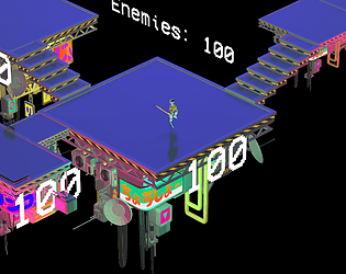
This is so cool lol-the visuals are the best ive seen in this jam. its got a really unique style. i also really like how the text displays are actual parts of the map. the "limited space" theme does fit here really well. however, there arent any sounds except for the bgm.
This is probably gonna win the jam lol-
man took the theme to heart lol, enjoyed this but the walking felt a bit janky idk i just fell off so much
You respected the theme literally which I really like nice job.
nice and interesting isometric view