Just "nice" *_* It reminds me a little bit of Lisa but with your own artstyle. Very cool game :D
Play Game Demo
Repari's itch.io pageResults
| Criteria | Rank | Score* | Raw Score |
| People's Choice | #63 | 3.222 | 3.222 |
Ranked from 18 ratings. Score is adjusted from raw score by the median number of ratings per game in the jam.
Comments
As others have already pointed out, I really like the graphic style and color palette used! The ability to dodge in battle seems like a really cool feature, I would have preferred to battle the queen so as to see different attacks... but I understand that maybe it is due to time limits. I'm curious to see how Repari will continue! Good job!
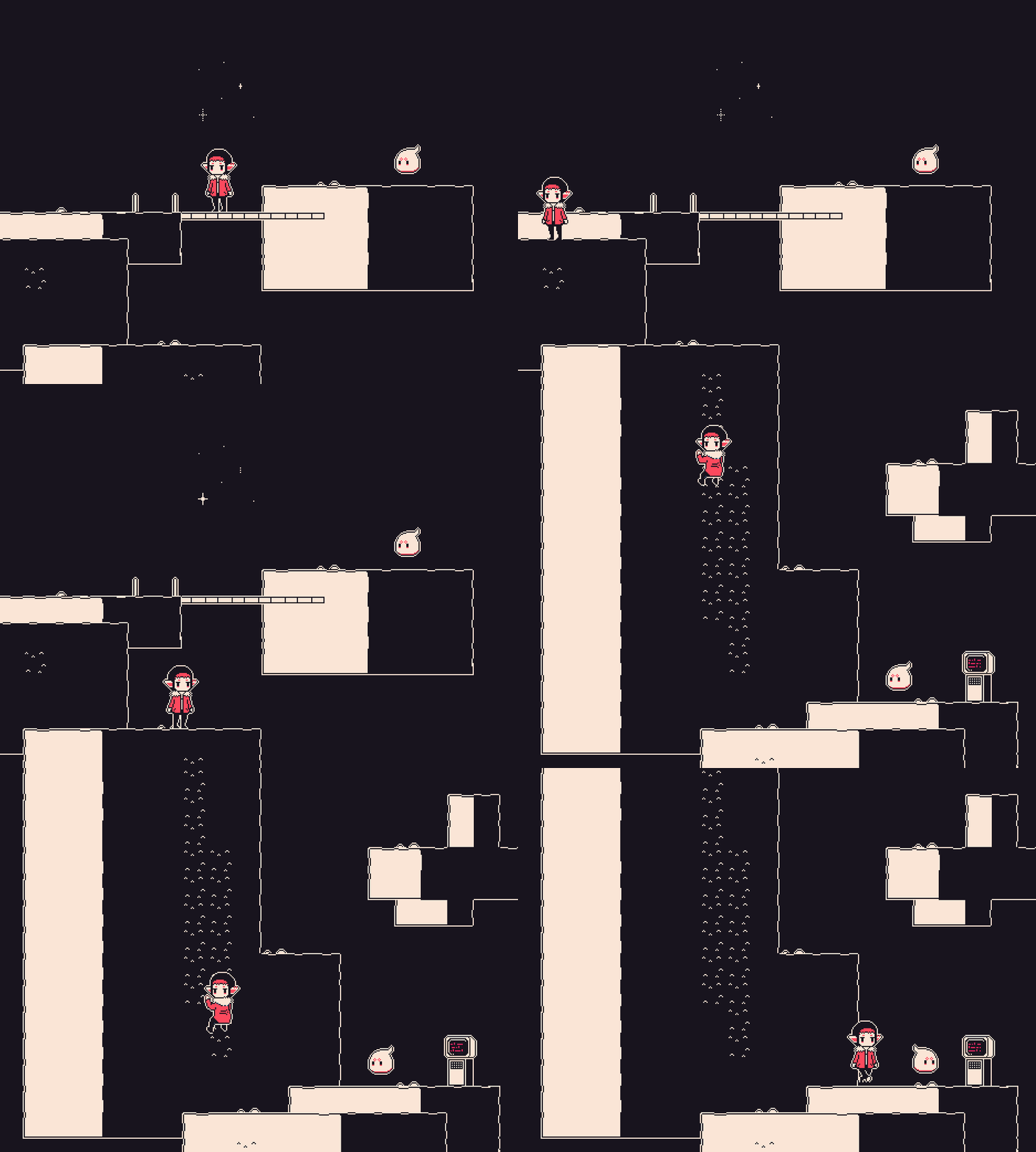
I know it's been mentioned below, but definitely want to make sure you move the "how to climb" tutorial / info to the first screen where you need to climb for the first time, since it's not completely intuitive. I definitely got stuck there for far longer than I'd like to admit. xD
But, once I figured that out, I found the simple color palette to be very pleasing and the gameplay equally satisfying -- I just with there was more! I wish you the best as you keep expanding on this one. :)
I really like the art style and the limited use of colour to create a nice palette that's very pleasing to the eye. Great music, too! Half the SFX are great and half don't really fit - but I assume that you'd re-do those if you move further with the project :)
I will say that I didn't know what to do for the first minute, because I wasn't taught how to climb down until a couple of screens later. I'd add a light, floating, subtle prompt when you walk to that right section :).
I hope you continue!
The artstyle is really good (limited palette pixel art *__*). It's a pity that there's little to play. The battle system needs some more depth but I'm sure you'll add some features in the full game ^ ^
This game has huge potential, but right now I think it needs some tweaks! I'll look forward to the complete version :D
An advice: let the player speed the dialogues up. :)
I liked this game. It reminds a bit like LISA: The Painful on Gameboy, but the “platforming” is more used for exploring instead of giving you a challenge. Even if you made some little mistakes here and there (like the Gold icon not fitting the three colors of the palette), I wished a more expanded demo, I am sure the game will be really good, but it’s sad I wasn’t able to see much about it :( Subbed, so I know when I can play the final version with more stuff!
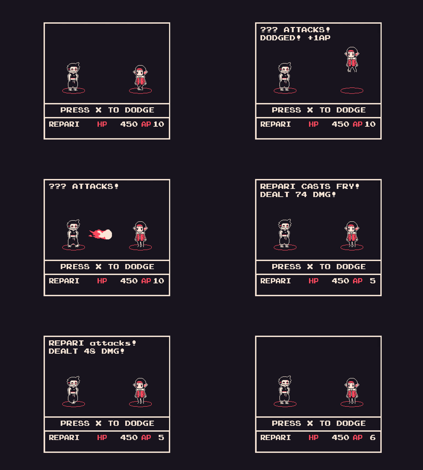
hey I love the artstyle! limited color pallete pixel art is just something else. What is this, just 3 colors? You made it work wonderfully and it gives the game such a clear identity. Cute ghosts, yummy onions, strong character design. Dodging is kinda hard in the beginning I will say, because the flames collision with Repari doesn't quite match the dodge timing. But 100% enjoyed playing! :)
I just played and loved the experience, the only negative point, for me, was the enemy HP. If it were a little reduced, it would be perfect. The songs match the art style very well and the use of colors is charming, great work! ^^
First thing that stood out to me when booting this game up is the visuals and music. The game has a really a cute minimalist pixel art style and the retro music choice fits it very well! The cute animations of the sprite as they jump and climb gives that extra spice and I like how the map transitions from each area for this particular game. I'd like to see more areas if this game gets expanded upon.
Since this is a demo version, it is very light in plot with small interactions that imply a possible bigger game in the future. I did like the small glimpses I got to see of funny characters being around in this setting, such as onions.
Overall combat is currently simple with a basic attack, skill and item option. The unique part is that your dodge is active based on your input and restores ‘MP’ with each success. It makes the battle more engaging in real time and I like that aspect. I do wish that the success window to dodge is slightly clearer/obvious or larger however as it is admittedly hard to pinpoint even after getting the hang of it. In case of the fireball, there isn’t really an audio or visual sign that hints at you that this is the exact time to jump outside of the movement of the fireball itself, which is easy to make a mistake and jump just slightly too early or slightly too late.
I am 100% a dumbass and didn't realize what indicated you could climb for an embarrassingly few minutes. However, once I learned how to climb I really enjoyed this! I love the minimalistic look, the battle I did was a little long, but I got the hang of dodging fireballs and I think it's a neat mechanic! I would love to play a longer game like this for sure.


Leave a comment
Log in with itch.io to leave a comment.