Play game
Safe Course's itch.io pageResults
| Criteria | Rank | Score* | Raw Score |
| Overall | #2 | 4.200 | 4.200 |
| Visuals(Graphics) | #2 | 4.600 | 4.600 |
| Sound/Audio | #2 | 4.400 | 4.400 |
| Fun | #4 | 3.800 | 3.800 |
| User Interface (UI/UX) | #5 | 3.600 | 3.600 |
Ranked from 5 ratings. Score is adjusted from raw score by the median number of ratings per game in the jam.
DevLog Link
https://maui-101.itch.io/safe-course/devlog/707381/safe-course-2024-1st-devlog
Leave a comment
Log in with itch.io to leave a comment.


Comments
Nice to meet you again! And I’m glad to see how your game is progressing. The changes you’ve made since the last jam are great. The new levels are also good. I finished up to C2 yesterday.
Maybe you can consider allowing players to adjust heading/cargo with WASD. Quite oftern, when I was experimenting with +-1/2 degrees, it was a bit tedious to do it with a mouse.
A couple of soundtracks would make the game even better.
Thanks for the feedback, I'm glad you appreciated the changes :)
I'll probably add a few controls for PC. As for the soundtrack, I definitely plan to add more but I'm waiting to really lock down the core concept of the game before adding the finishing touches (like music, refined UI and improved assets). I might still go for a few placeholder sountracks in the meantime if I find some. Ideally I would have one soundtrack per sector to set a unique tone for each.
Thanks for playing (again) !
So I actually got to play this in one of the previous jams as well. The new free look camera is a fantastic addition and the mini-map is definitely easier to read at a glance. The tutorial is solid and I really liked the level that forces you to learn how to adjust your cargo. It's a great way to ease people into the game. The UI is still a bit rough looking but that is less important than nailing down the fun first. Just a small thing too but when you open the map, it should hide the player's ship. The only reason for this is that it really distracts from the map and makes it a lot harder to read. Solid work over the past month!
Yes, I'll think I'll do something like hiding the ship or blurring the background to help with readability on the fullscreen map.
Thanks for the feedback and encouragement :)
It's nice and polish, i like it. but i feel i don't have enough reward by biting the levels (adding a score could be nice)
i also felt theat it could be more fun with a mid launch interactions (shoot a météorite or burn the rest of carburant for a speed up ?)
Thanks for the feedback :)
I'm currently thinking about how to make it more engaging and maybe having something do to mid-flight.
For a mobile game, the controls work great on browser
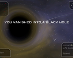
The black hole is stunning! It does make me look more critically at the fidelity of the other assets though.
Ah yes, the Cargo thing... I called it Cargo because I wanted it to make more sense (like the ship would actually drop some of it's cargo into space before launching to become lighter) but you're not the first one to mention that it feels bad to lower it because like it might be affecting your score or something (which it's not since there isn't any score right now). I'll probably change the name to "Weight" or "Mass".
As for adding feedback mid flight, I think I could add some notifications like "Warning : collision course detected" or "Collision avoided". But I also don't wanna be too annoying with the notifications... And for interactions I'm not sure, the basic concept was that once you launch you no longer have control and can just relax and watch what happens. I might need to revisit that...
I'm trying to find ways to make the gameplay more engaging while still keeping it a simple mobile game since I also worry that the game might feel too repetitive after playing for several levels.
Anyway, thanks for the feedback, that's very helpful :)
Wow, very impressive. The visuals(the black hole!) and sound are very good. A chilled atmosphere, but a challanging puzzle game. I understand that you aim at mobile devices, but maybe you could add keybord controls for the web-version.
Thanks for the kind words, I'm glad you liked it :)
About adding keyboard controls, I'll think about it.